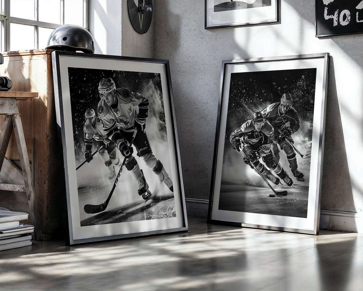
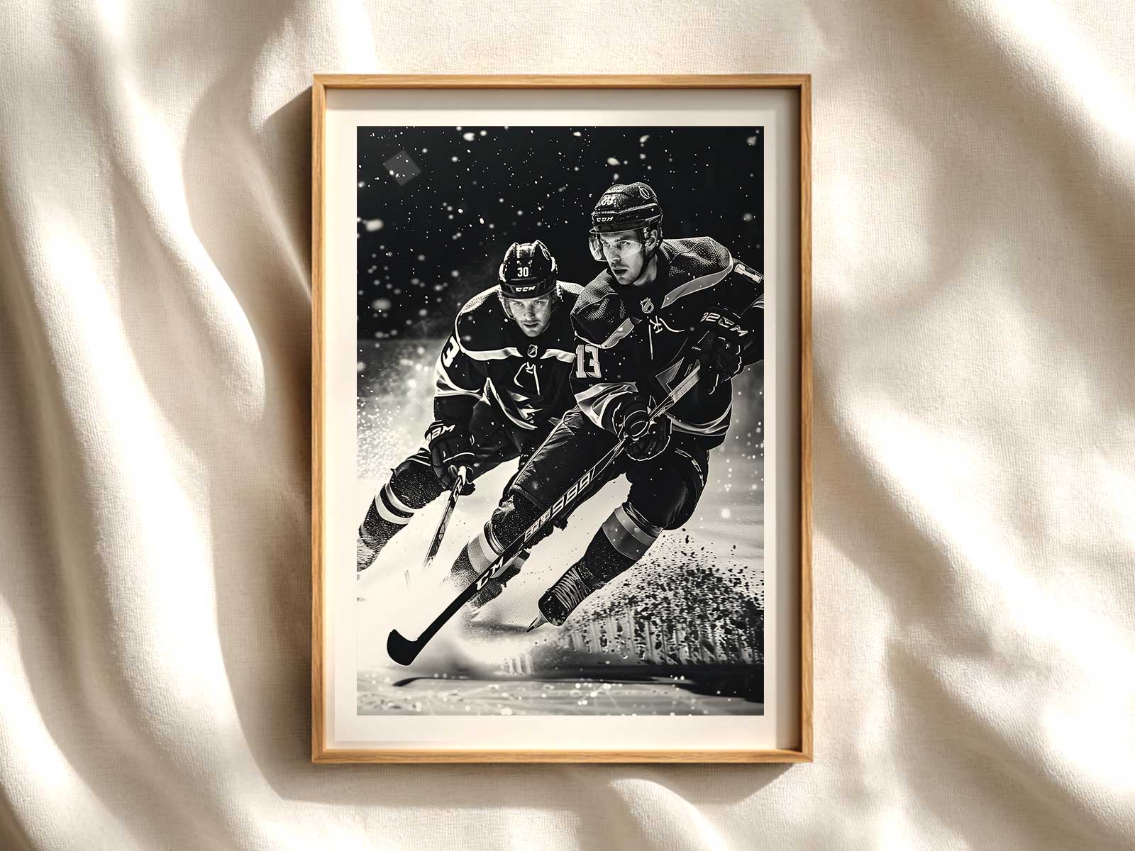
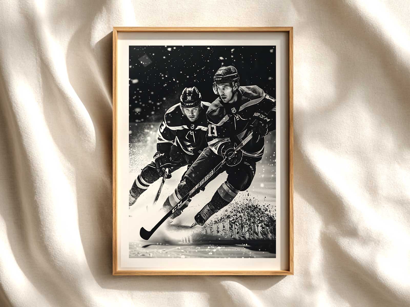
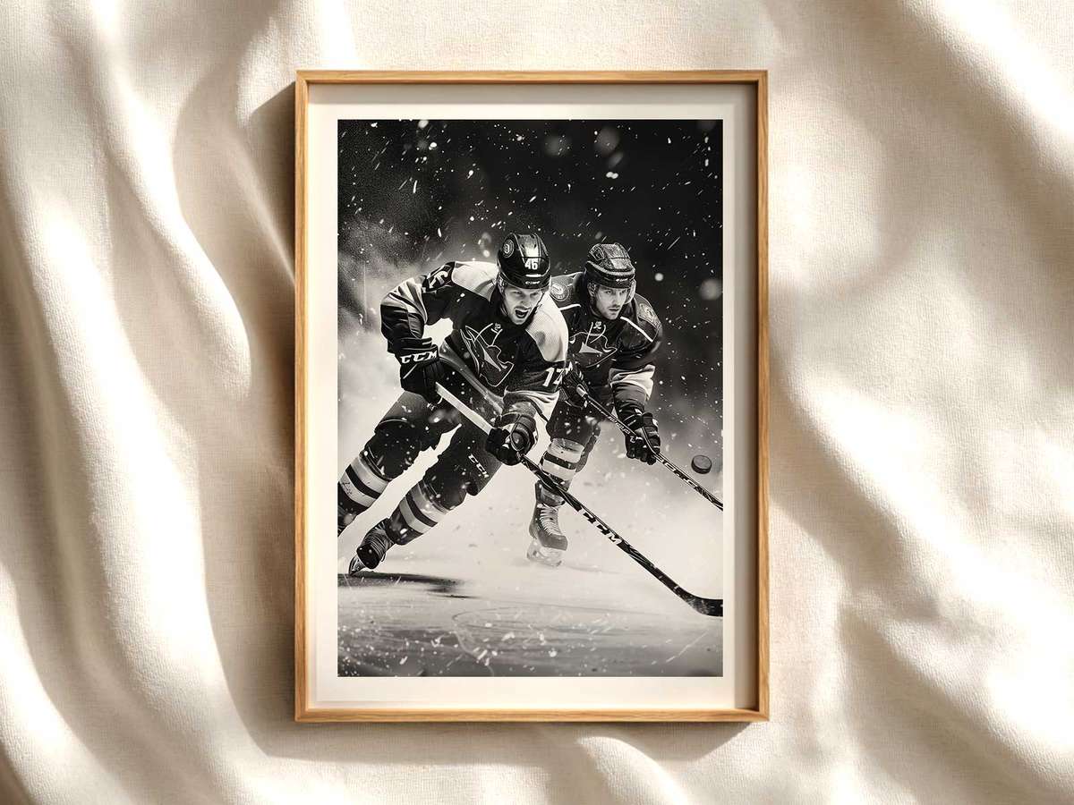
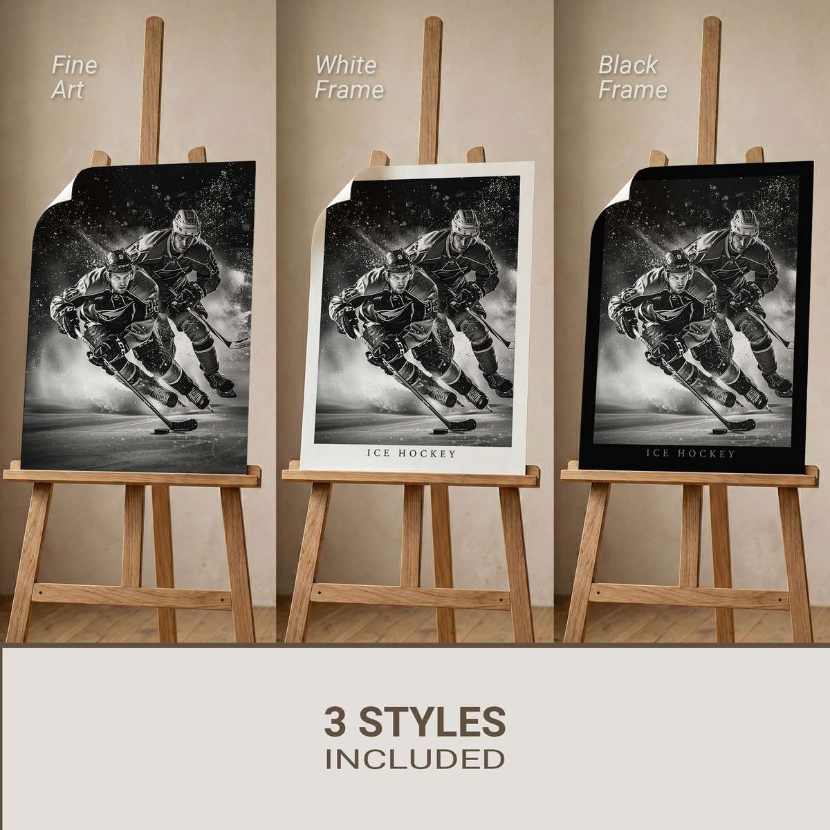
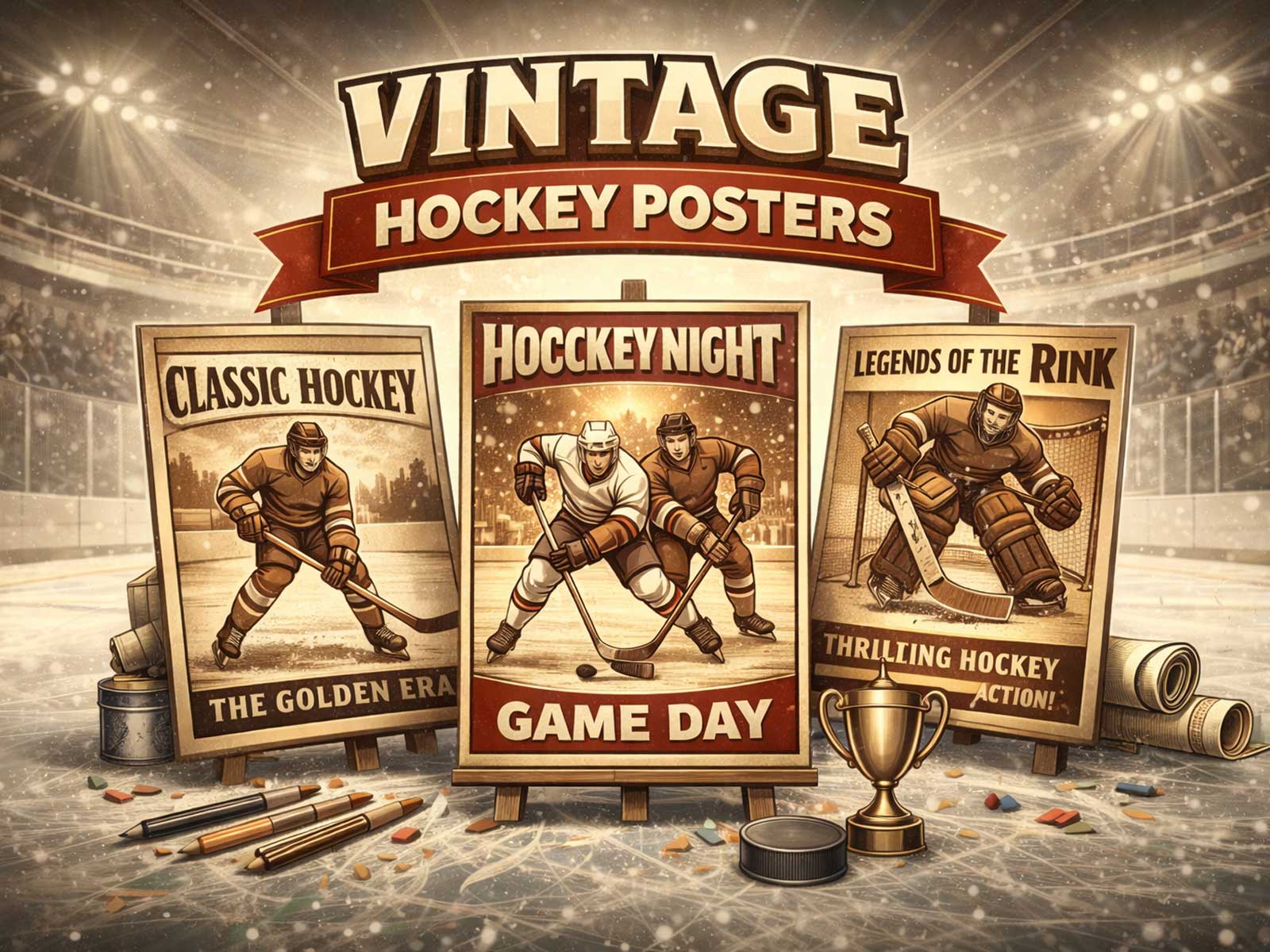
There is a particular electricity to a hockey image that translates immediately into room rhythm. A single framed poster can reorganize a space: the sweep of a skate across glossed ice becomes a compositional line, the sharp contrast of jersey colors punctuates a neutral wall, and the hard geometry of the rink—boards, face-off circles, goal creases—lends decisive structure to whatever sits around it. This is not merely about fandom; hockey imagery carries a visual grammar of speed, contact and cold light that the eye reads as movement even when the room is still.
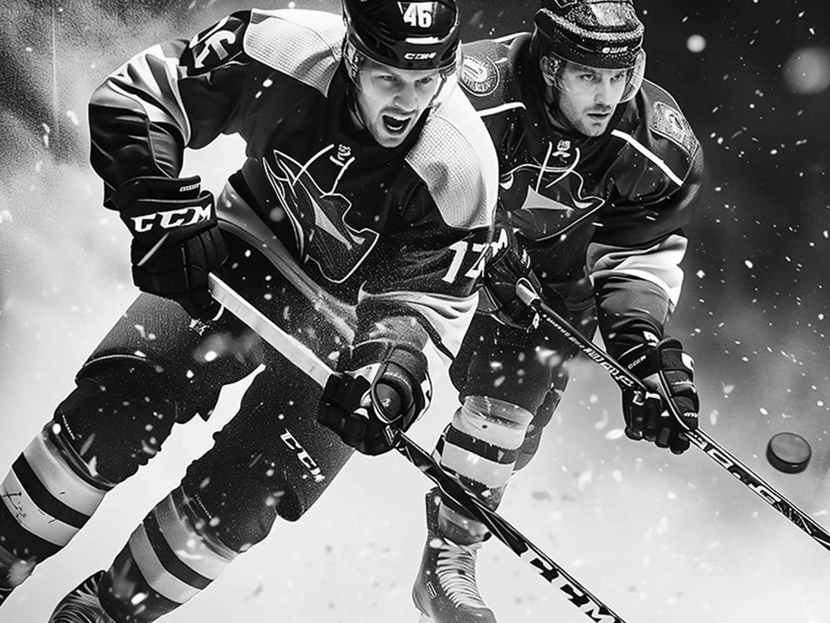
Visually compelling hockey art leans on three ingredients. First, light: the ice surface acts like a reflective stage, scattering stadium luminance into crisp highlights and deep cool shadows. Those luminous blues and washed whites push warm interiors toward a modern, airy feel when balanced with wood or leather accents. Second, motion: lean bodies, bent knees, and angled sticks form diagonal vectors that create implied momentum across the frame. Even a static photograph suggests continuation—speed that continues beyond the edges of the print. Third, identity: jerseys, crests and mask designs give the image immediate cultural reading. A strong emblem or contrasting team palette anchors the piece, letting viewers instantly decode allegiance and atmosphere.
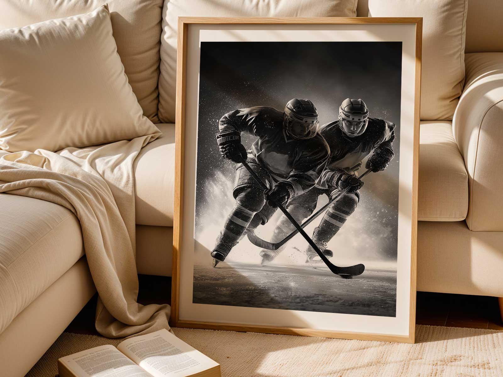
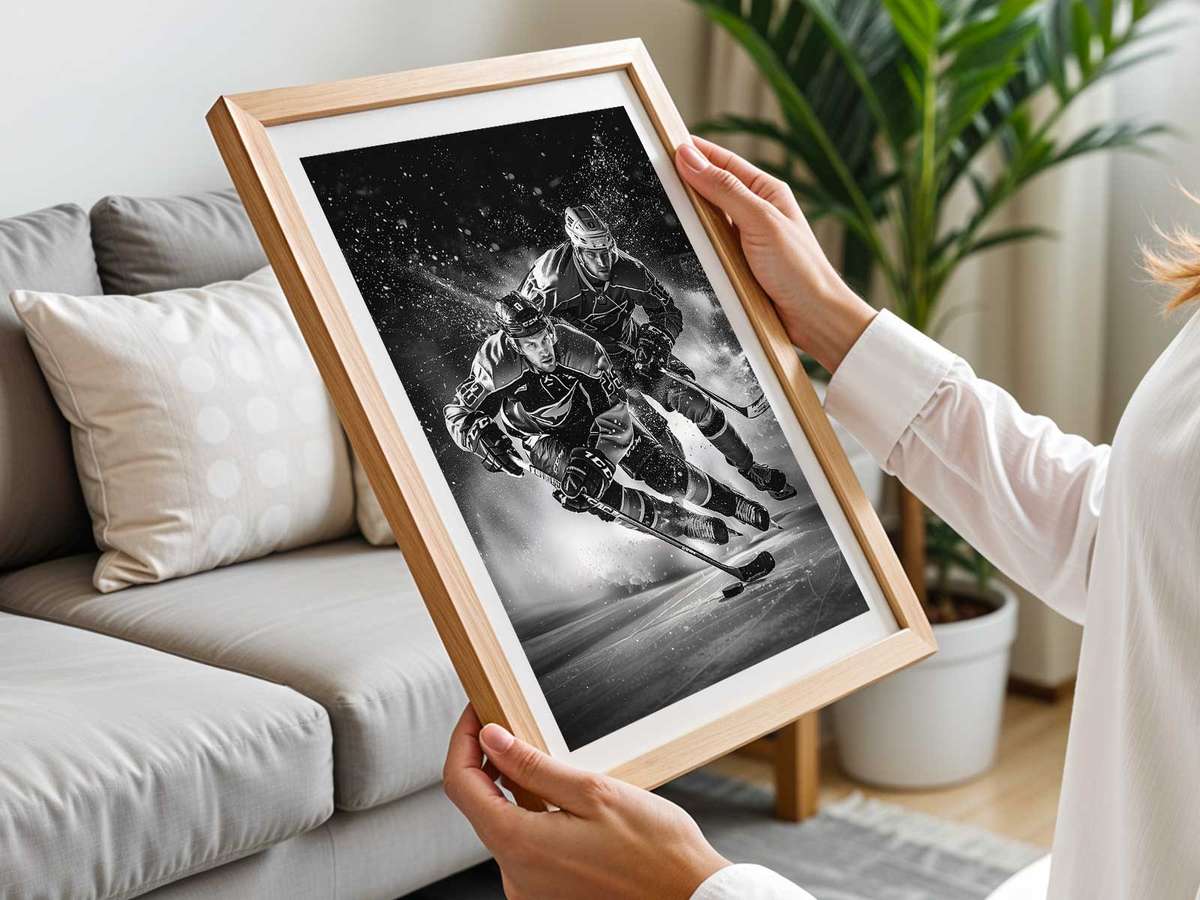
Place matters. In a minimalist living room, a large-format hockey poster becomes a bold focal point, its cool palette offsetting warm textiles and making seating feel arranged around an unseen event. In a bedroom or home office, a medium print hung over a desk or headboard introduces compact energy—enough tension to inspire without overwhelming. In dedicated fan caves or game rooms, clusters of prints—game action, close-up equipment studies, retro logos—create narrative rhythm: sequence becomes storytelling, and rhythm becomes ritual for returning viewers.
[IMAGE_INSERT_ARTICLE_01]
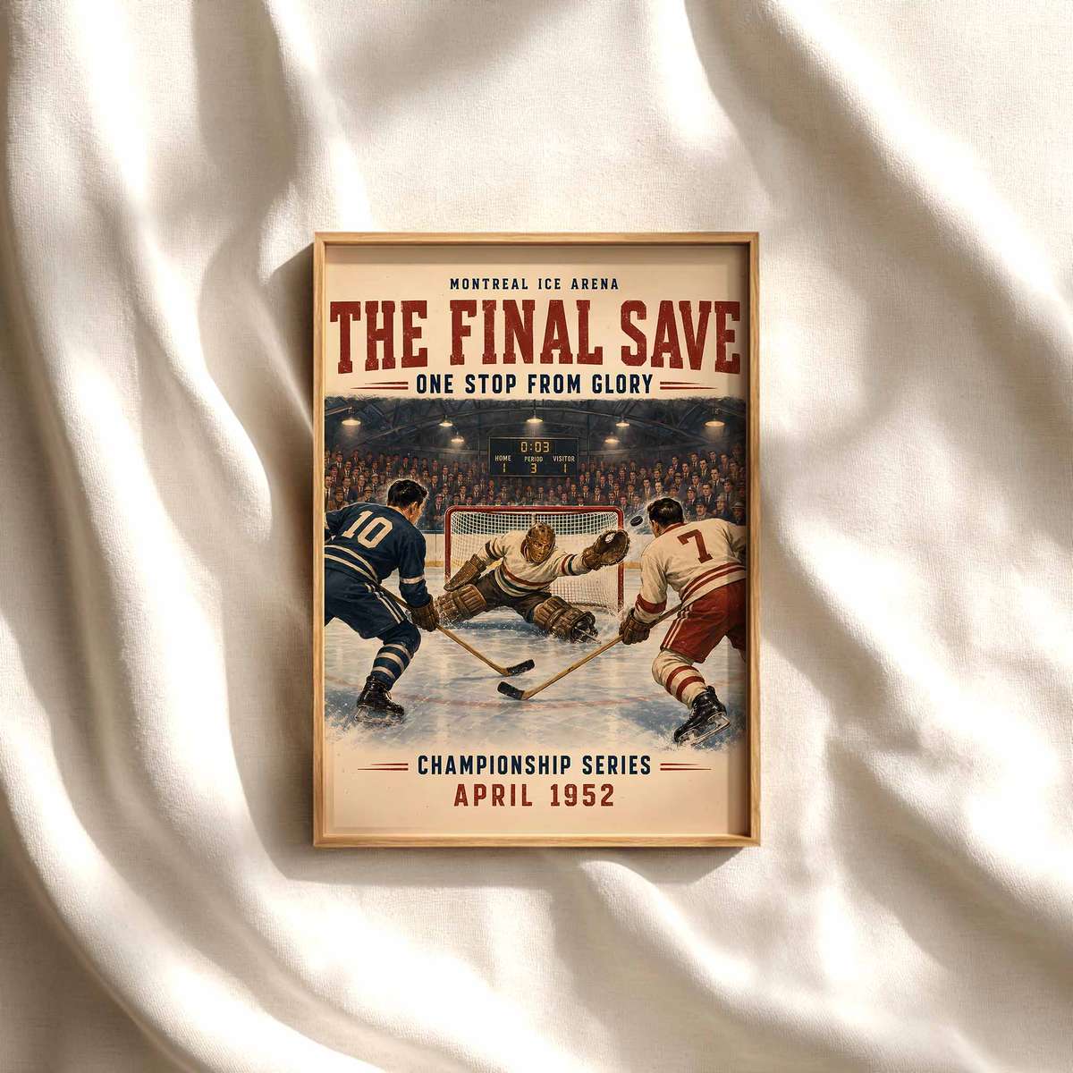
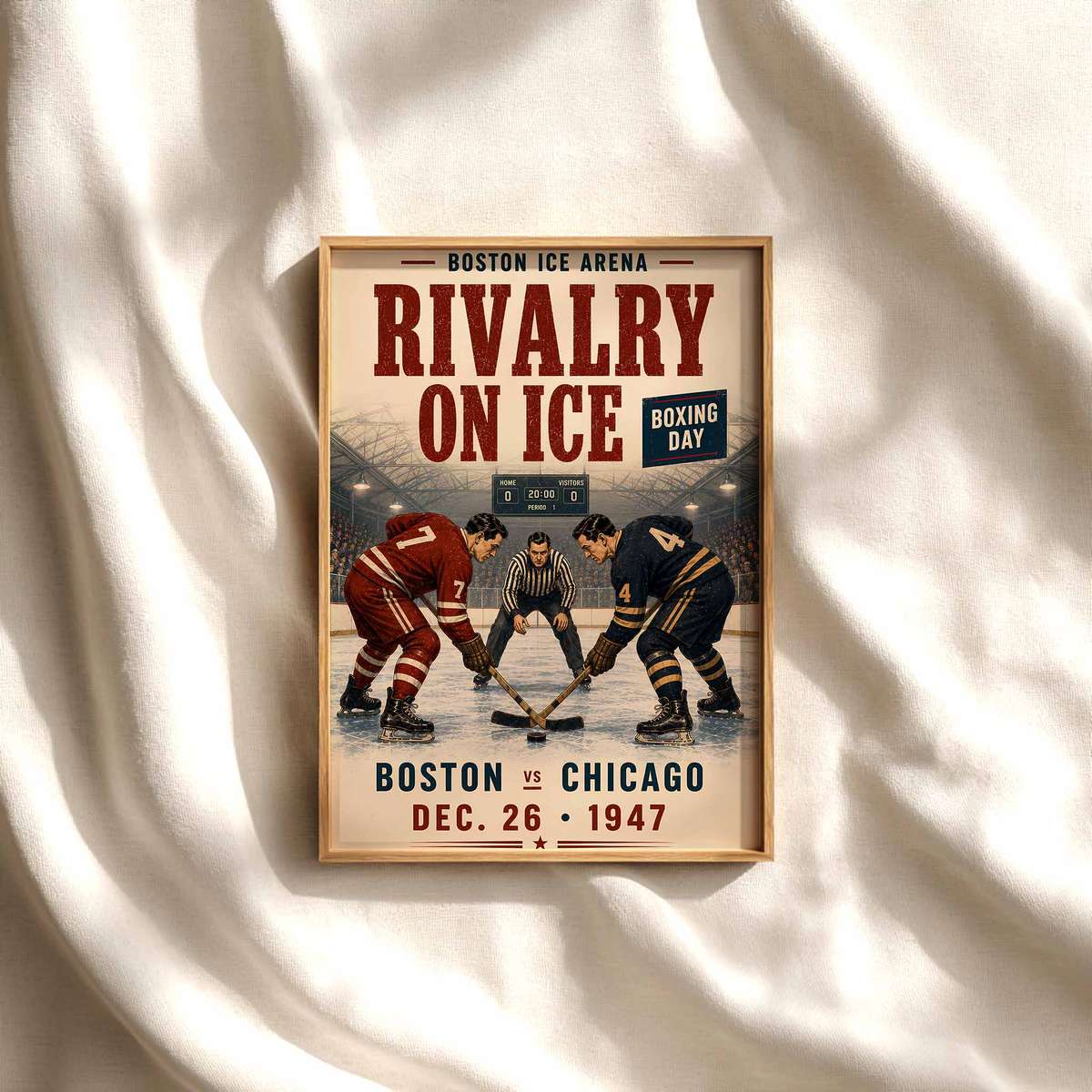
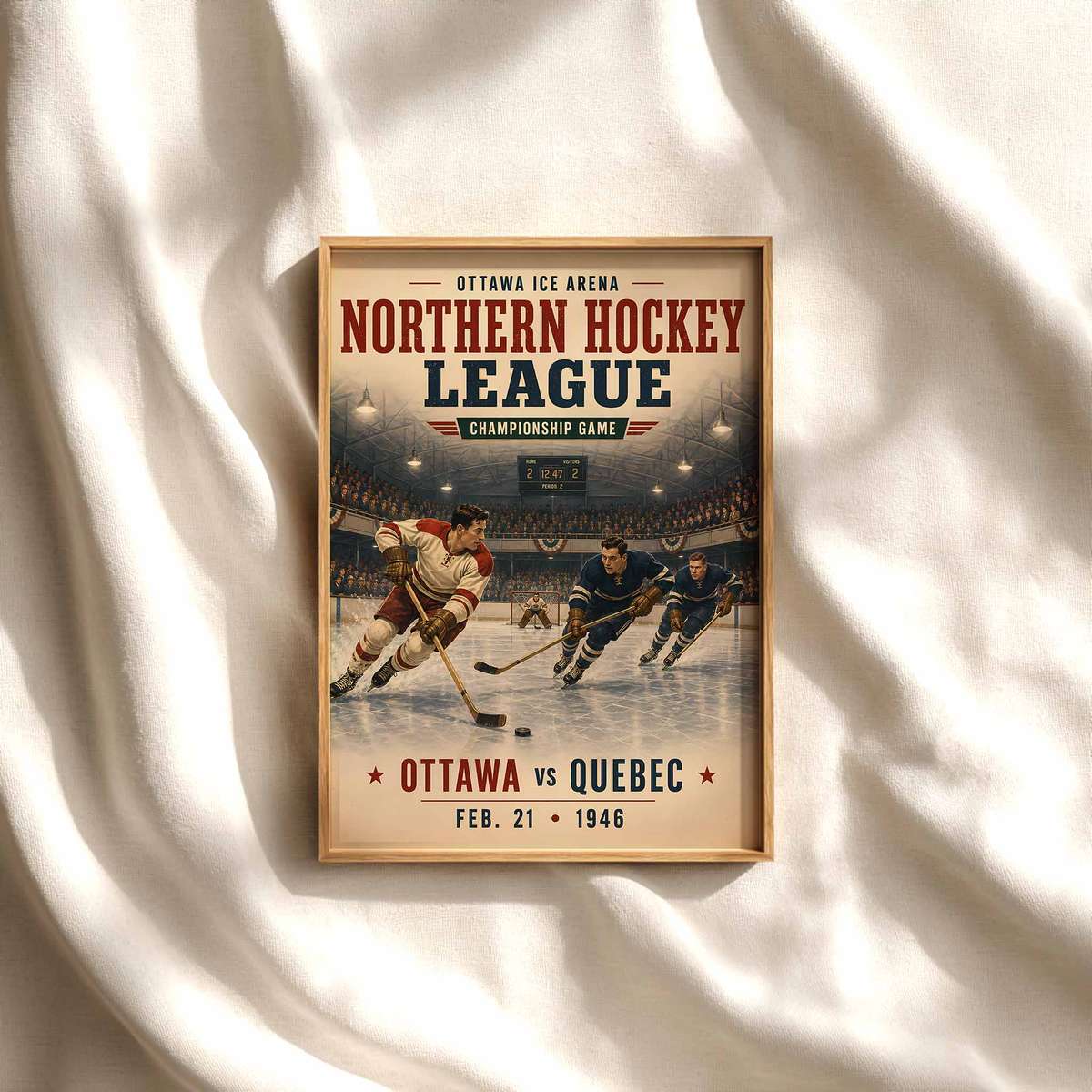
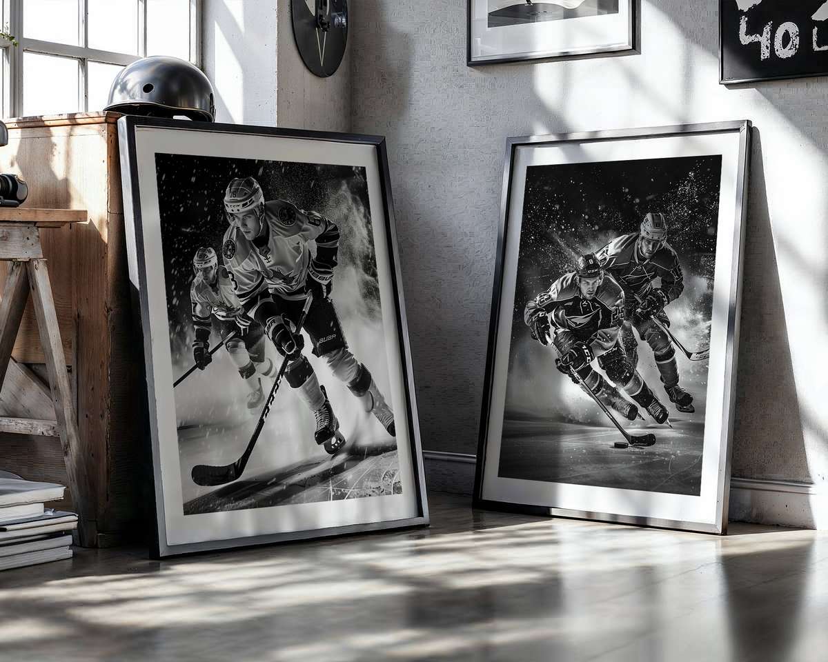
Design choices within the image shift the mood from retro to contemporary. A vintage-inspired poster that favors grain, subdued inks and old-school typography conjures nostalgia and pairs beautifully with mid-century or industrial furniture. Modern editorial photography, by contrast, emphasizes high-contrast lighting, tight crops and graphic negative space, matching crisp Scandinavian or urban loft interiors. Both approaches exploit hockey’s inherent tension: the collision between bodies, the strain in muscles, the frozen instant before impact. Those micro-expressions and bodily angles read as drama and give any wall a cinematic pulse.
Texture is another powerful ally. Close-up shots of skate blades biting ice, puck spray, and scratched rink surfaces translate tactile detail into visual texture on a flat surface. When printed on matte or textured paper, these images invite a tactile response—you sense the cold, the grit, the speed—without stepping onto the ice. For collectors, mixed materials (paper, metal, or framed canvas) can echo equipment: brushed metal mirrors the sheen of helmets, deep-matte paper recalls a sweater’s fabric.
Ultimately, hockey wall art works because it fuses clear graphic elements with emotional shorthand. Its diagonals and contrasts create rhythm; its palette and reflective highlights bring cool luminosity; its visible crests and costume pieces signal community and identity. Whether you want a subtle, design-forward statement or a room that celebrates raw sporting drama, a well-chosen hockey image gives you both: the aesthetic language of motion and the cultural shorthand of the sport, transforming walls into scenes that feel alive.
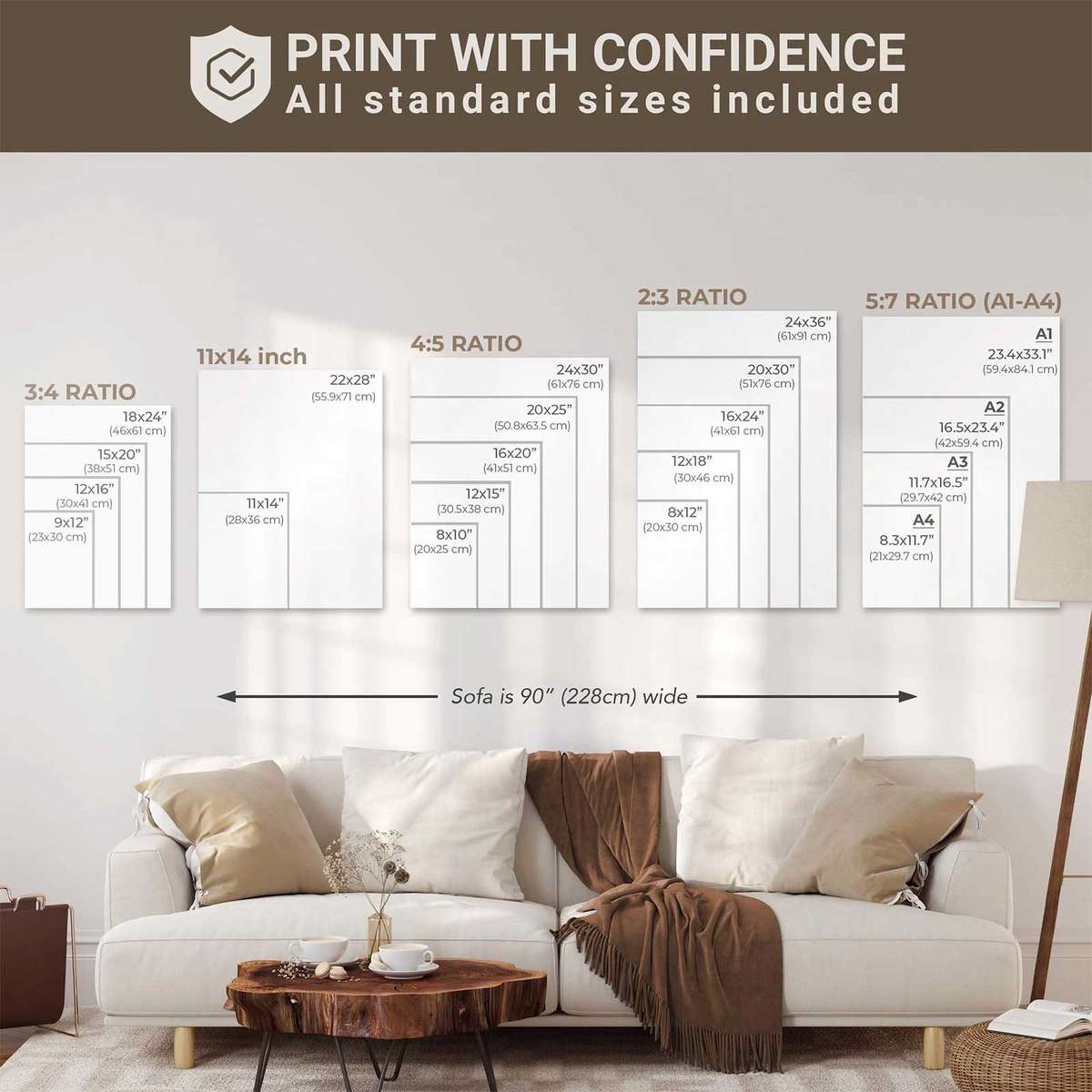
Choose a scale and finish that matches your room: large-format for bold drama, smaller framed pieces for layered collections. Pair with complementary textures—wood, wool, metal—to let the cool of the image sing without chilling the space.