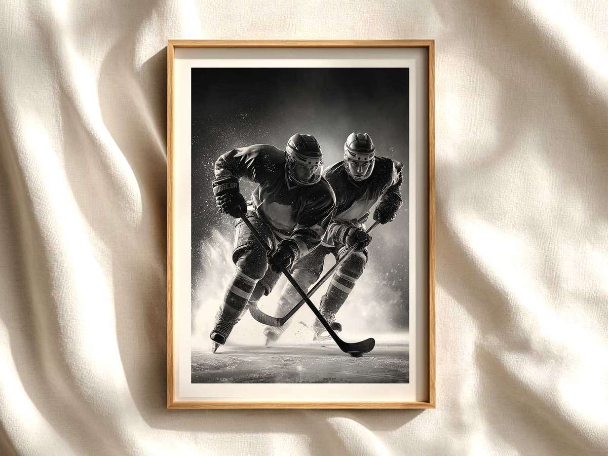
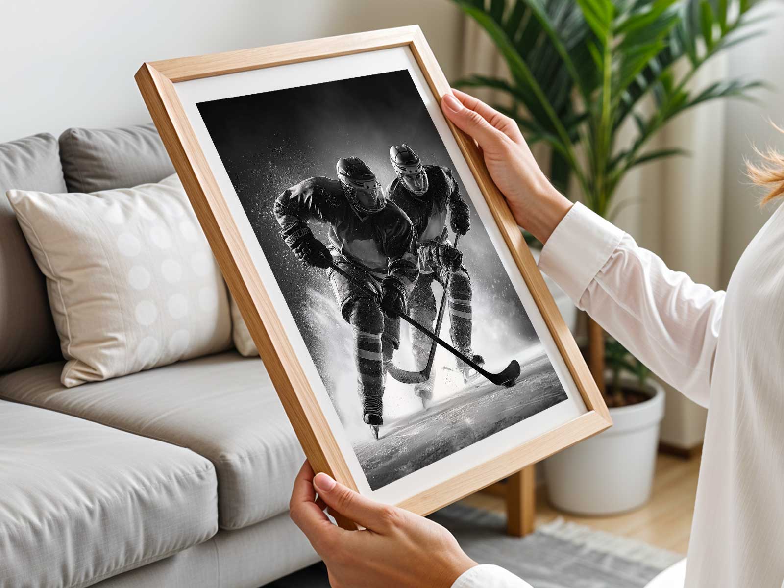
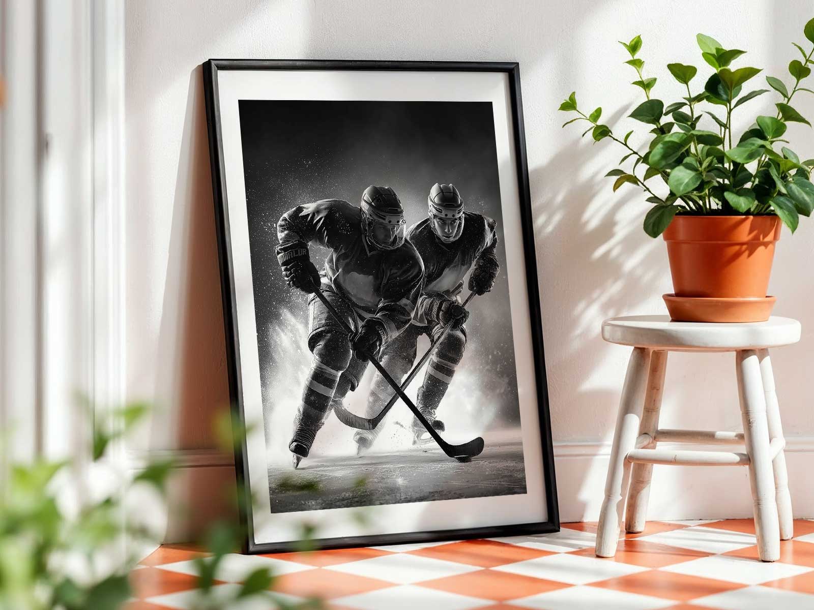
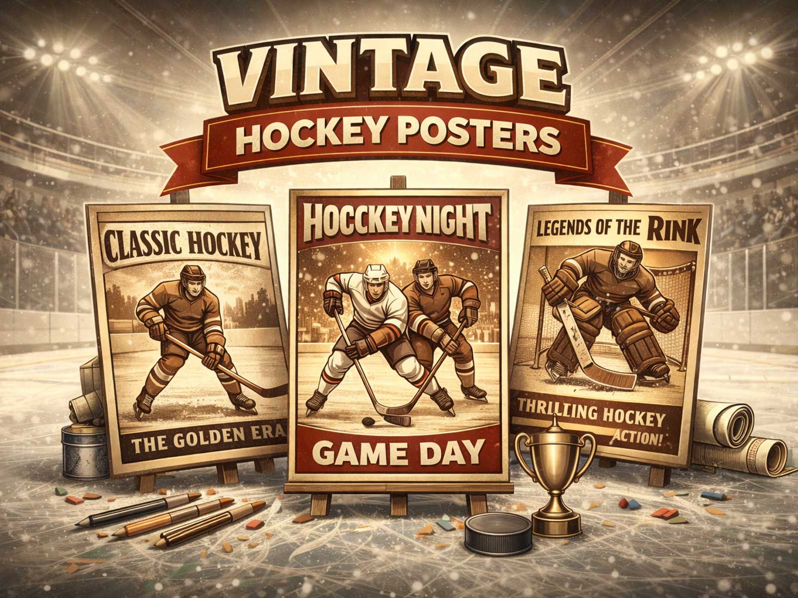
There is a particular gravity to a vintage hockey poster that goes beyond simple nostalgia — a combination of visual patina, team heraldry, and the echo of hard‑wood and tinny arena acoustics that together create an object with real presence on a wall. These posters are not just images of players and logos; they are condensed atmospheres, small reliquaries of a sport’s material culture. When you stand in front of one, you sense the worn canvas of a sweater, the chalky edge of a crest, the faint halo of light from an old scoreboard. That sensory depth is what separates authentic vintage hockey posters from generic “retro” prints.
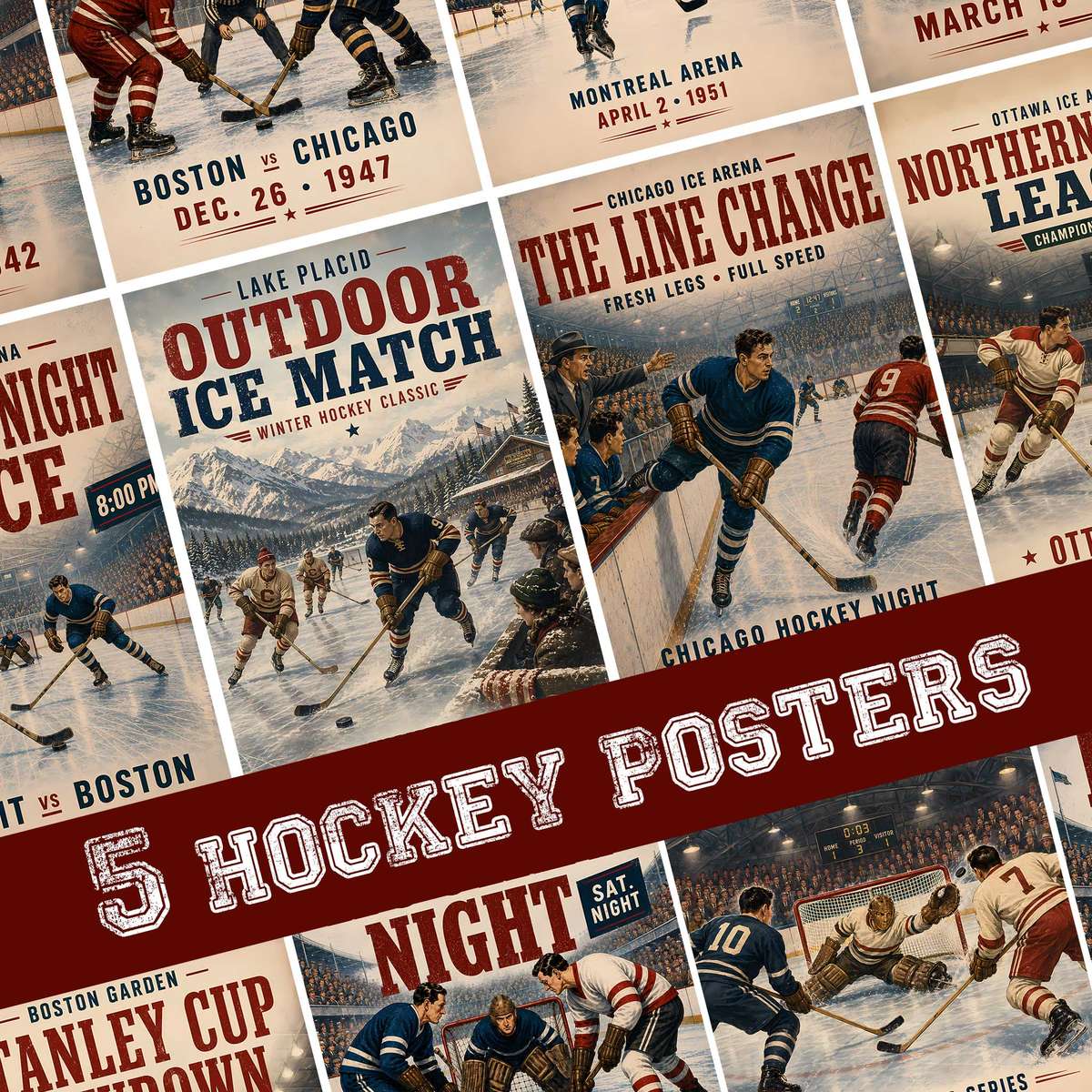
First, look at surface and texture. Authentic vintage posters — or faithful reproductions that honor the look — show signs of time in the way ink settles and paper breathes: subtle cracking, muted highlights, and uneven saturation that read as the image’s lived-in memory. This visual patina works like an acoustic filter: it softens modern gloss and introduces a tactile suggestion you can almost touch. Designers who mimic that effect do so by allowing halftone dots to breathe, by dialing down contrast, and by embracing small blemishes that signal a human, print‑age process rather than a digital afterthought.
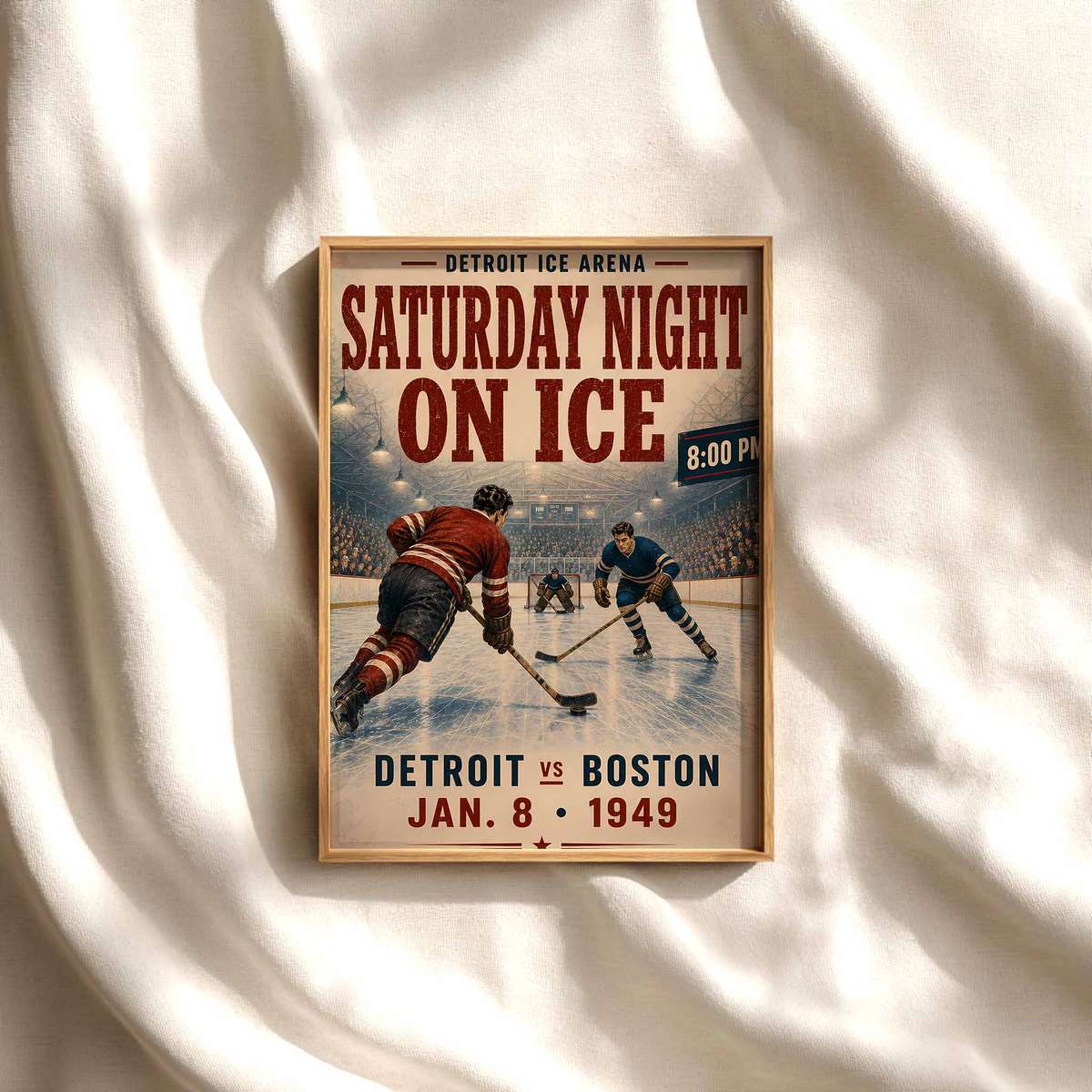
Equally important are old logos, sweaters, and crests. These elements are shorthand for eras and identities: a shoulder patch, a stripped collar, a blocky number on a wool jersey instantly locates the poster in a lineage of teams and towns. Crests were often hand‑drawn and lettered, carrying idiosyncrasies—off‑register colors, slightly uneven strokes—that give them character. When these visual cues are rendered faithfully, they do more than remind; they reconnect viewers to the rituals of a rink: the smell of zamboni steam, the squeal of blades, the communal theatre of a Saturday night game.
The choice of typography in vintage hockey posters matters as much as imagery. Mid‑century and early modern sports lettering favored condensed, geometric sans‑serifs or expressive slab serifs with strong weights and purposeful imperfections. Type was designed to read from bleachers and bars: bold, legible, and often slightly weathered. That typographic voice, when paired with period color palettes — deep vermilions, musty golds, faded navy and off‑white — creates a visual grammar that signals authenticity at a glance. It’s not merely an old font, it’s a way of speaking about the game consistent with the posters’ cultural moment.
[IMAGE_INSERT_ARTICLE_01]
Beyond material and design, the emotional pull of vintage hockey posters is rooted in memory: personal, communal, and architectural. Posters evoke the geometry of old arenas—low ceilings, exposed beams, hand-painted scoreboards—and the social rituals that took place within them. For collectors and decorators, a vintage poster carries those narratives into domestic space, giving a den or office the sense of having hosted a thousand conversations and rituals. That’s why these pieces are chosen for fan rooms and collector walls: they don’t just decorate, they anchor identity.
There is also a practical aesthetic advantage. Compared with modern, hyper-polished sports art, vintage posters integrate easily into layered interiors: wood and leather, amber lighting, and well‑worn furniture seem to accept them without visual friction. Their muted palettes and textured finishes make them forgiving focal points that age gracefully alongside the room. A single authentic piece can set the tone for a collection or act as the keystone in a gallery wall of memorabilia.
Finally, the difference between authentic heritage feeling and generic retro styling comes down to intention and detail. Generic retro borrows surface motifs; authentic vintage captures process and context. It respects how posters were made, the materials available, and the cultural signals of the time. That integrity is what makes a vintage hockey poster feel enduring: it is not merely an imitation of the past, but a preserved fragment of it, willing to carry memory and atmosphere into a modern interior.
For anyone furnishing a game room, office, or living space, choosing a vintage hockey poster is a choice for narrative depth. It gives a room history, invites stories, and rewards repeated looking with new discoveries—small details in crests, typographic quirks, and paper texture that reveal themselves over time. In short, these posters are less about longing for a bygone era and more about living with that era’s visual and emotional language in the present.