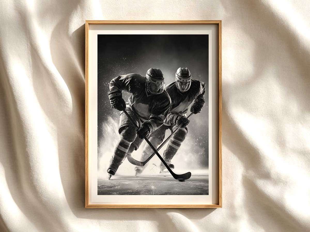
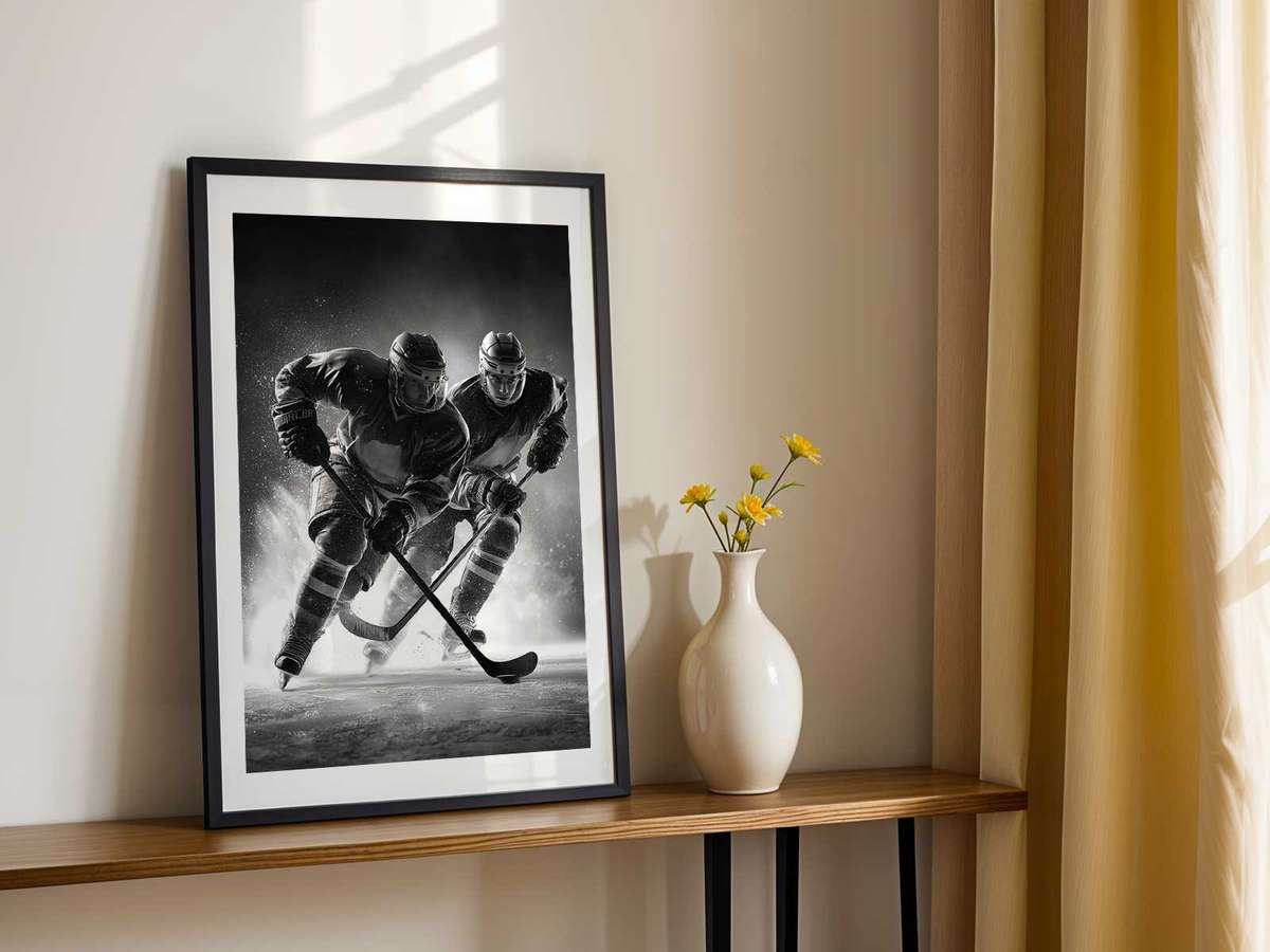
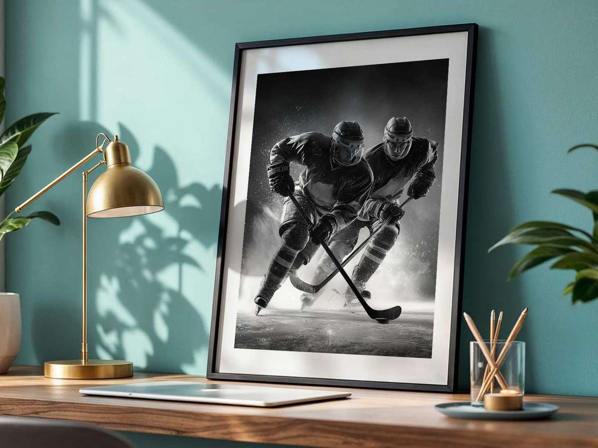
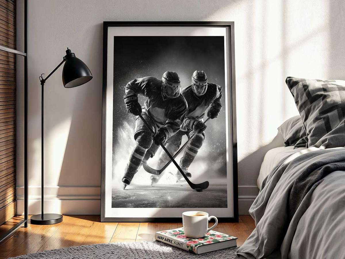
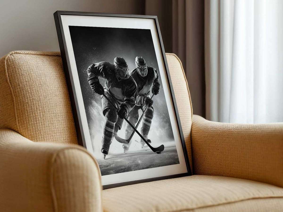
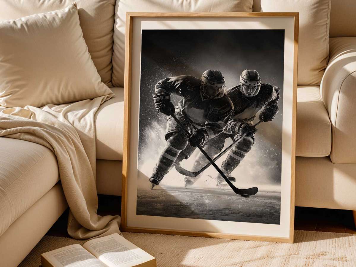
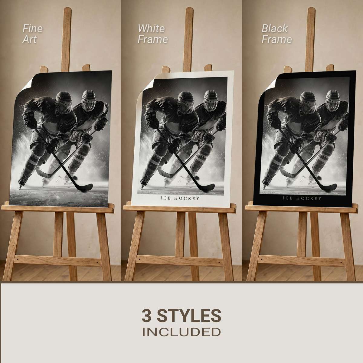
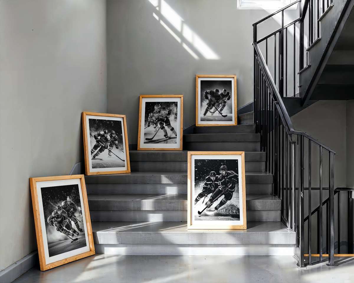
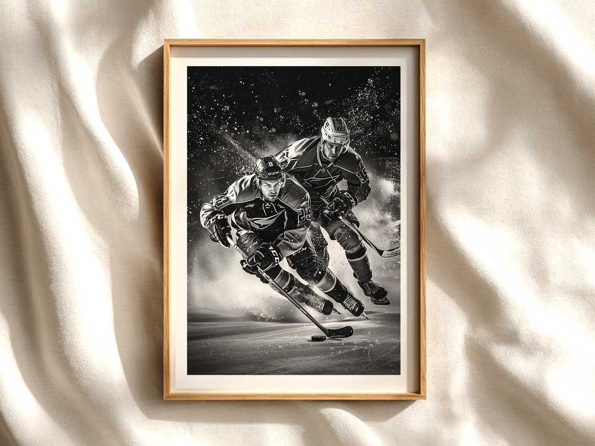
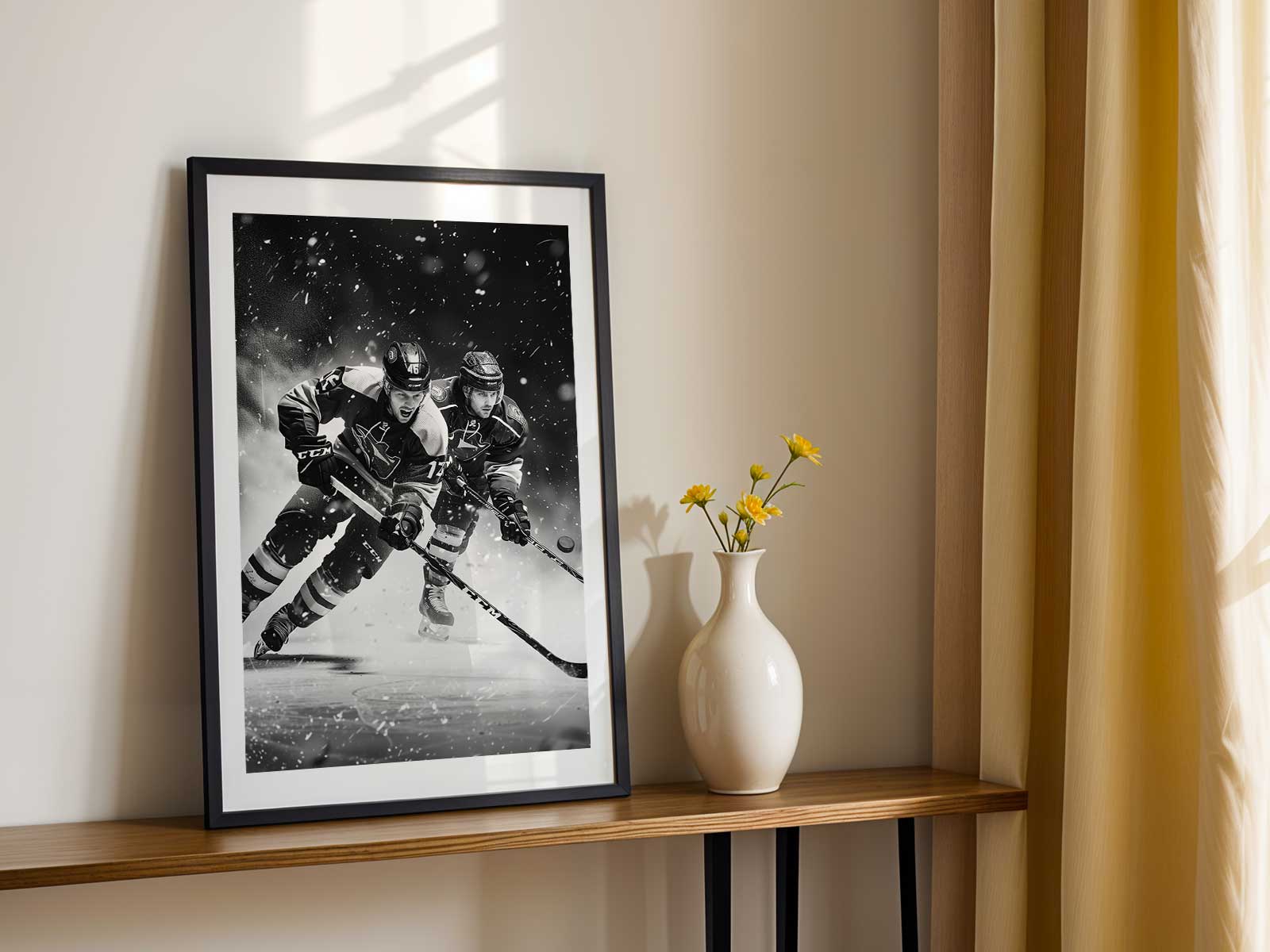
Hockey is a sport built from extremes: the bright, near-blank white of the ice, sudden flashes of saturated team color, and athletes moving at top speed through a compressed, kinetic arena. A Connor McDavid poster that leans into those contrasts becomes more than a portrait; it becomes a room-defining visual statement. The crispness of the ice acts like negative space in a painting, allowing helmet silhouettes, jersey crests and stick angles to read clearly across a living room wall or a narrow hallway.
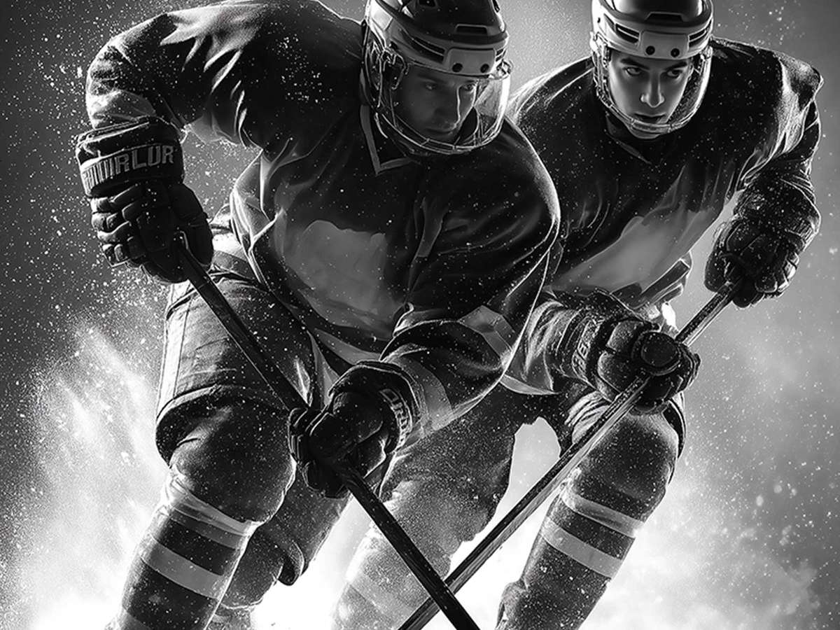
What makes the image visually convincing is the interplay between stillness and implied motion. The photograph or illustration must capture a single, decisive fraction of time: a stride in mid-power, a head turned toward the puck, a spray of ice frozen like freeze-frame confetti. That suspended moment communicates velocity without blur because the background ice and arena lighting provide a neutral stage. The result is kinetic energy you can feel from across the room — a posture, a reach, the tension in the shoulders — that reads as both athletic drama and elegant form.
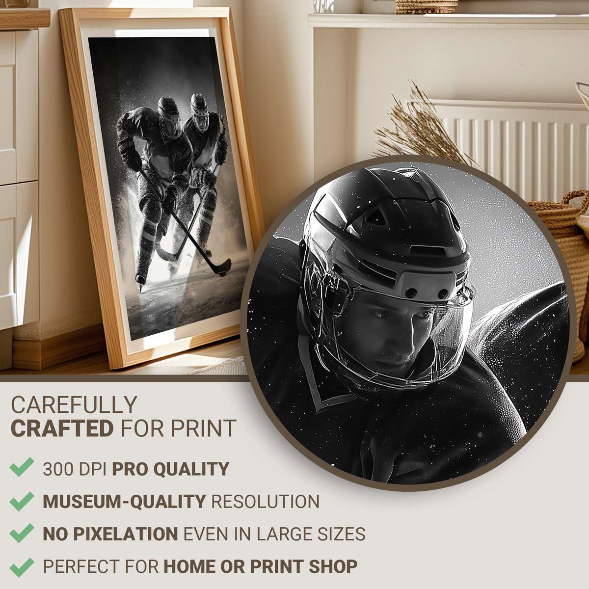
Color plays a central role. Against the white plane of the rink, bold team colors become graphic elements rather than mere decoration. A deep jersey hue or a vivid accent on a glove or stick tips the composition, guiding the eye from crest to blade. Designers who respect this dynamic will use high-contrast separations: deep shadows on the uniform, luminous highlights on the helmet visor, and a clean halo where skate spray meets ice. These choices keep the poster legible at a distance while rewarding close inspection of texture — the grain of the ice, abrasion marks on the boards, the weave of fabric in a vintage or modern jersey.
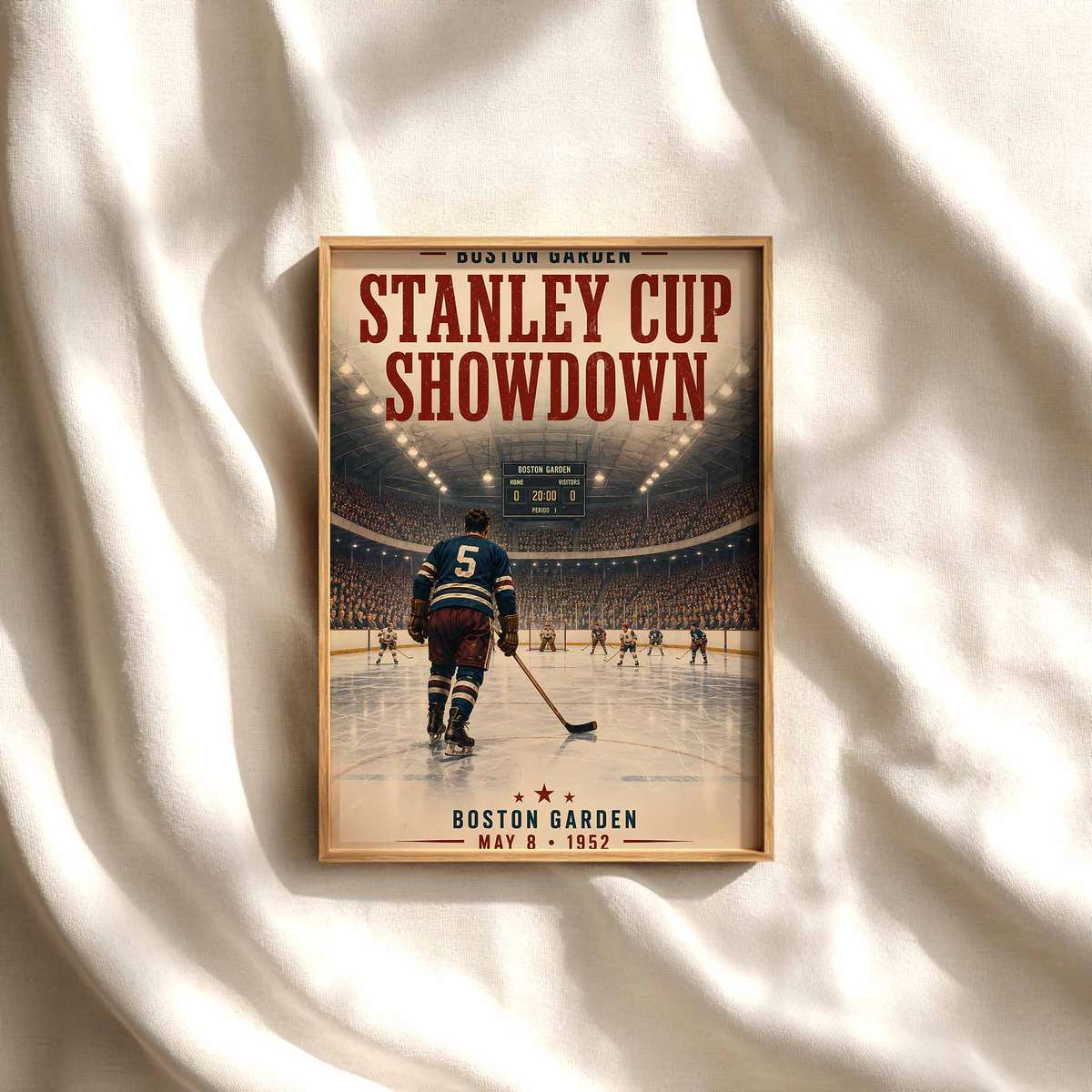
Rink geometry and lighting also shape how a hockey image functions as wall art. Dashed lines, faceoff circles and the curve of the boards create compositional anchors that can echo room proportions or furniture lines. Overhead arena light, when photographed well, sculpts muscles and creates reflective planes on helmets and sticks; it gives the piece an arena-like atmosphere even in small domestic spaces. A poster that hints at crowd blur or distant scoreboard glow conveys that the action is still unfolding, which keeps the work feeling alive rather than static.
[IMAGE_INSERT_ARTICLE_01]
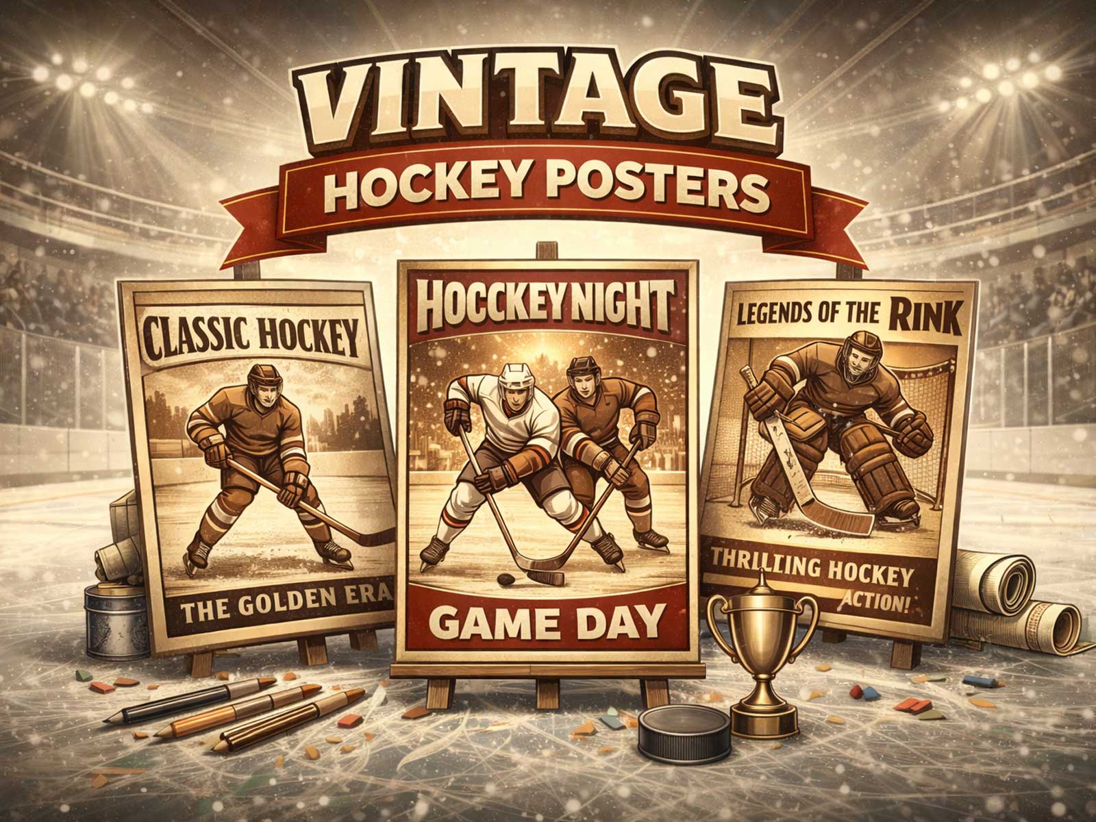
There is a stylistic choice between modern immediacy and retro memory. A contemporary treatment emphasizes crisp contrast, saturated color, and tight crops that celebrate movement and technical polish. A retro approach leans on film grain, muted tones, and wider context — the boards, an old scoreboard, or a crowd shot — to evoke nostalgia and the tactile pleasure of archival prints. Both treatments have room in thoughtful decor: modern pieces bring a kinetic, almost minimalist energy to offices and game rooms, while retro prints warm a study or collector wall with history and texture.
Beyond aesthetics, the most desirable hockey posters succeed because they translate sport-specific details into universal visual language. Body tension becomes sculptural, the stick a diagonal that carries momentum across the frame, and the spray of ice a punctuation mark. These elements create images that read well from both across a room and up close, making them flexible for bedside walls, behind a desk, or grouped in a gallery-style layout. The artwork’s readability from a distance ensures it anchors the room; its subtle textures and compositional cues reward repeated viewing.
Ultimately, a Connor McDavid poster designed around the opposition of white ice and bold color, of suspended motion and continuing match atmosphere, offers more than fandom. It brings a precise, high-energy mood into a space: sharp, focused, and alive. Whether you prefer the clean lines of a modern print or the warm patina of a retro interpretation, the visual language of hockey — contrast, movement, and identity — makes for wall art that feels as dynamic as the game itself.