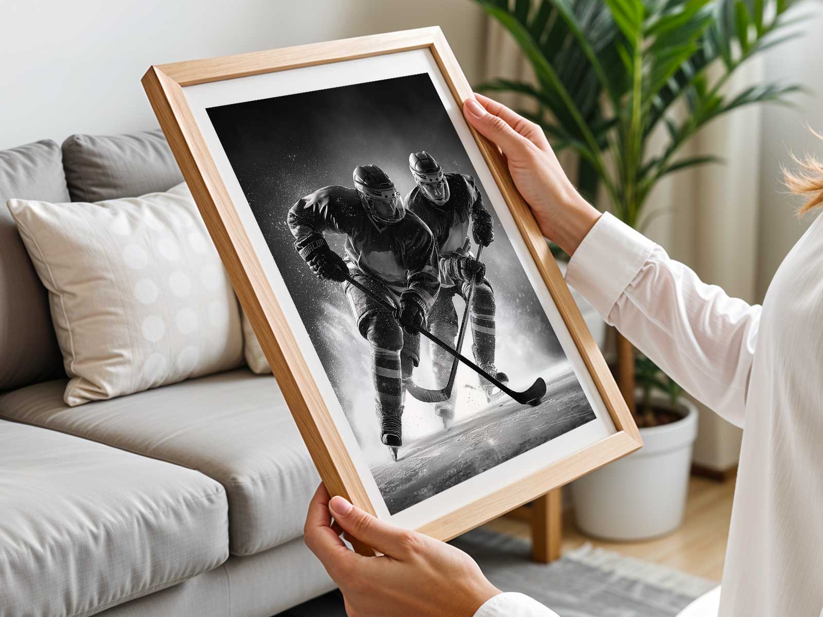
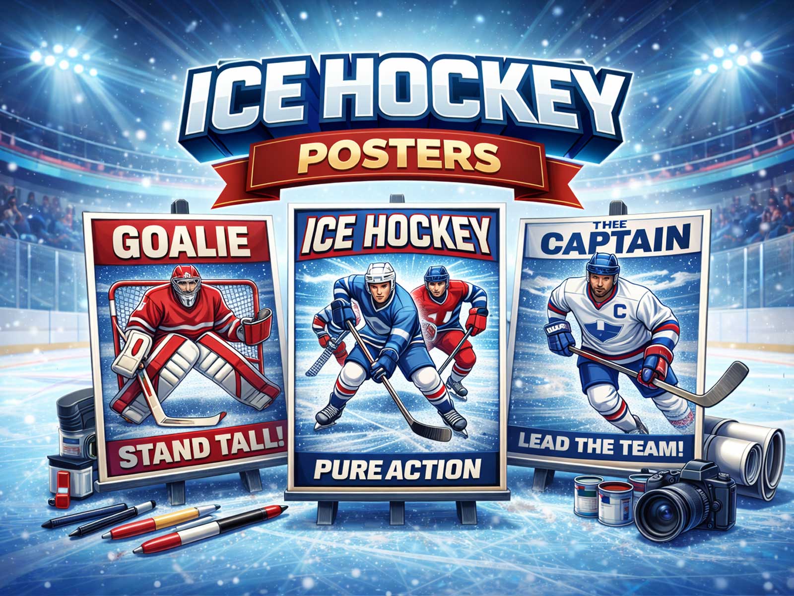
What starts as playful party iconography—pucks, pennants, cartoon skates and confetti—can become a convincing piece of wall art when the design is reoriented around hockey's strongest visual signs. The trick is not to erase the festive origin but to extract the game's pure, readable elements: the freeze-frame of impact, the geometry of the rink, the contrast of jerseys, and the tactile language of ice. A poster born for a hockey themed birthday party can therefore be remade into a permanent image that animates a room rather than simply decorating it.
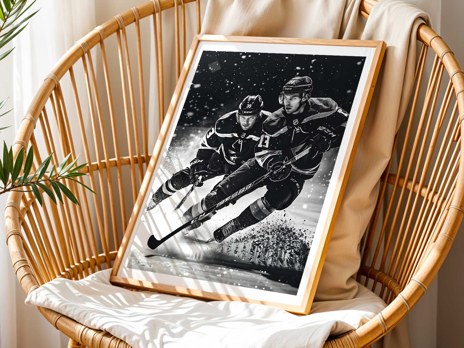
Begin by privileging motion and tension. Party imagery often flattens movement into icons; a wall piece should translate that implied motion into a single cinematic instant—skate blade carving an arc, ice spray suspended like glass dust, stick flex in mid-shot. These are the visual primitives that read quickly across a wall: even from across a living room the viewer perceives speed, commitment and force. Up close, the same poster rewards inspection with grain in the ice, subtle gloss on the helmet, and the wear marks on tape and sticks.
Color and contrast are the poster’s architecture. Where celebratory art scatters multiple bright elements, effective wall art chooses two or three dominant tones—team color, rink white, and a dark counterpoint—to create signage that anchors a space. A bold stripe of team color along the edge, a crest treated as a graphic block, or a shadowed silhouette of a player in profile all establish identity without crowding the composition. This restrained palette lets the poster read as a designed object: it can sit in a minimalist office, a wood-paneled den, or a kid’s bedroom while still carrying unmistakable hockey energy.
Rink geometry offers compositional clarity. The red line, face-off circle, and boards are not only functional elements of the sport; they are hard graphic shapes that orient the eye. A successful conversion from party art places these shapes deliberately—using a circle as a focal halo behind a player, or a rail of advertising boards as a horizontal tension line. These elements provide depth and context without resorting to busy, party-like clutter.
[IMAGE_INSERT_ARTICLE_01]
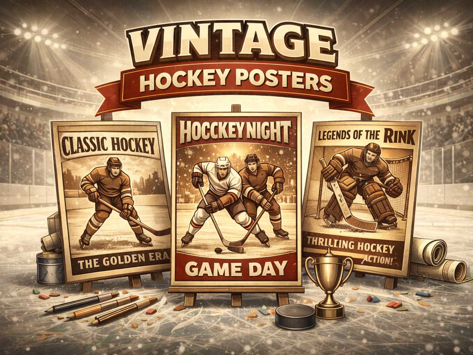
Texture and finish amplify mood. Matte paper retains the archival, vintage feel—suggestive of old arenas and layered cheering—while a subtle satin finish can mimic ice light and make colors hum. Consider how a poster's surface behaves in a hallway under warm bulbs versus in a game room with directional spotlights; good hockey art changes with the room, turning the poster into part of the atmosphere rather than a pasted-on badge.
The balance between modern and retro matters to identity. Retro treatments—muted inks, halftone grain, and simplified crests—evoke nostalgia and fit collector walls and studies. A modern approach—high contrast photography, crisp type, and negative space—speaks to contemporary interiors and offices. Both choices keep the game's essential signs in view: stance, stick, helmet, and the blunt geometry of the rink.
Finally, think about how the image performs in real rooms. From a distance, strong silhouettes and high-contrast color blocking ensure legibility; up close, detailed textures and composition choices reward longer looks. The most enduring pieces translate a birthday's fleeting excitement into a visual story: kinetic but composed, celebratory yet serious. Such a poster stops being a one-night backdrop and becomes a measured, room-defining object that channels hockey’s speed, identity, and cold intensity into a living space.
Author: