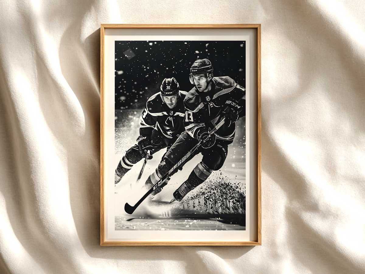
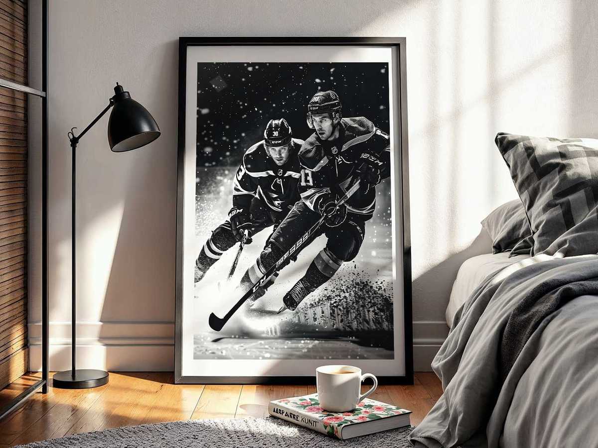
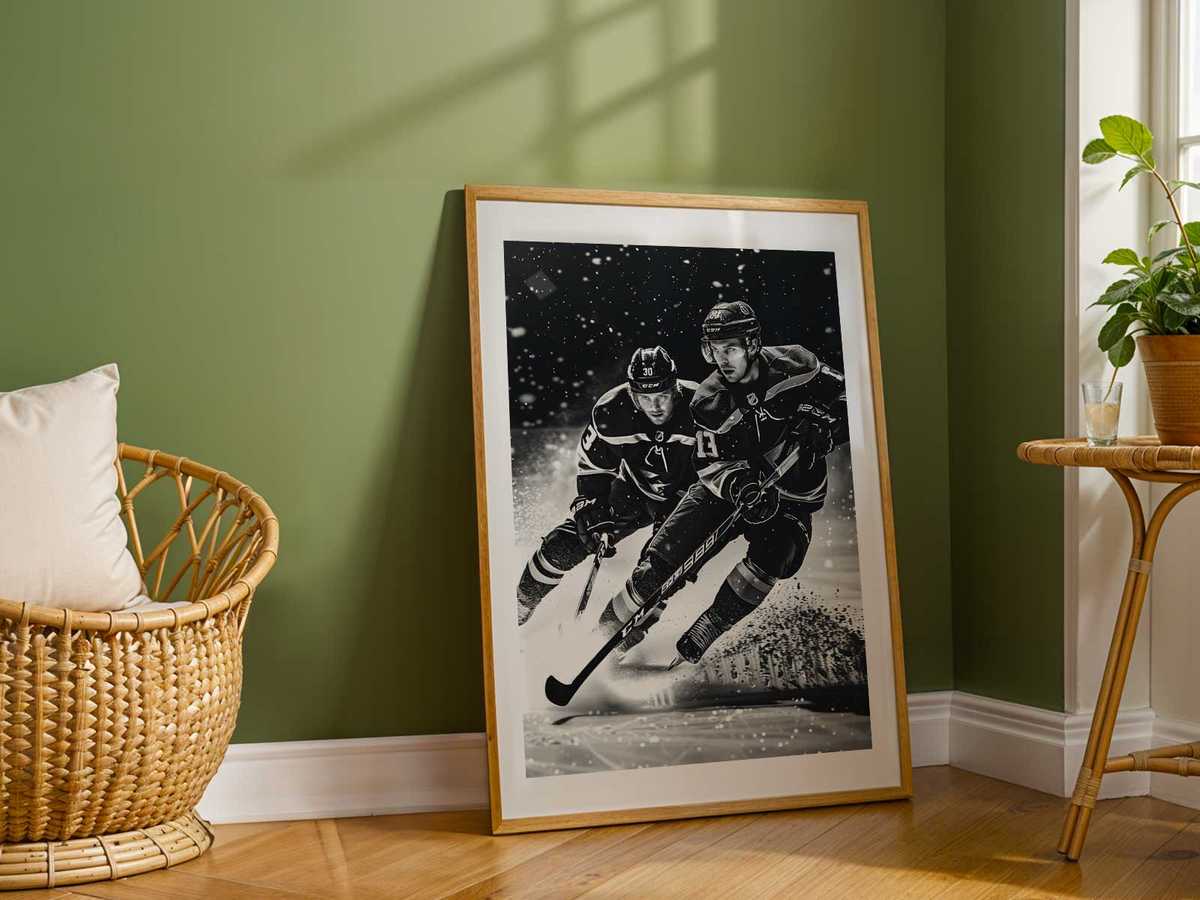
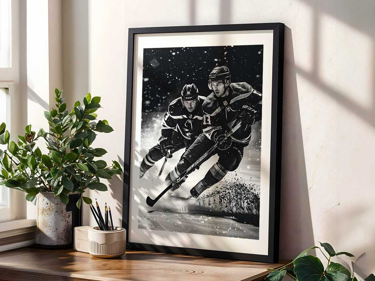
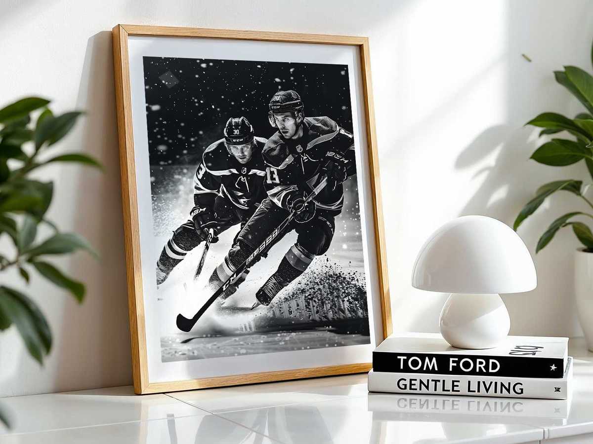
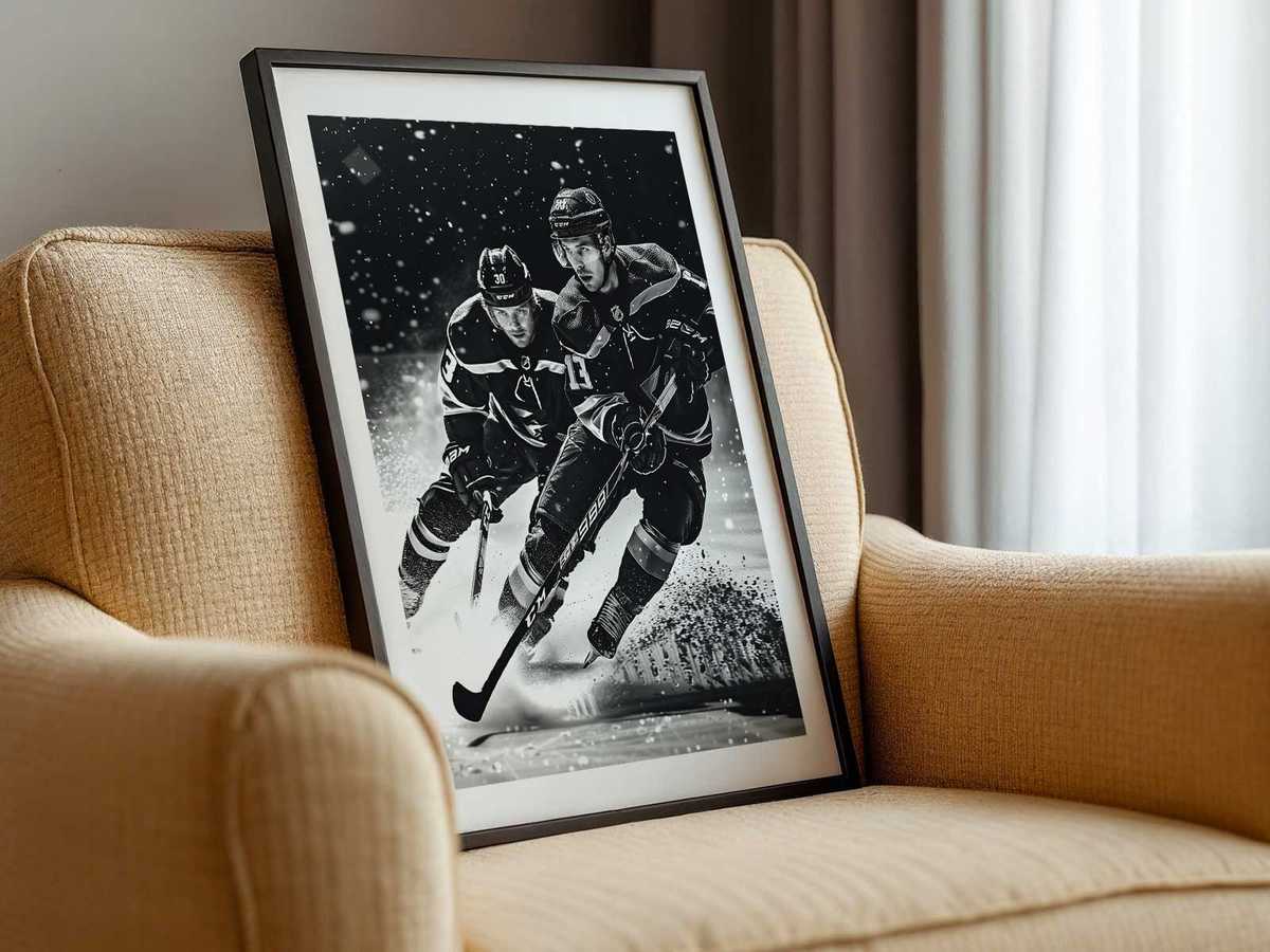
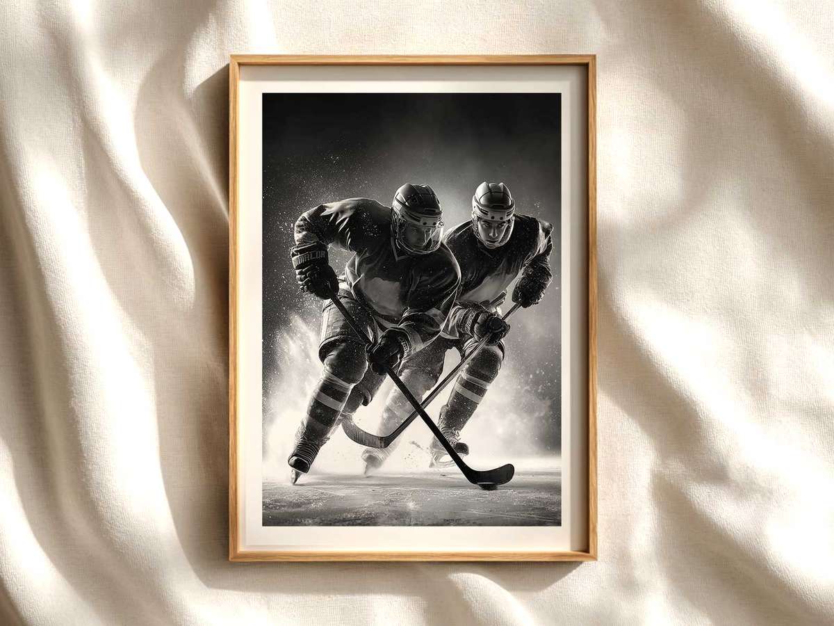
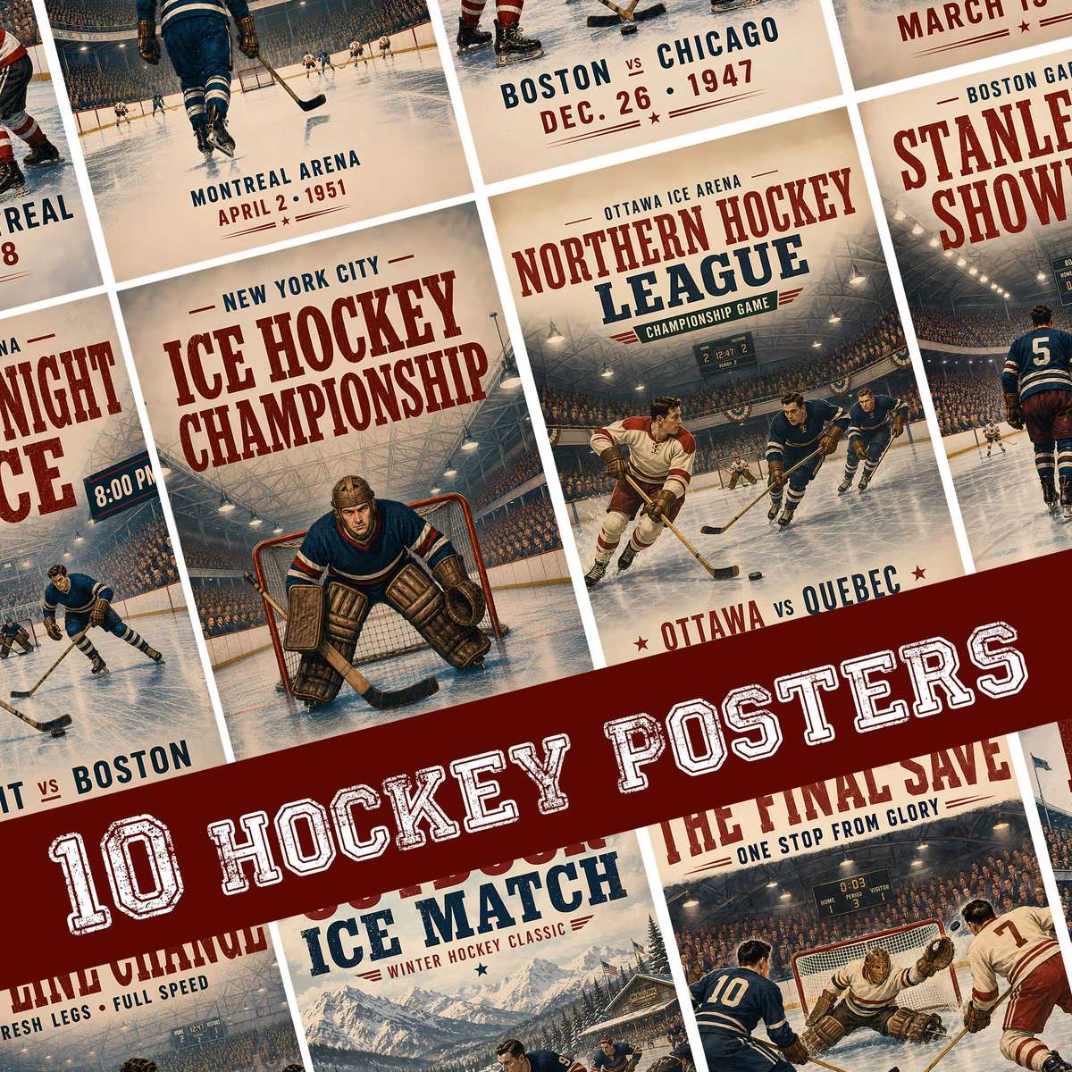
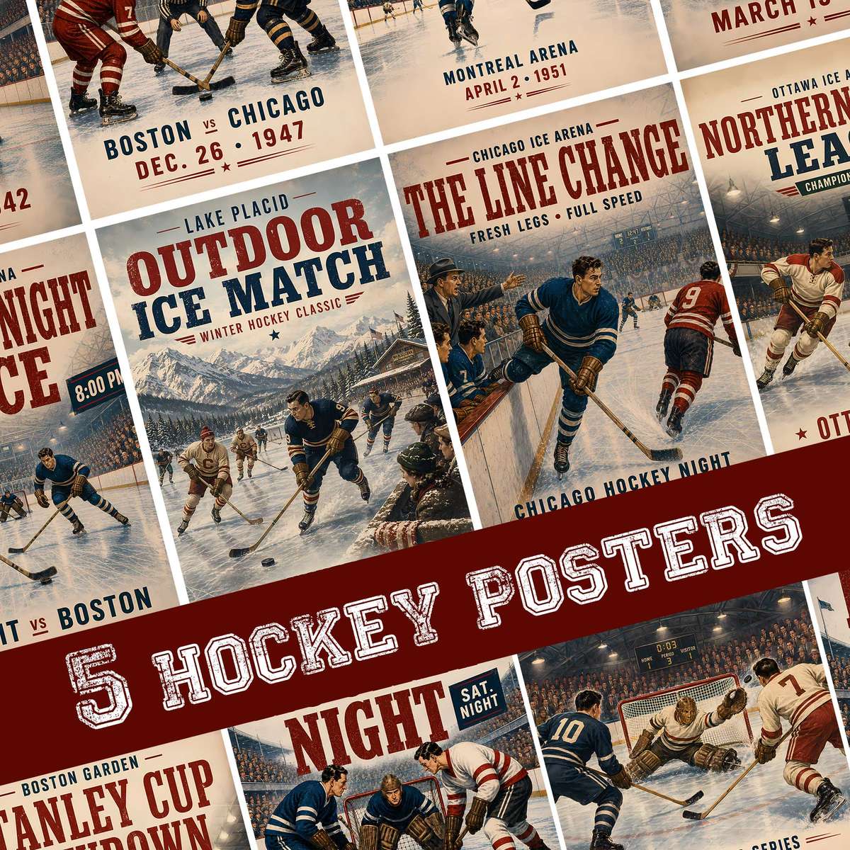
Hockey stick wall decor works because the game’s visual language is shorthand for motion and mood. A single frame — a stick in mid-swing, a blade kissing ice spray, a silhouetted player leaning into the check — reads instantly as movement even when frozen on paper. That stored energy gives a room a pulse: it translates rink tempo into an interior rhythm that feels deliberate rather than decorative.
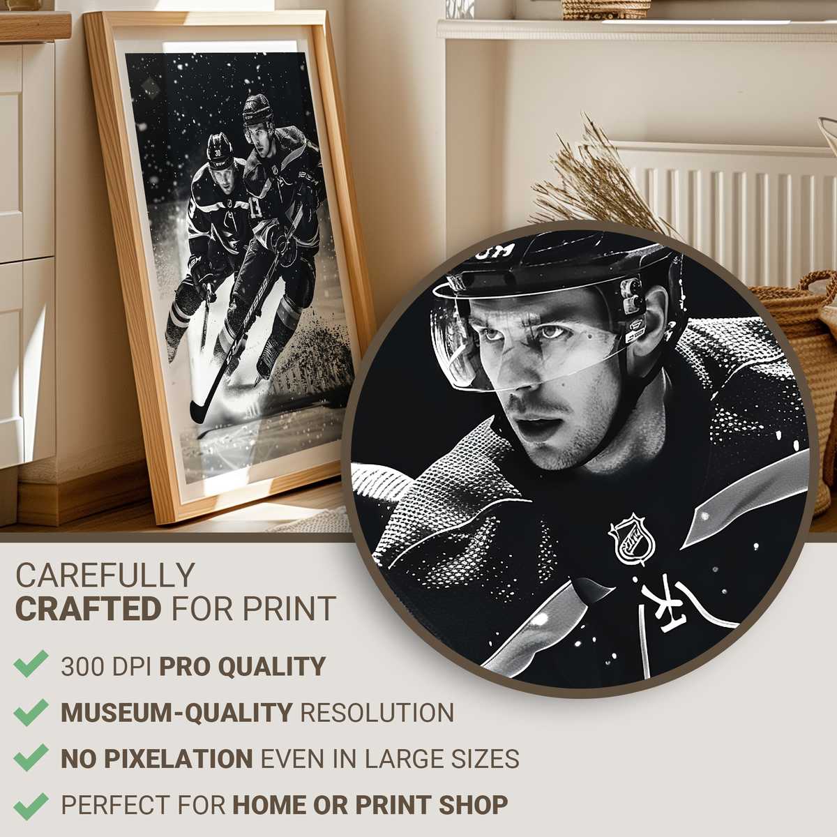
The first thing that hits the eye is contrast: bright arena light against the cool blue-gray of ice, sharp team colours against neutral walls, glossy helmets and matte jerseys creating layers of texture. These contrasts make the image legible from across a living room and richly detailed up close. From a distance the composition reads as a bold graphic; near the poster you see body tension in shoulders, the twist of hips, the flex in a wooden or composite shaft — visual cues that keep the work interesting at every viewing distance.
Ice texture and light are fundamental to the mood. The subtle grain of skate-cut ice, the glitter of frozen spray, and the halo of overhead lamps create a luminous coldness that’s aesthetic rather than clinical. When hung above a desk or in a hallway, that cool light introduces an arena-like atmosphere: it sharpens focus, suggests pace, and offsets warm interiors without clashing. In darker rooms the poster becomes a focal point that seems to emit its own brisk clarity.
[IMAGE_INSERT_ARTICLE_01]
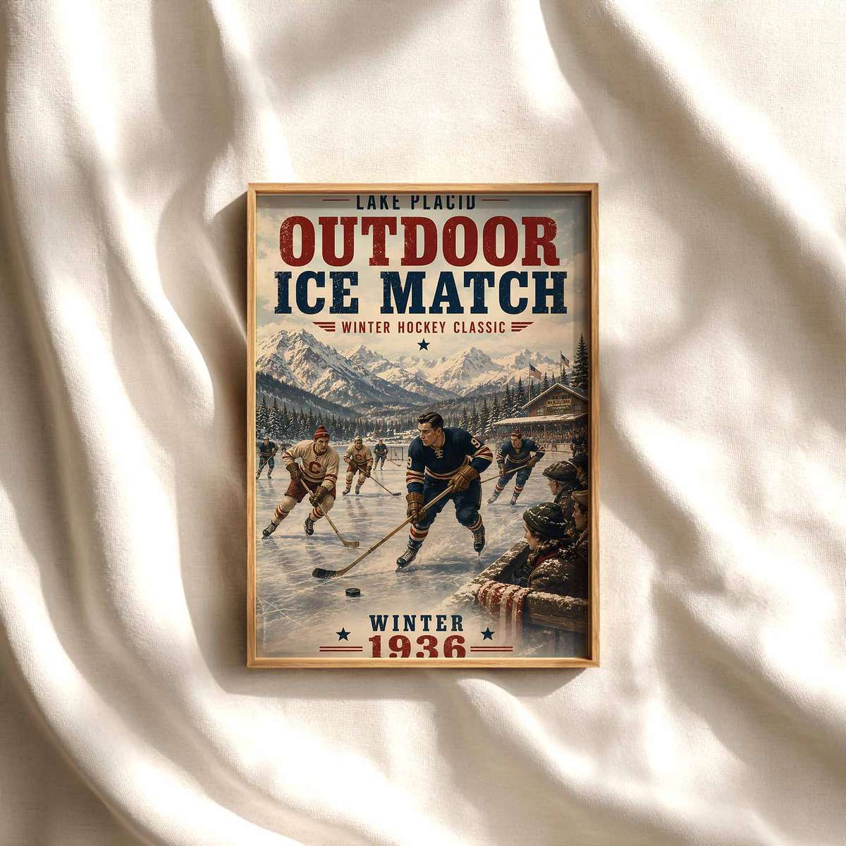
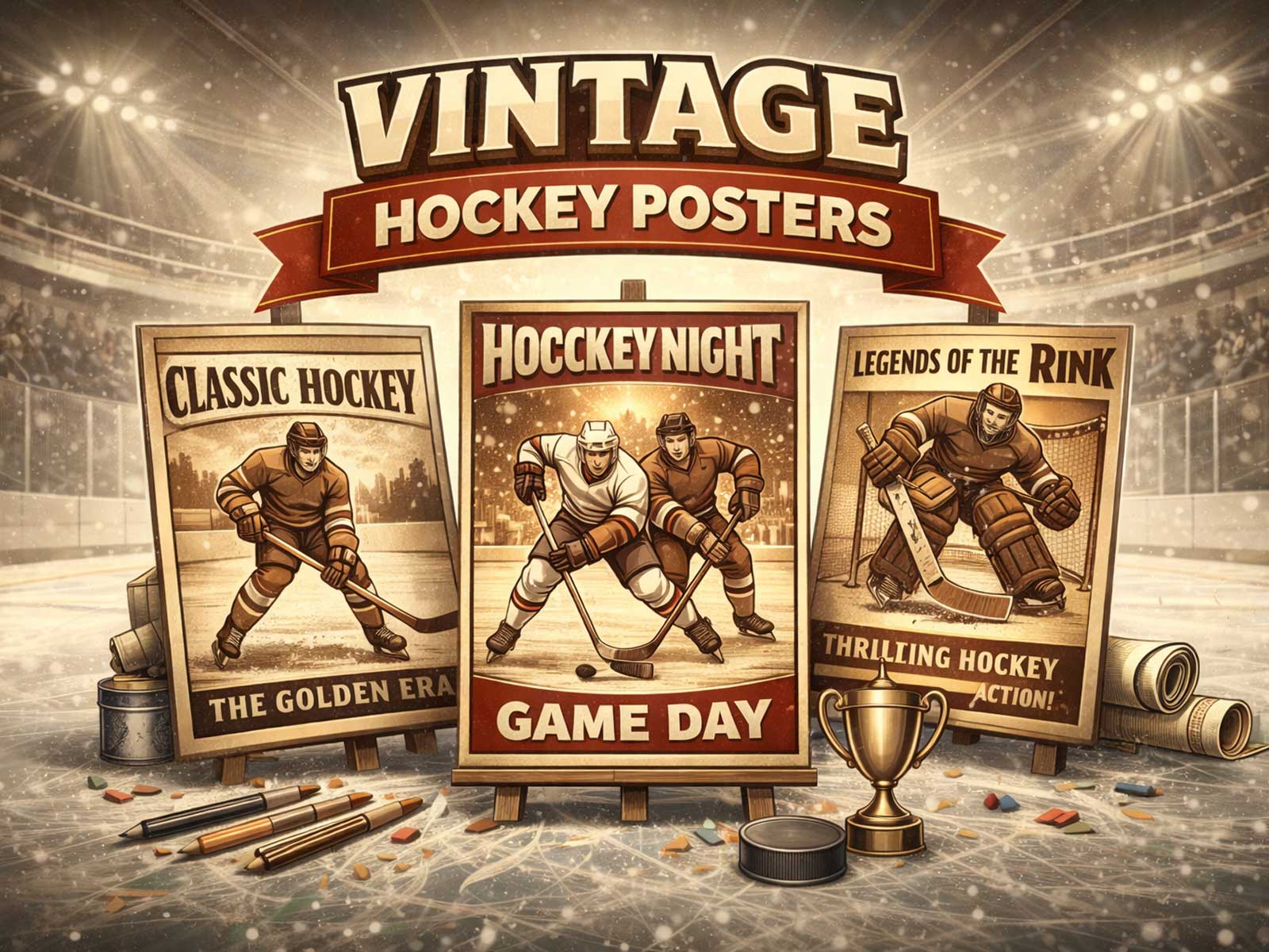
Body language is another reason hockey posters carry weight in a room. The game’s poses are taut and economical — a forward’s stride, a defender’s brace, a goalie’s crouch — so the image communicates tension and intent without busy composition. That economy suits modern interiors where a single, powerful image can set the tone. Conversely, retro-style hockey art with grainy film texture or muted palettes evokes memory and nostalgia, softening sleek contemporary décor with a lived-in sport history.
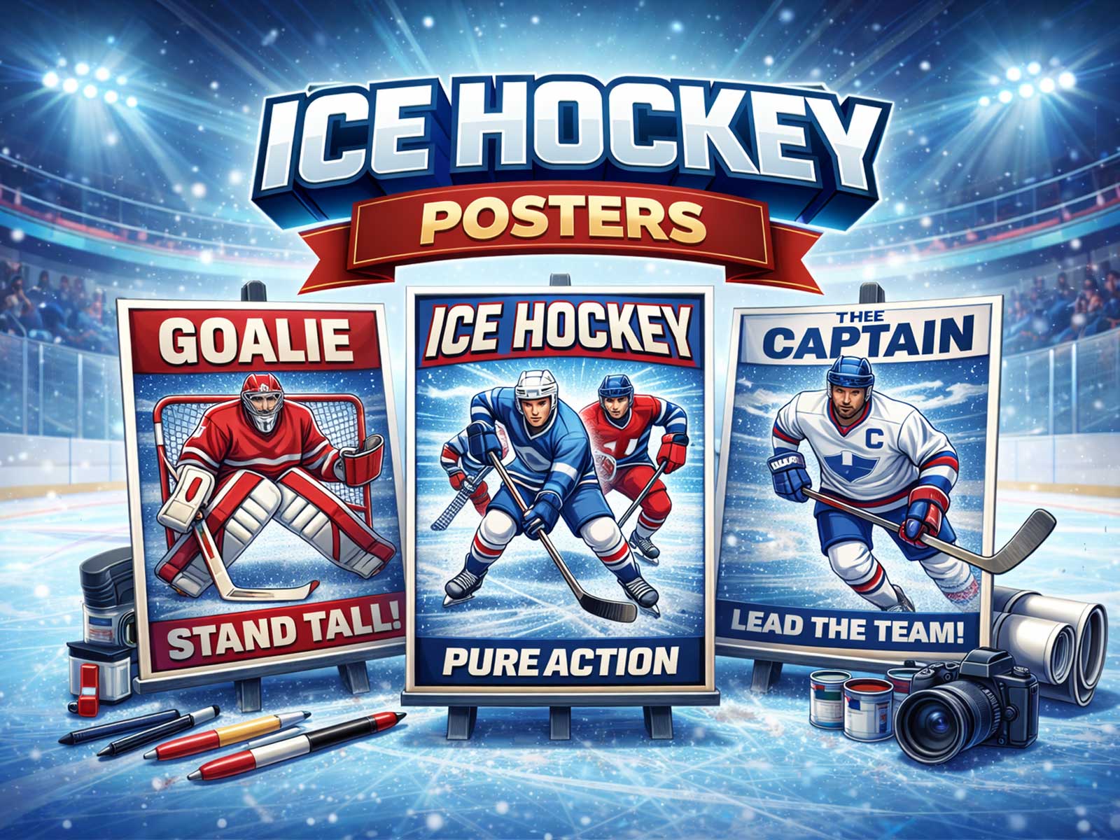
Colour and identity anchor the piece. Team crests, jersey stripes, and helmet accents offer instantly recognizable markers that signal fandom at a glance while functioning as strong color keys for room design. A poster dominated by a deep navy and bright red can become the connective accent between sofas, rugs, and shelving. Even when team names are not the focus, the palette of hockey — icy whites, arena steel, seasonal reds and blues — brings a disciplined, sporty palette that pairs well with leather, wood, and industrial metals.
Compositionally, hockey images often exploit diagonal geometry: the tape-wrapped stick, the slant of a skating lane, the angle of a shot. These diagonals inject rhythm into otherwise static wall planes, guiding the eye and helping small rooms feel more dynamic. A vertical pair of prints showing approach and impact can create a visual sequence along a stairwell; a single widescreen piece above a media cabinet reads like a frozen broadcast moment, giving a room cinematic drama.
Beyond visuals, hockey posters convey culture — the rituals of teams, the communal energy of arenas, the tactile icons of the sport. This cultural presence is immediate yet versatile: it can assert quiet, study-like intensity in a home office or amplify competitive energy in a game room. The artwork’s readability ensures it performs well under different light conditions and at varying viewing distances, while layered detail rewards repeat inspection.
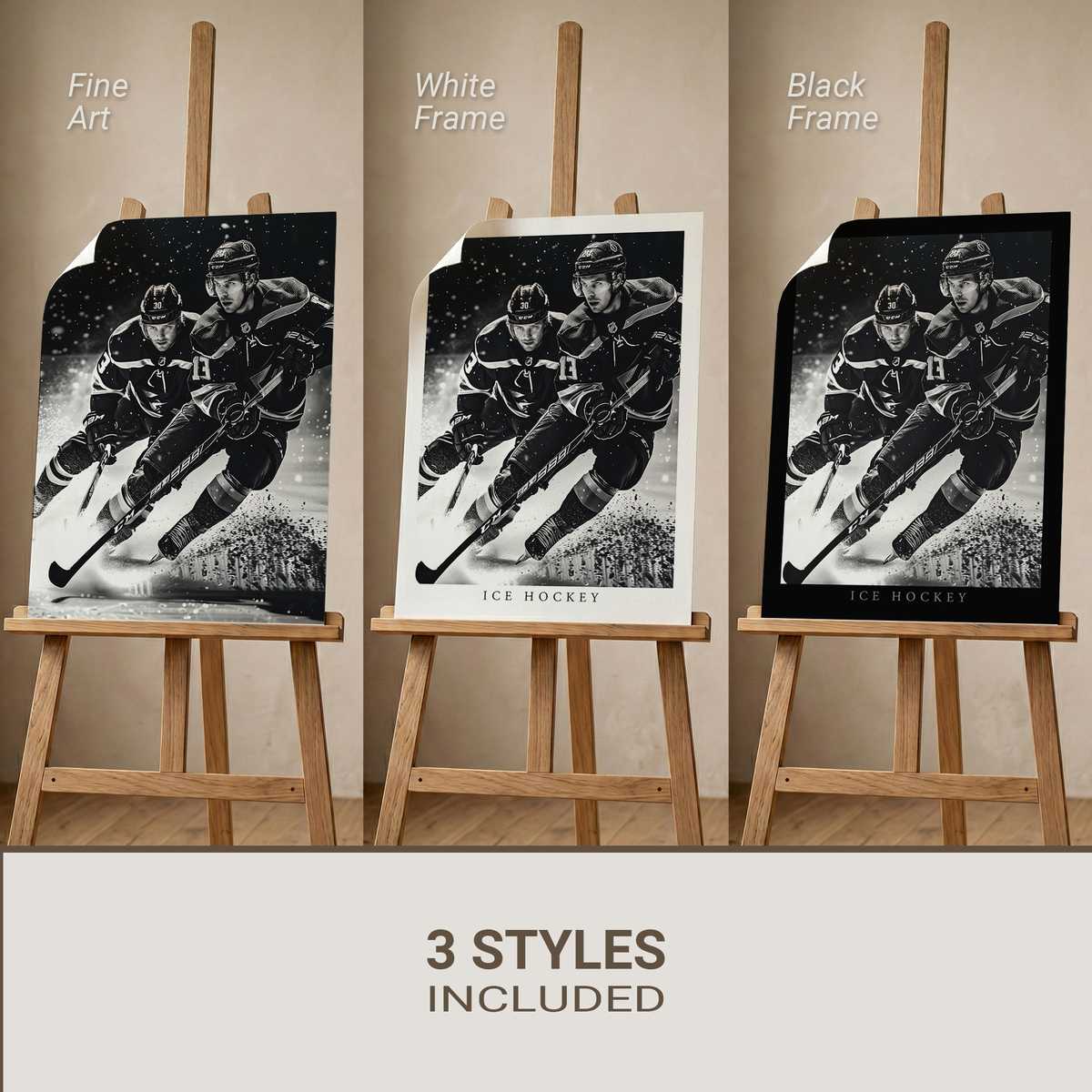
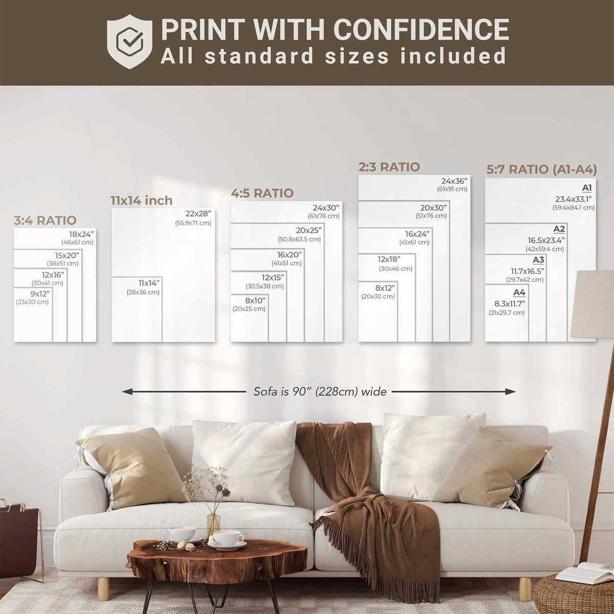
Choosing hockey stick wall decor is therefore a design decision as much as a fan choice. Consider scale and finish: a matte print emphasizes texture and vintage feel, while a gloss or metal finish amplifies light and modernity. Frame selection can steer the mood toward archival collector or contemporary gallery. Keep surrounding decor minimal if the image is high-contrast, or echo a key jersey colour in cushions or a lamp to weave the piece into the room palette.
Ultimately, hockey imagery brings rhythm to interiors by converting the sport’s cold luminosity, bodily tension, and emblematic identity into a single visual note that a room can play on repeat. It’s an athletic motif that reads as movement, memory, and style — a poster that doesn’t just hang on the wall but sets the speed and tone of the space around it.