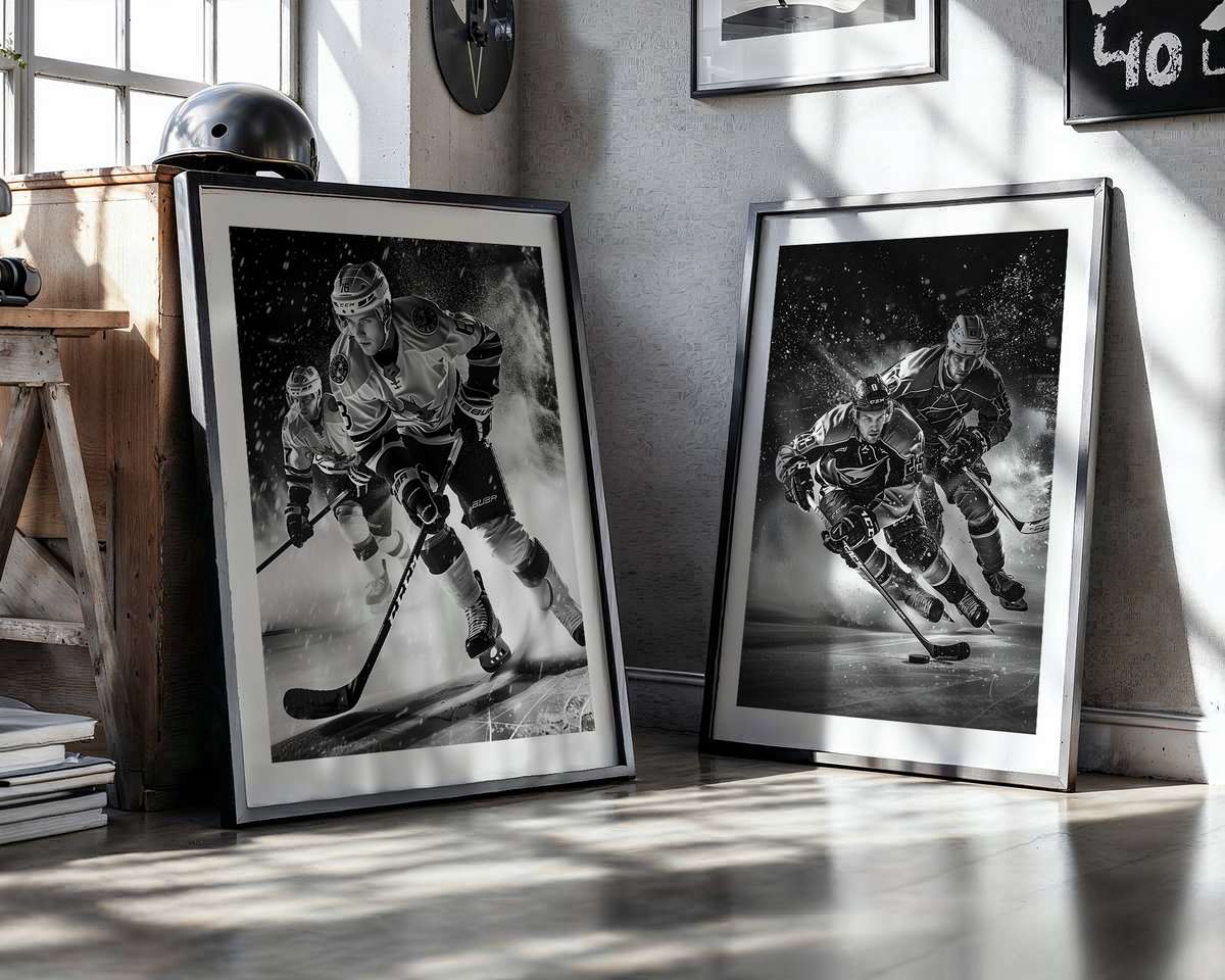
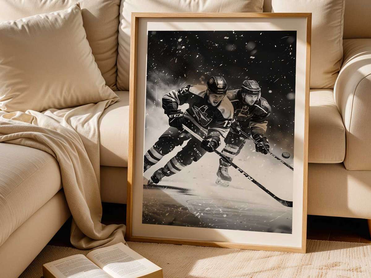
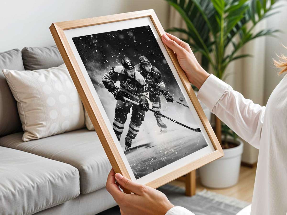
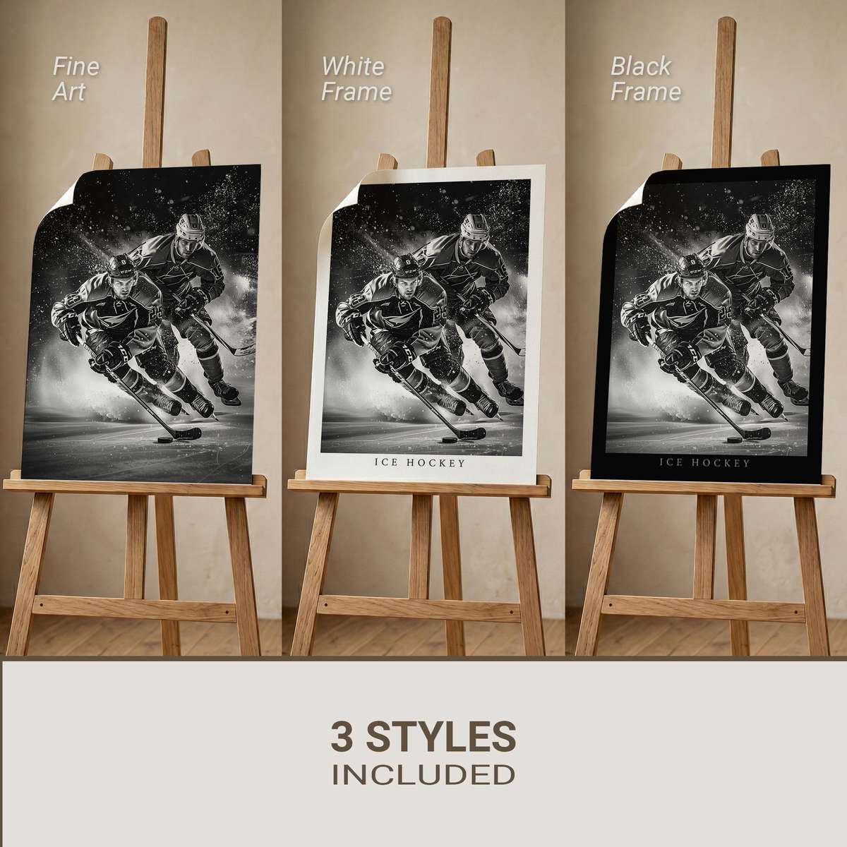
A compelling Minnesota Wild poster needs a clear visual idea rather than a scattershot collage. Start from the team’s visual DNA—Forest Green and Minnesota Wheat with Iron Range Red and Gold accents—and let a single focal motif carry the composition: a puck‑on‑ice freeze frame, a helmet silhouette, or a bold team crest derived from the Wild’s wilderness logo. Those choices immediately anchor the poster in the franchise identity while giving the eye one confident place to land.
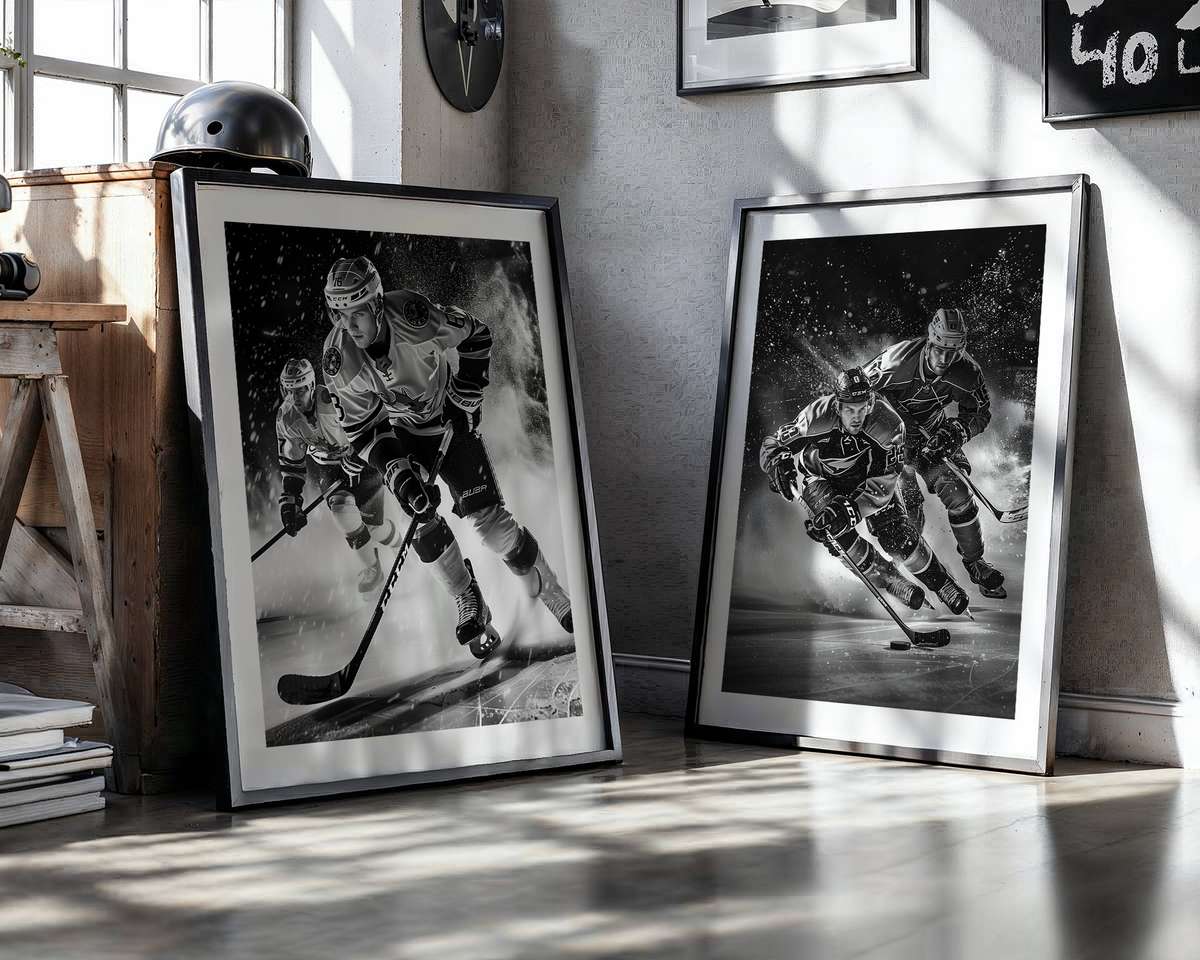
Hockey’s pictorial power comes from repeatable, tactile ingredients: the granular spray of shaved ice, the clean geometry of rink boards and faceoff circles, the stark silhouettes of stick and helmet, and jerseys rendered in saturated team color. Designers rely on texture layers to suggest wear and ice granularity, and on high‑contrast lighting to keep the image legible from across a room. For a Wild poster, using the official palette—Forest Green and Minnesota Wheat with small Iron Range Red or Gold highlights—ensures the piece reads as unmistakably Wild at first glance.
Choose a single, decisive point of focus to avoid a decorative, unfocused result. A puck-on-ice close-up makes speed and impact tactile: ice crystals suspended in the spray, a shallow depth of field that isolates the disk, and a band of team color reflected in the blade or stick tape. A helmet or visor silhouette tightens the human presence into an abstract graphic element—helmet contours, visor reflections, and stick angles become formal shapes that read well at distance yet reward closer inspection. Alternatively, the Wild primary logo, with its landscape/forest/night-sky motif, can serve as a bold emblematic anchor, recognizable even when treated with texture or vintage wear.
[IMAGE_INSERT_ARTICLE_01]
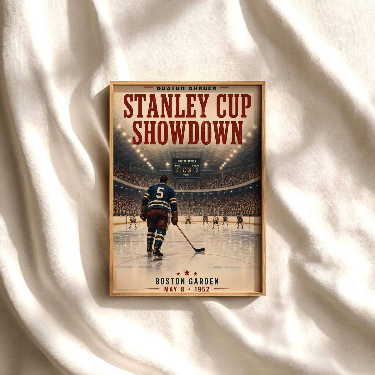
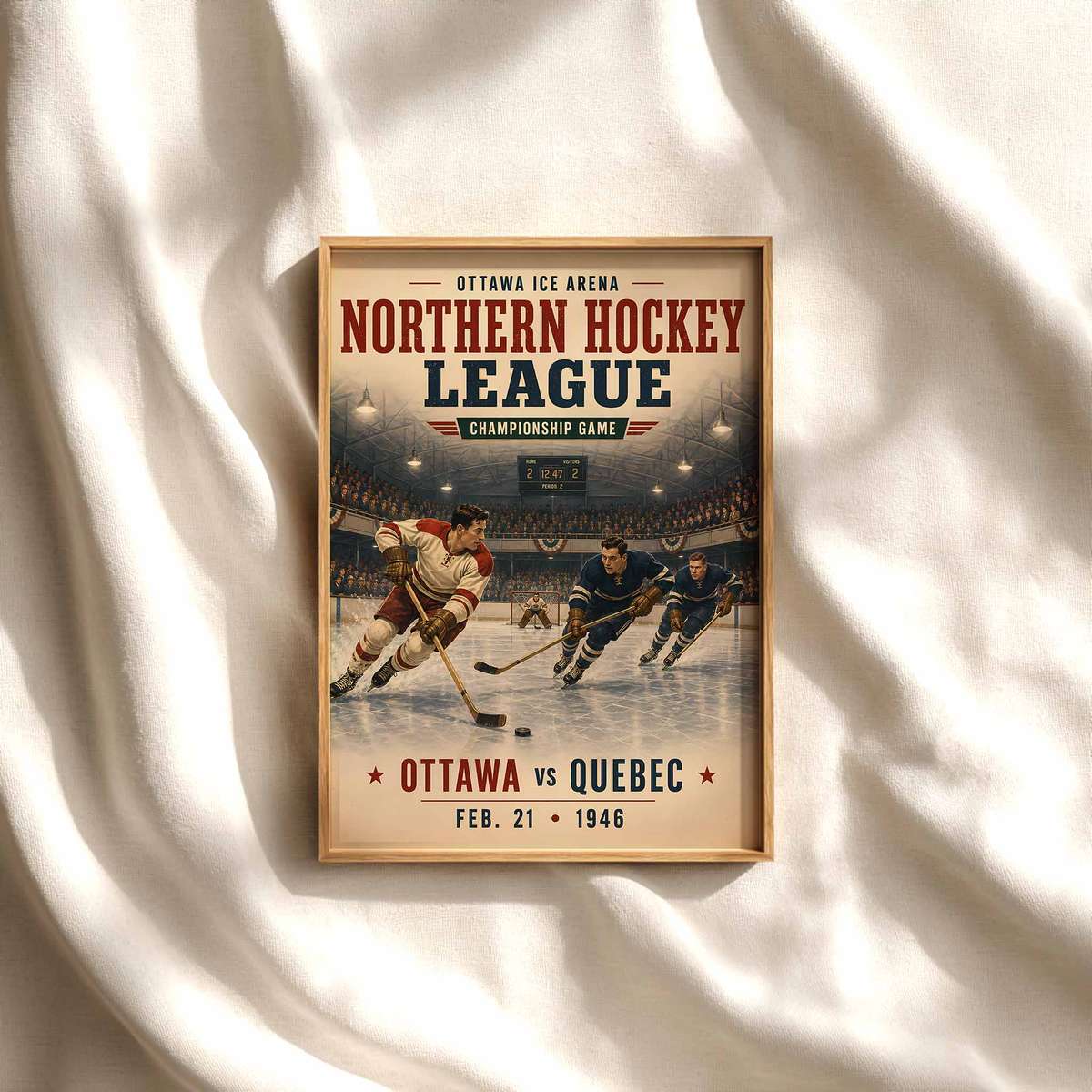
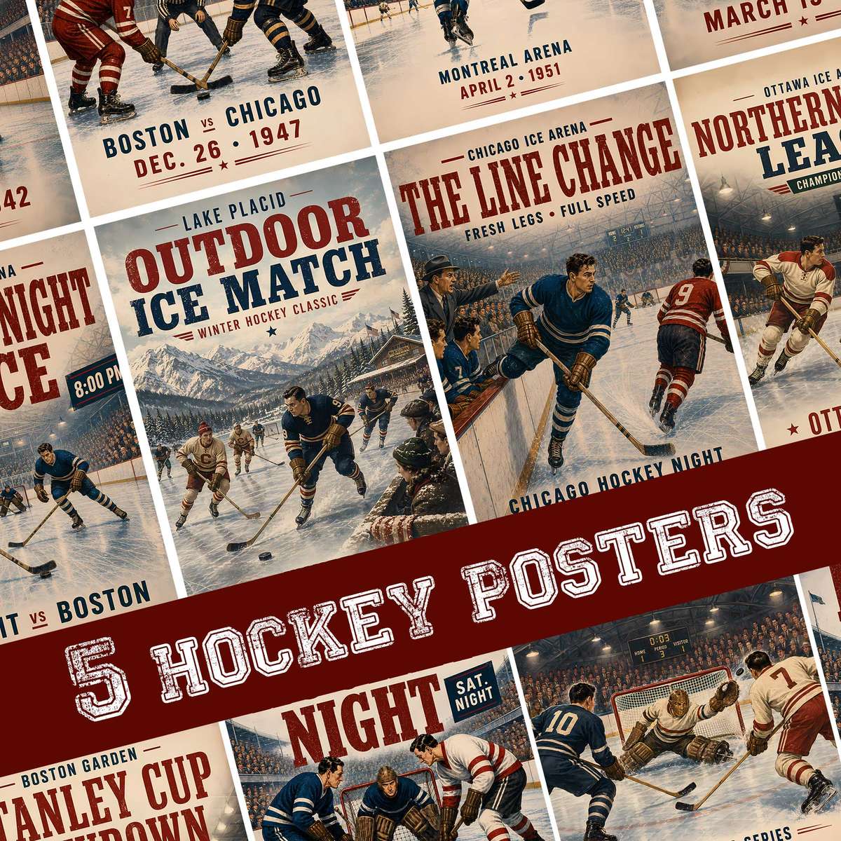
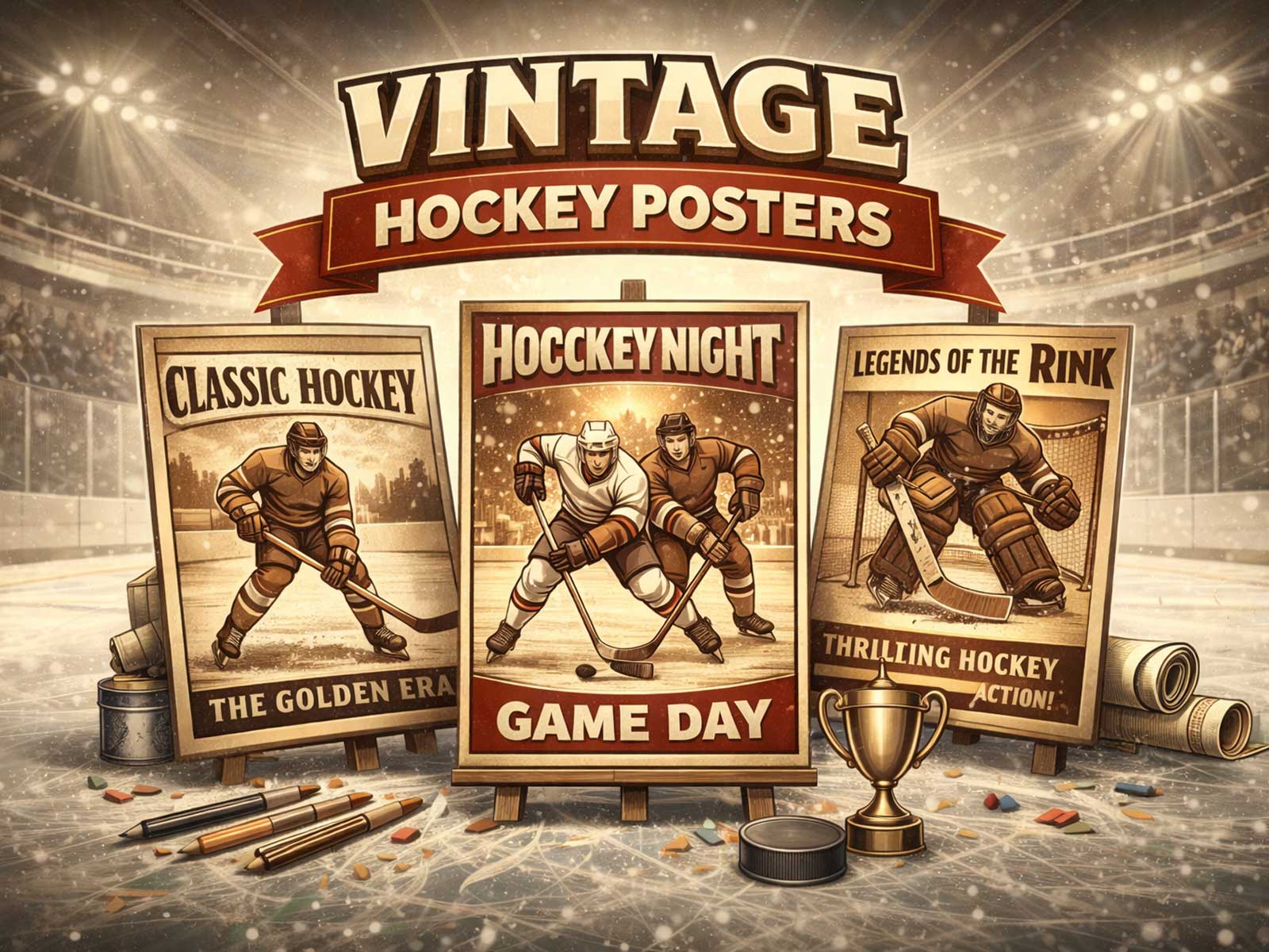
Composition choices determine how the poster lives in a room. High-contrast palettes and strong color blocking keep the image readable on a hallway wall or above a desk; texture and mid-century, vintage cues give a print an archival, study‑mood warmth. Motion cues—subtle motion blur or a freeze-frame of ice spray—deliver kinetic energy without visual clutter. When the focal motif is scaled and centered or purposefully offset to one side, it creates a rhythm with the room’s furniture and lighting, whether the goal is an arena-like, intense statement in a fan cave or a restrained, nostalgic accent in a home office.
Beyond color, the desirability of a Minnesota Wild poster comes from visual specificity: body tension implied by a reaching shoulder, the jagged geometry of a skate cut, the glossy silhouette of a stick, and the way ice texture catches studio or arena light. These are the cues that make a sports image feel alive on the wall. Using the team’s official palette and the Wild’s wilderness emblem gives the work team-facing credibility, while careful texturing and a single focal motif keep the piece from feeling merely decorative.
Whether your room aims for kinetic intensity, archival nostalgia, or a refined collector’s study mood, a Wild poster that emphasizes one clear visual idea—ice texture made tactile, a helmet silhouette reduced to a graphic, or a puck frozen in impact—will hold together visually and emotionally. It will be readable from a distance, offer rewarding detail up close, and translate the cold, fast, high‑contrast language of hockey into a print that feels both distinctly Wild and designed to live with.