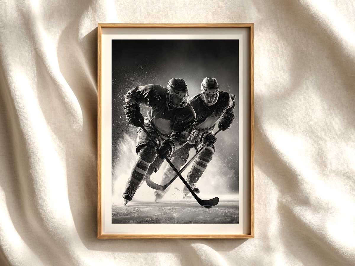
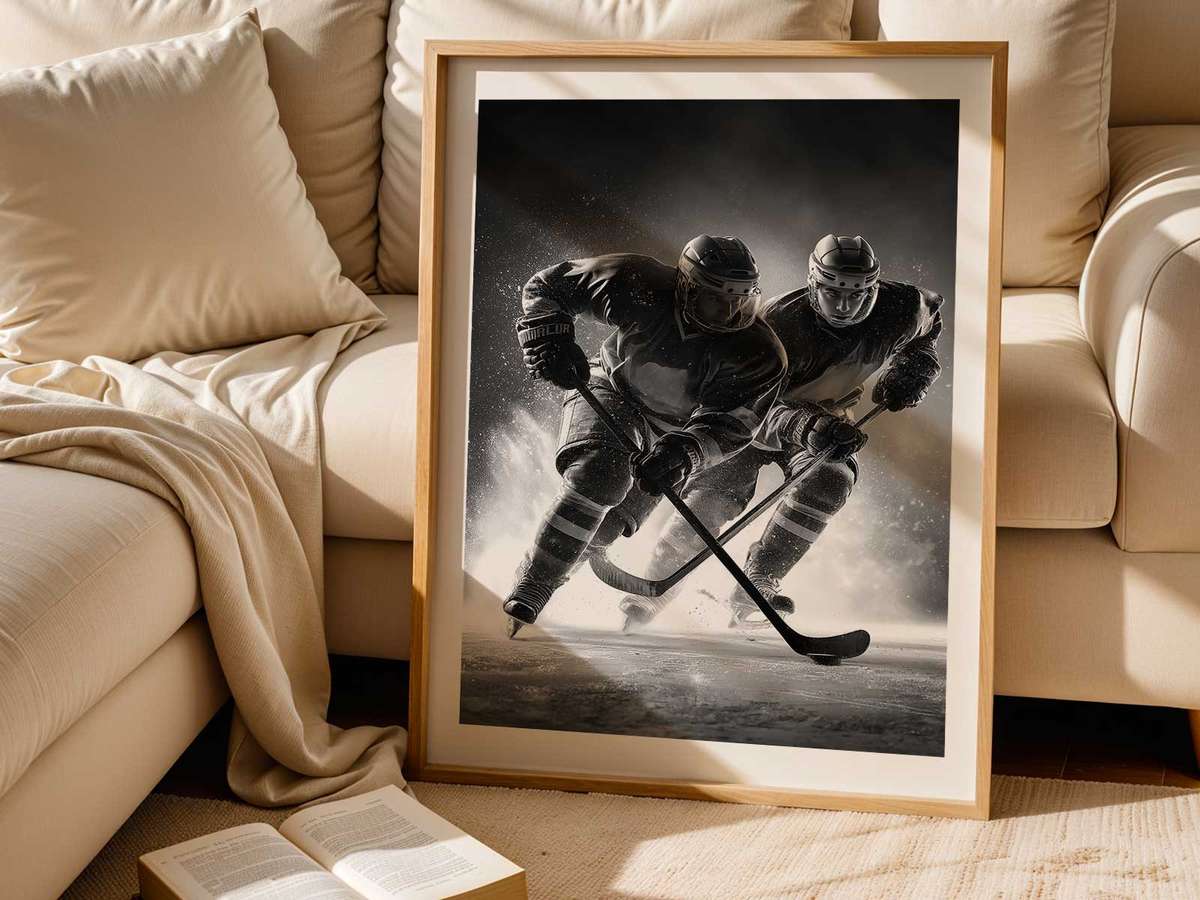
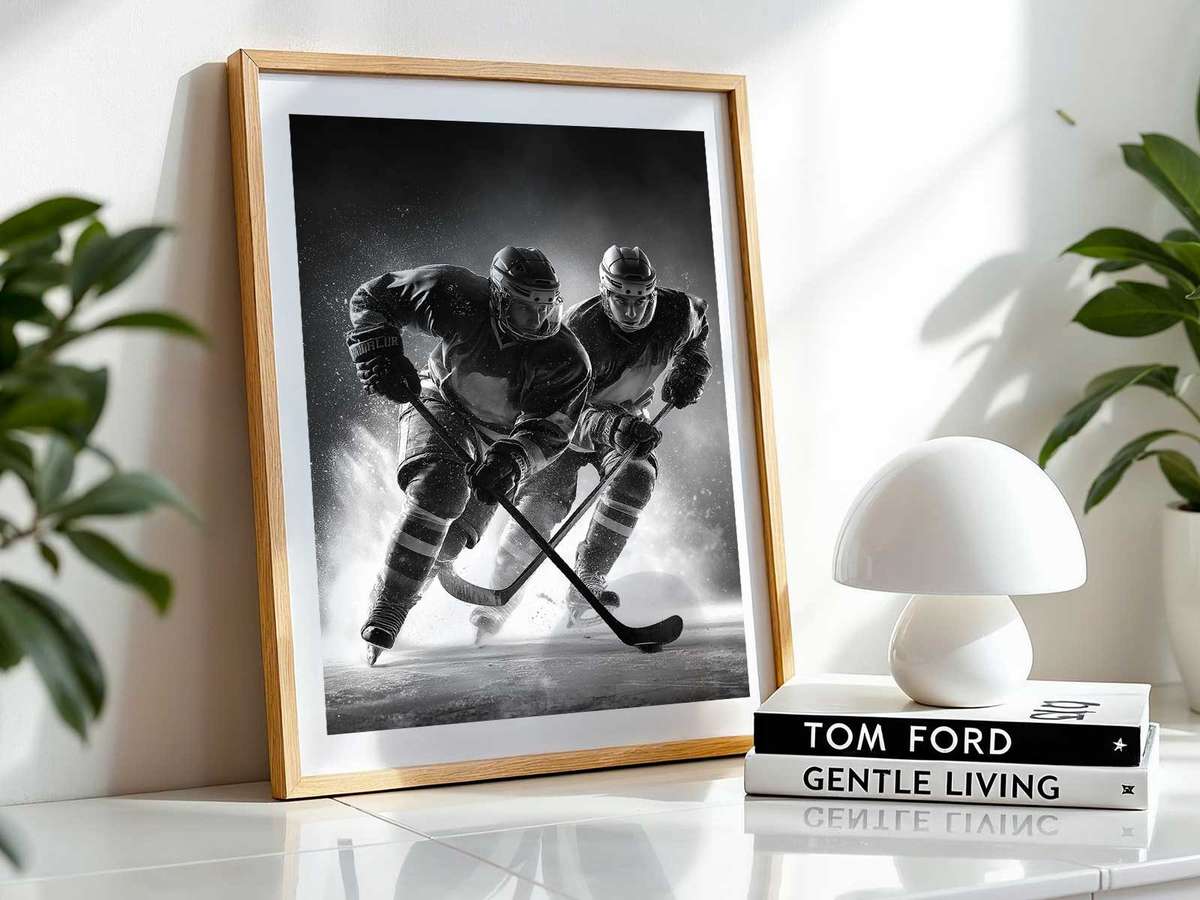
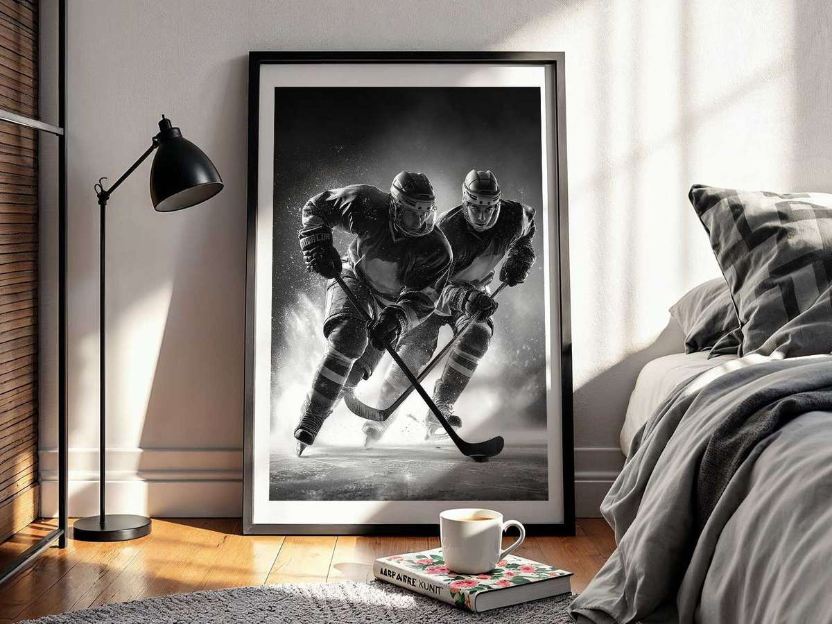
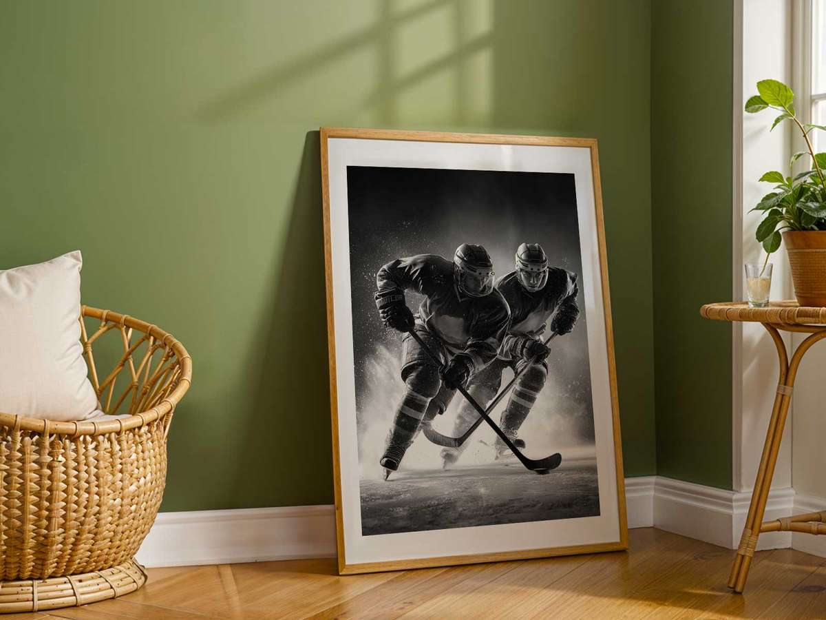
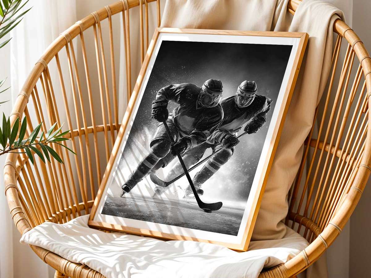
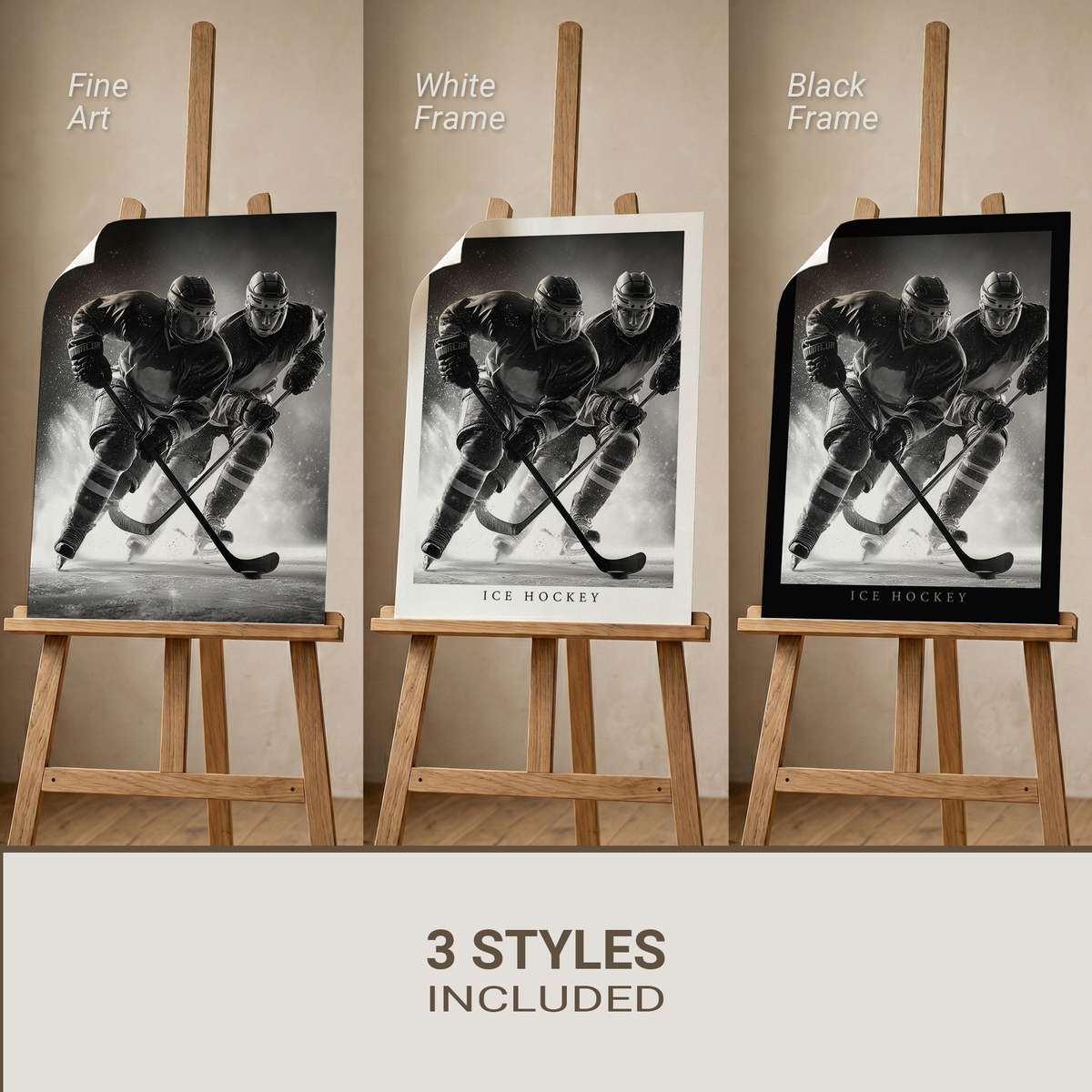
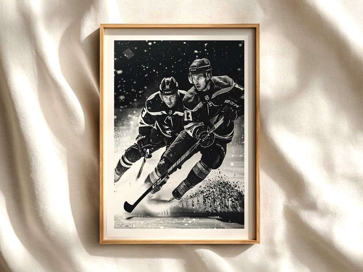
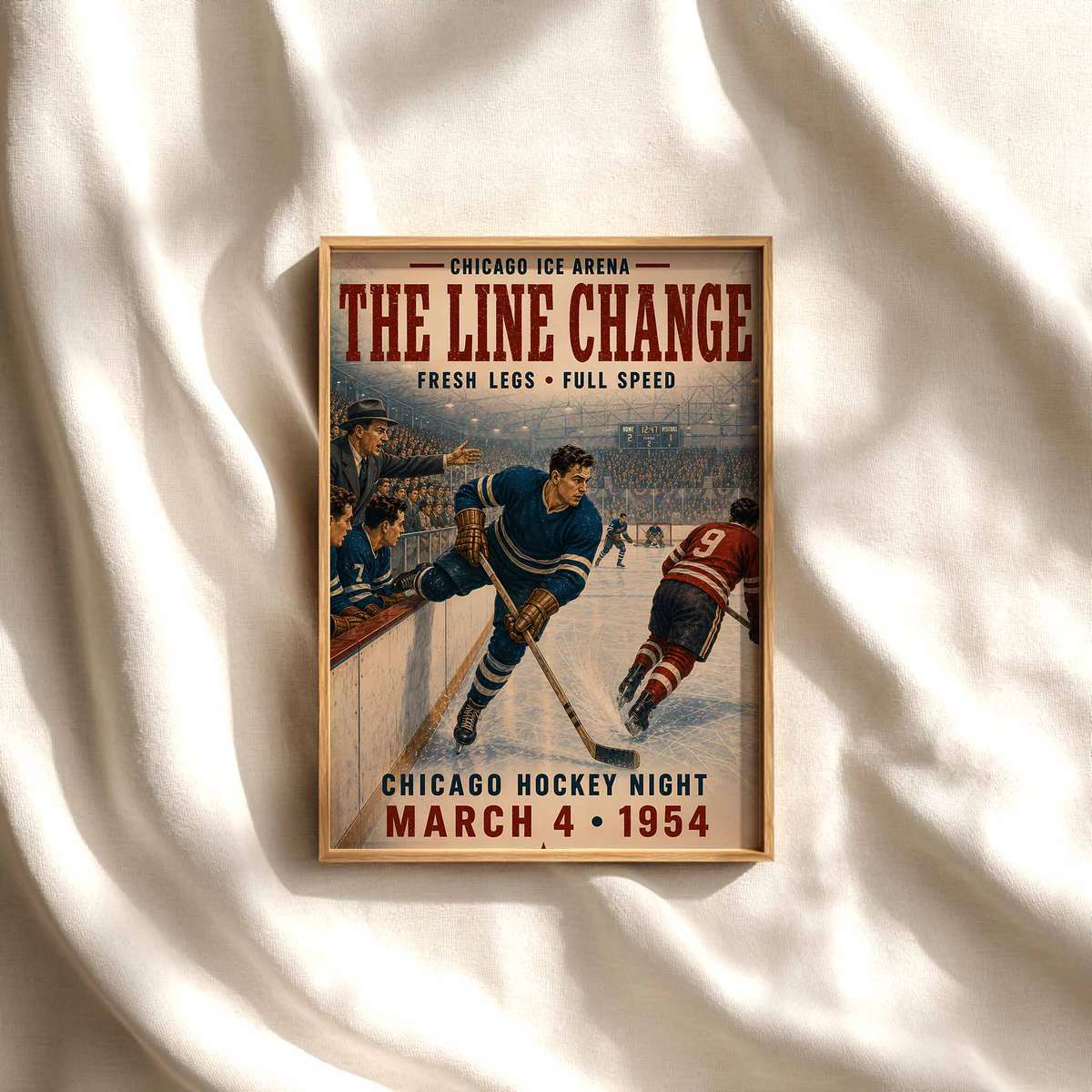
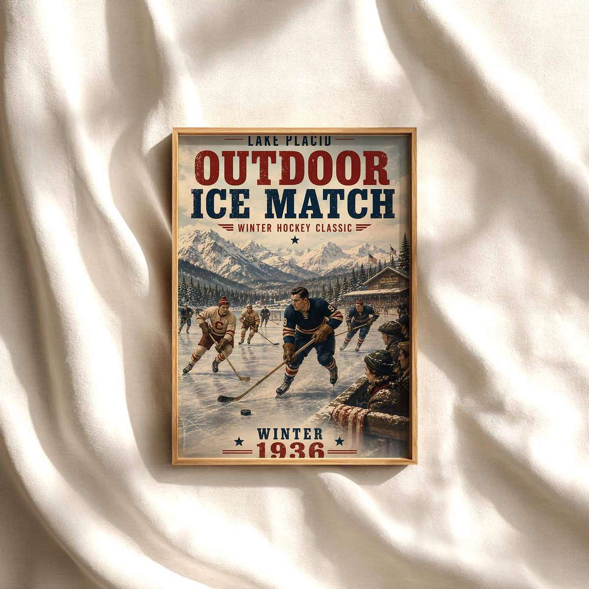
An oilers poster isn't just a team image; it's a concentrated piece of visual grammar that translates the sport's raw dynamics into a single, readable statement for a wall. What makes hockey instantly recognizable as poster art are a handful of repeatable visual cues: the hard, reflective plane of the ice, the geometric lines of the rink, the layered silhouette of helmet-stick-shoulder, and those sudden sprays and skates-etched arcs that record velocity. When an artist or photographer chooses a tight visual focus—say, the spray of ice curling from a stopping blade against a deep team-blue shadow—the result avoids generic decor and becomes a specific mood piece that anchors a room.
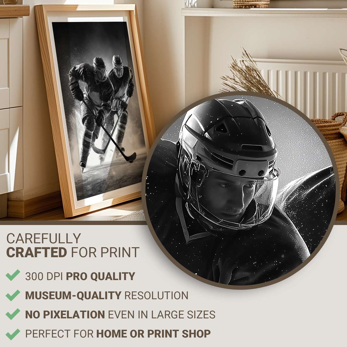
Speed is rarely photographic blur alone; in hockey posters it is the suggestion of motion held in mid-air: a puck suspended near a stick blade, the frozen arc of snow, a jersey tugged across a shoulder, or the taut extension of arms in a shot. These moments create body tension that reads clearly from across a living room or an office and rewards closer viewing with texture — salt-like ice crystals, stitched numbers, scuffed helmets, and the glossy relief of a crest. That micro-detail gives the image depth without demanding a narrative, so the poster functions both as an energetic centerpiece and as a quiet study in material and motion.
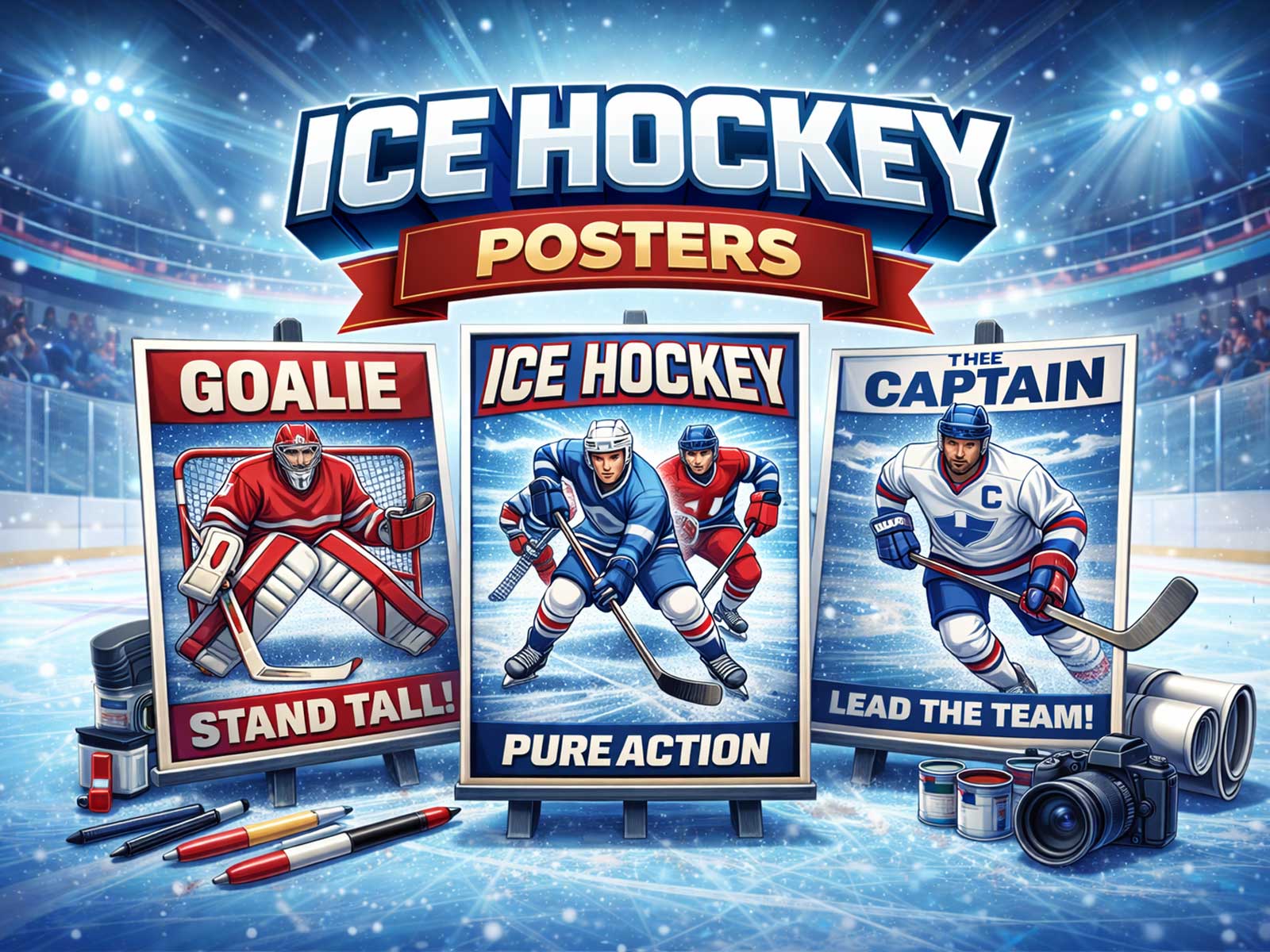
Contrast is the designer’s ally. Hockey imagery benefits from a natural high-contrast palette: the cold white of the ice, the saturated team colors of the kit, the black of a puck or stick, and the arena lights that cut sharp highlights and long shadows. For an oilers poster this contrast translates into immediate clarity—the crest and jersey colors read from a distance, while highlights on helmets and skates catch the eye up close. Framing a poster around a single strong palette—deep blue, orange accents, and the neutral field of ice—keeps the composition decisive and bold on a wall, rather than wandering into decorative clutter.
Fan identity lives in those graphic elements: a crest placed off-center, the worn curve of a vintage-inspired jersey, or the modern, high-tech sheen of contemporary equipment. Choosing a focal point prevents an image from feeling like generic sports wallpaper. For example, focus tightly on a forechecking silhouette cutting across the blue line, or on the lower half of a player where stick, gloves and skates form an abstract, almost emblematic shape. Both approaches say something different—nostalgia versus immediacy—but each creates a strong visual emblem the owner can live with.
[IMAGE_INSERT_ARTICLE_01]
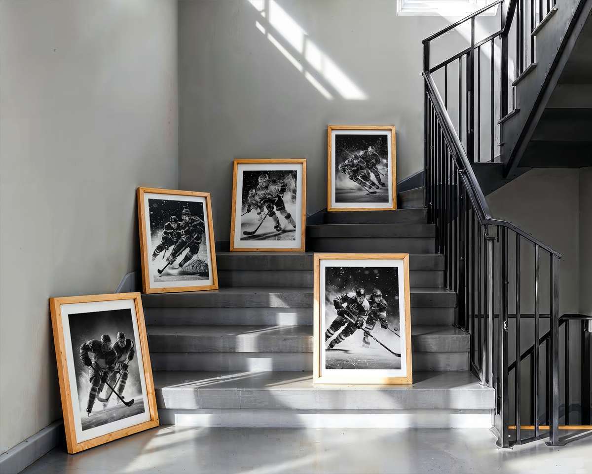
Room placement changes how that visual language reads. In a game room, a kinetic composition with visible ice spray and motion lines amplifies the space’s energy; in a study or office, a cropped, high-contrast portrait of helmet and crest leans toward a more disciplined, archival mood. Hallways benefit from long, horizontal crop decisions that echo rink geometry; bedrooms can use softer, retro-leaning textures and muted lighting to evoke memory rather than adrenaline. A thoughtfully chosen oilers poster will therefore be legible at arm’s length and from across the room—the strong shapes and color blocks work at scale while the finer textures invite repeated inspection.
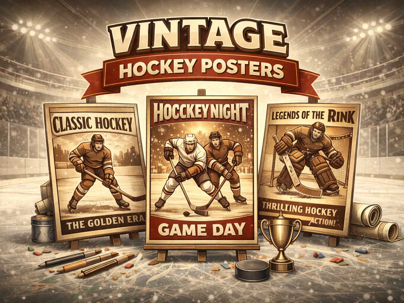
Modern versus retro is not just style but temperament. A retro treatment—muted tones, film grain, and a slightly desaturated ice—whispers nostalgia and pairs well with wood furniture and collector displays. A modern treatment—high dynamic range, crisp whites, and intense color—creates an arena-like presence suited to minimalist interiors or media rooms. Both can be true to hockey’s visual code if the composition commits to a clear focal point: the spray of a skate, the silhouette of a stick, or the shield-like placement of a crest.
Ultimately, what makes an oilers poster desirable is its ability to distill the sport’s sensory cues into one sustained image that shapes a room’s atmosphere. It brings kinetic energy without noise, identity without overstatement, and a tactile sense of cold intensity that contrasts beautifully with warmer interior tones. That visual specificity—selecting one crisp focal moment and amplifying its ice, equipment, color, and motion—turns a piece of hockey art into a lasting element of décor rather than a passing souvenir.