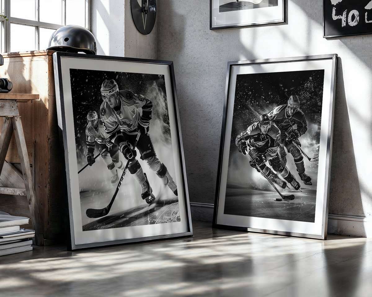
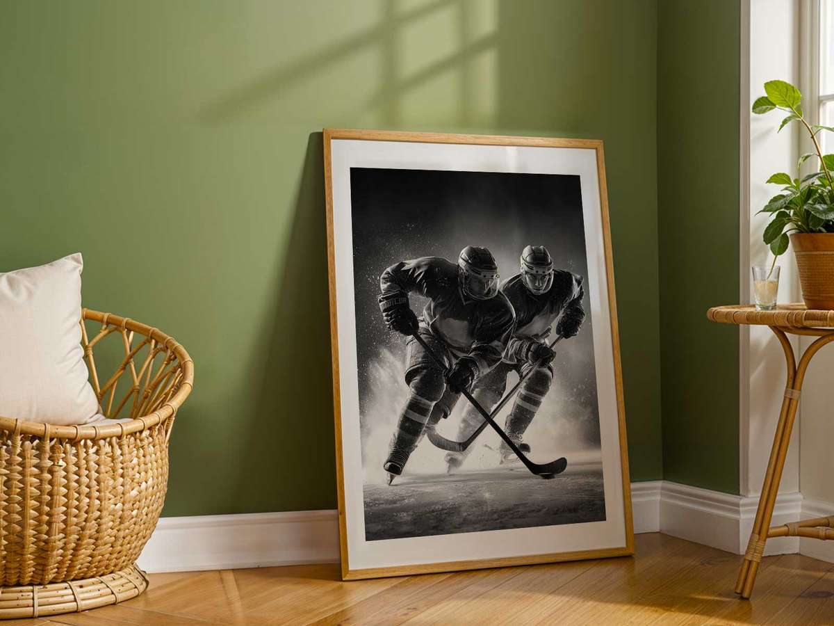
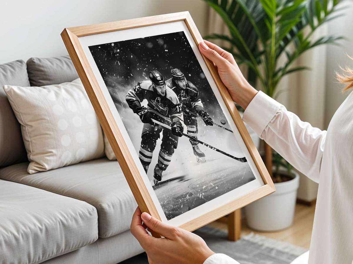
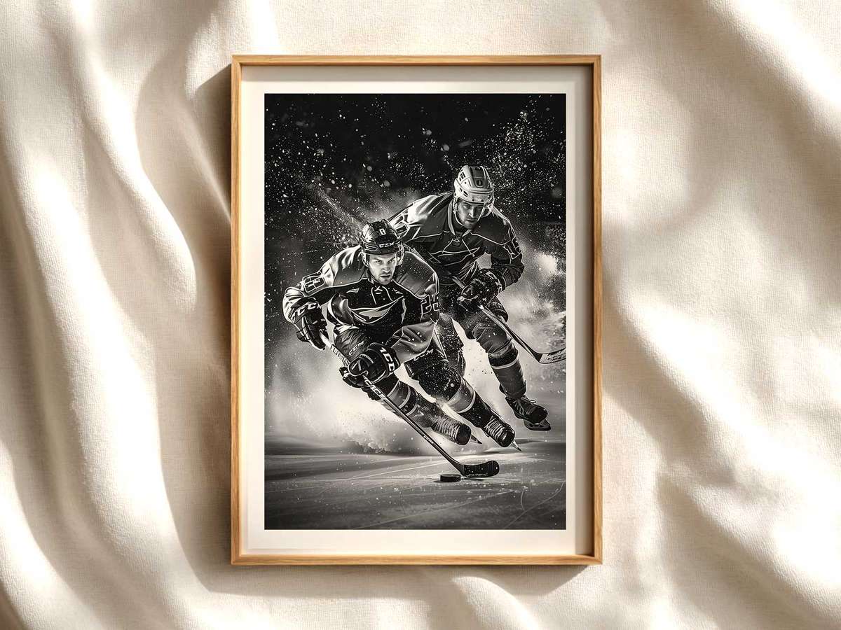
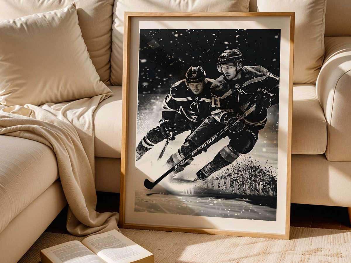
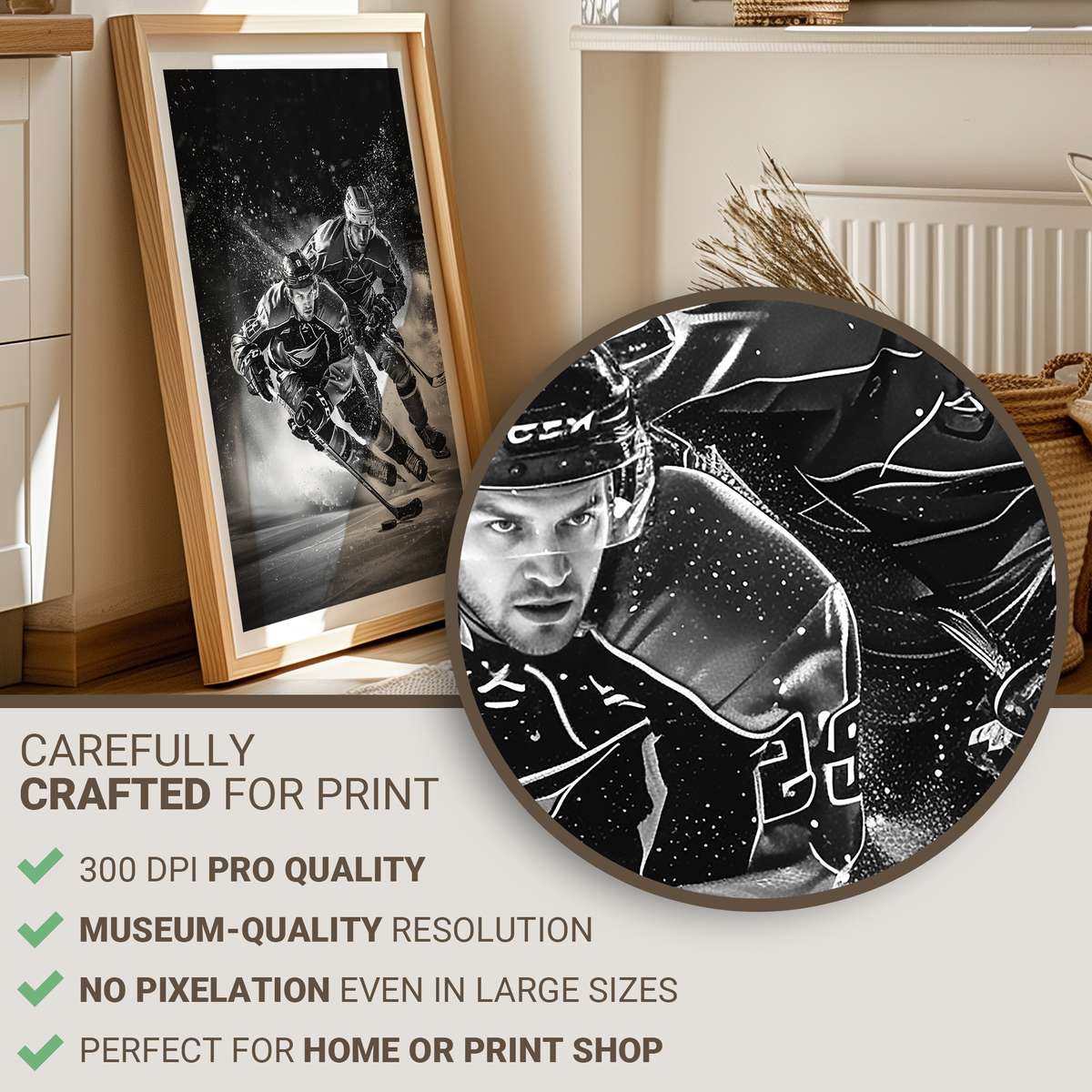
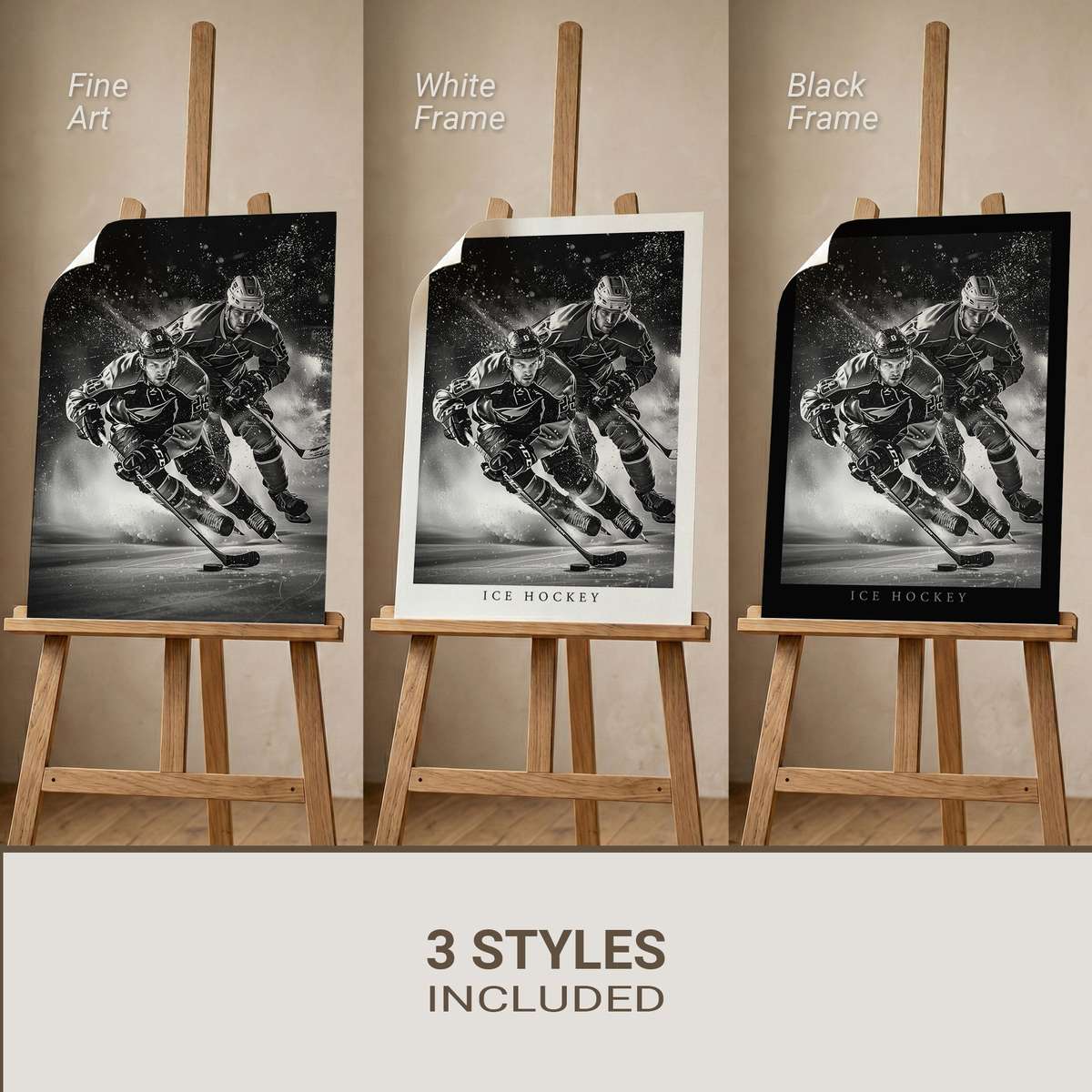
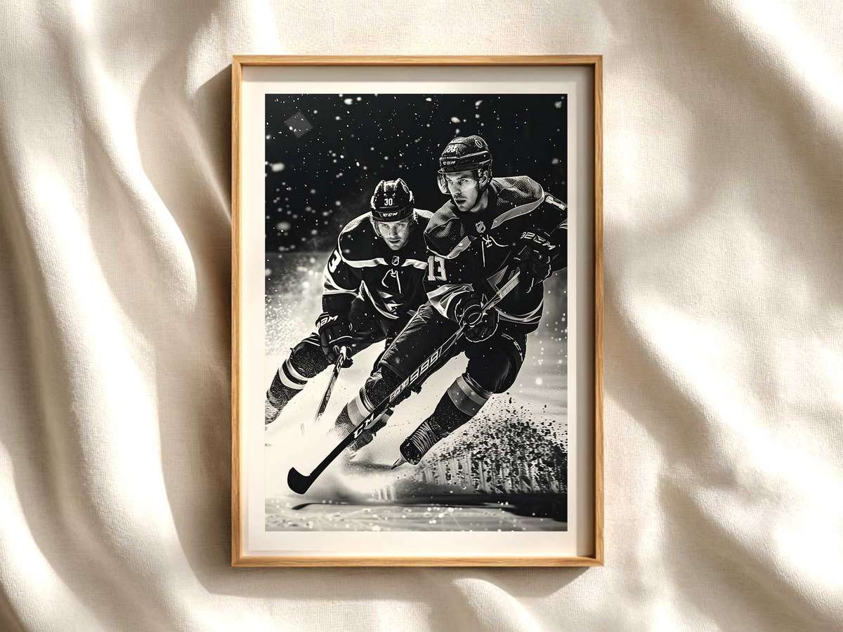
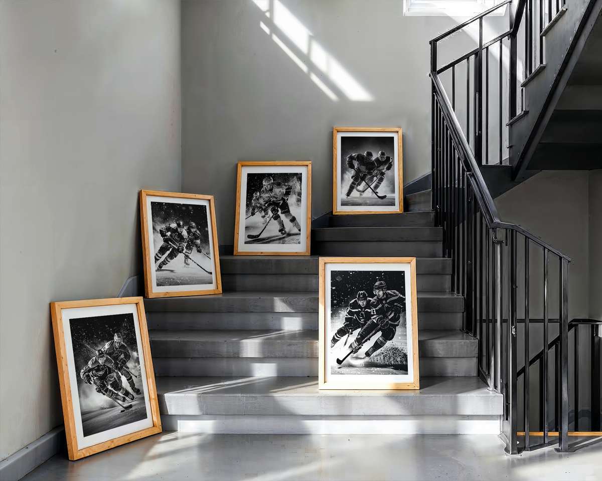
Hockey is a visual sport: it lives in flashes — the spray of shaved ice, the curve of a stick, the graphic boldness of a jersey crest. A San Jose Sharks poster succeeds when it chooses a single visual focal point and builds everything else around that instant of intensity. Think less generic team décor and more a decisive moment: a forward carving across the blue line, a goalie set in silhouette against arena light, or a close-up of the teal shoulder patch caught in motion. That chosen focus makes the poster read clearly from across a room and reveal texture and nuance as you step closer.
What makes hockey immediately recognizable on a wall is the combination of cold surfaces and hot action. Ice is not neutral white; under arena lights it becomes a textured field of pale blues, reflective streaks and black puck marks. A Sharks-themed composition uses that chilly palette as a stage for contrasting elements — the deep teal and black of the jersey, a flash of white trim, the chrome of the stick and metallic sheen of a helmet. Those contrasts give the eye an entry point and maintain legibility at a distance, so the poster keeps its impact whether hung above a sofa or as part of a collector gallery.
Speed and motion are conveyed through compressed shapes and directional cues: leaning shoulders, bent knees, trailing spray, and stick arcs. A strong San Jose Sharks poster picks one of those cues as its primary visual anchor. For example, isolating the ice spray created by a hard stop produces an immediately cinematic image — the frozen droplets read like confetti, the player’s posture communicates force, and the rink lines slice the frame into dynamic diagonals. That single, decisive gesture prevents the composition from feeling decorative-only and gives the artwork a kinetic heart.
[IMAGE_INSERT_ARTICLE_01]
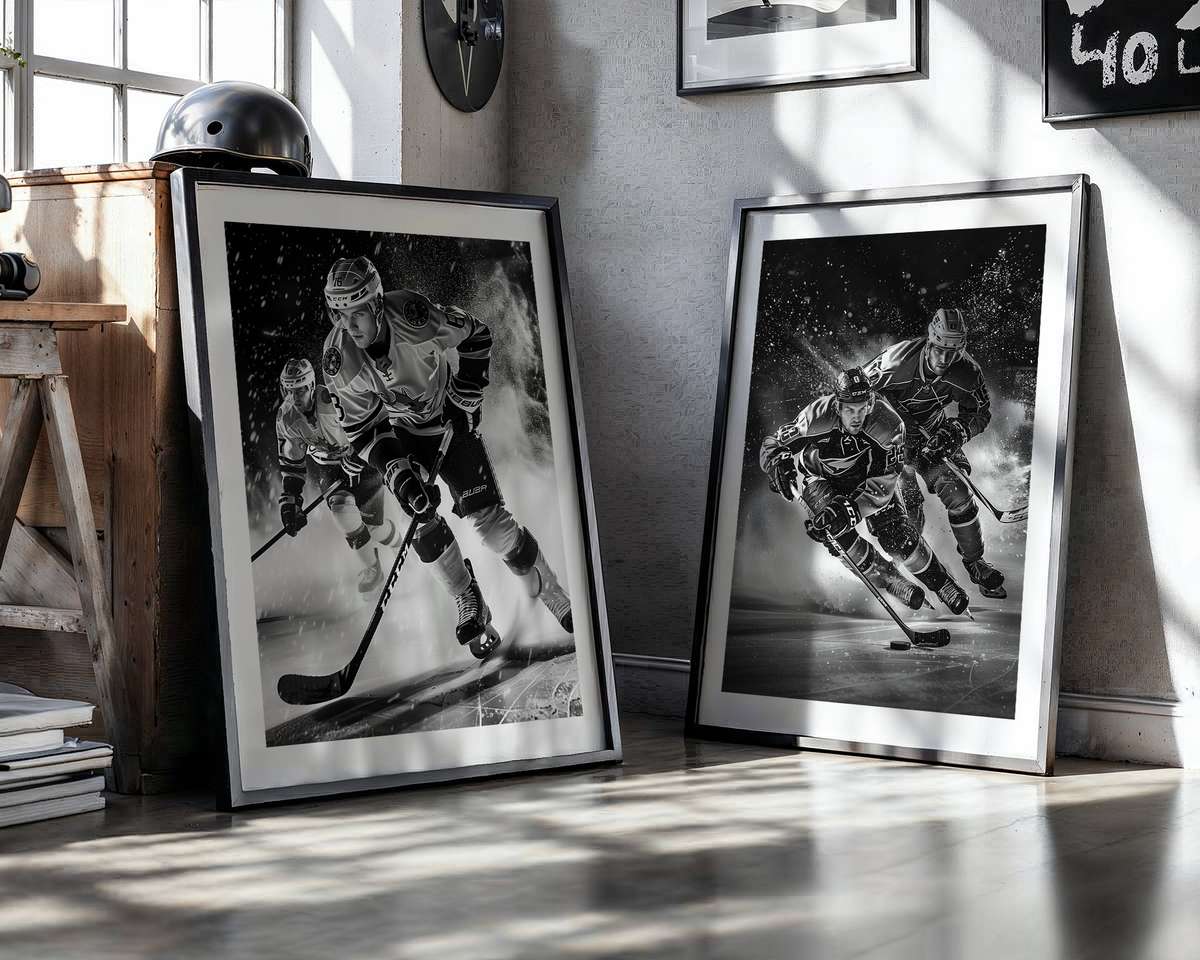
Equipment becomes graphic shorthand for the sport. Helmets, gloves and sticks reduce to powerful silhouettes that register even at a glance. The Sharks’ colorway functions as identity shorthand: teal anchors the palette, black and white provide contrast, and any crest or shoulder patch offers focal detail for fans. A poster that emphasizes these elements — close-cropped glove with puck, the curl of a stick blade against ice, or the helmet visor backlit by arena bulbs — translates team pride into design-minded imagery that reads well in modern and retro interiors alike.
Rink geometry helps structure the composition. The boards and dasher lines create horizontal bands; face-off circles and blue lines supply circular and diagonal forms that balance figure and negative space. Designers use this built-in architecture to position the subject so the eye travels naturally through the image: entrance at the shoulder or stick, follow the motion across the ice, rest on the crest or the fan silhouette in the background. This makes the poster both readable from across a room and rewarding up close, where you can appreciate surface details like skate marks, helmet reflections, and fabric texture.
Beyond the game action, a Sharks poster can shape room atmosphere. A piece leaning into arena light and contrast produces a theatrical, arena-like mood suited to game rooms and dens; a tighter, high-contrast crop emphasizing gear and ice texture feels archival and study-ready; a wider scene that includes cheering fans and arena architecture produces a communal, team-proud energy. Good hockey wall art chooses one of these moods and commits, so it complements the room rather than competes with it.
Ultimately, the desirability of a San Jose Sharks poster rests on visual specificity: a decisive focal point, the readable contrast of team colors against textured ice, and evidence of motion or impact that rewards repeat viewing. That intersection of speed, cold clarity and emblematic identity is what turns a sports image into a living piece of decor — it makes the wall feel charged, the room feel charged, and the fan’s connection to the team immediately visible without resorting to generic decoration.