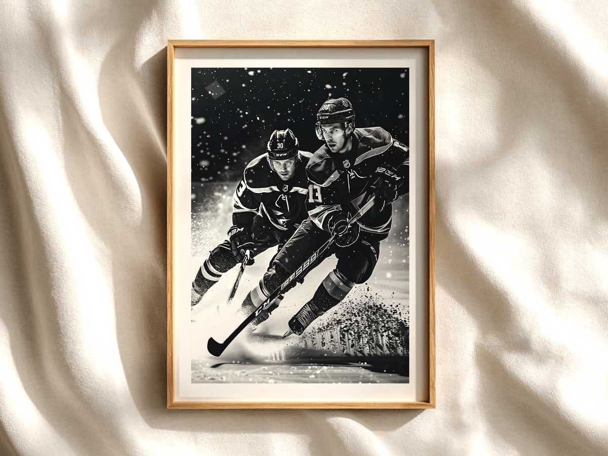
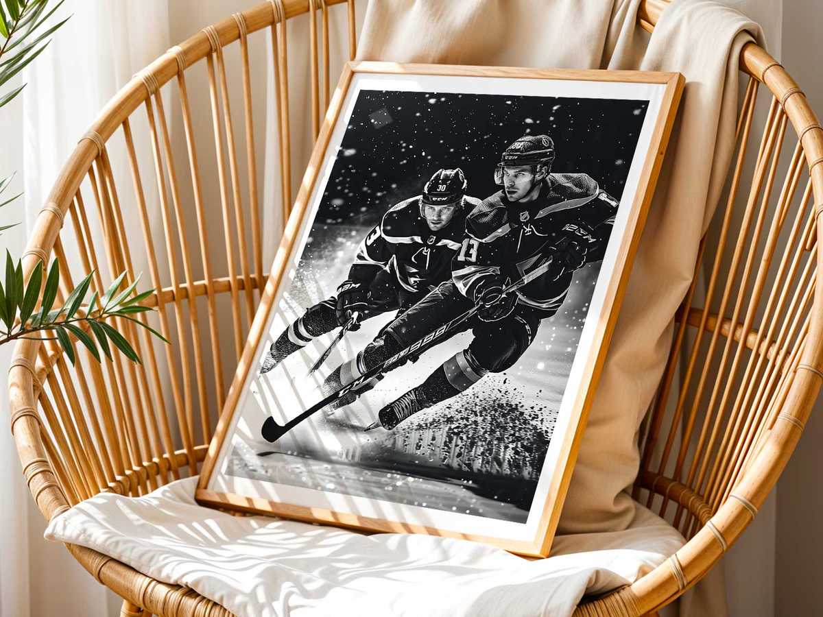
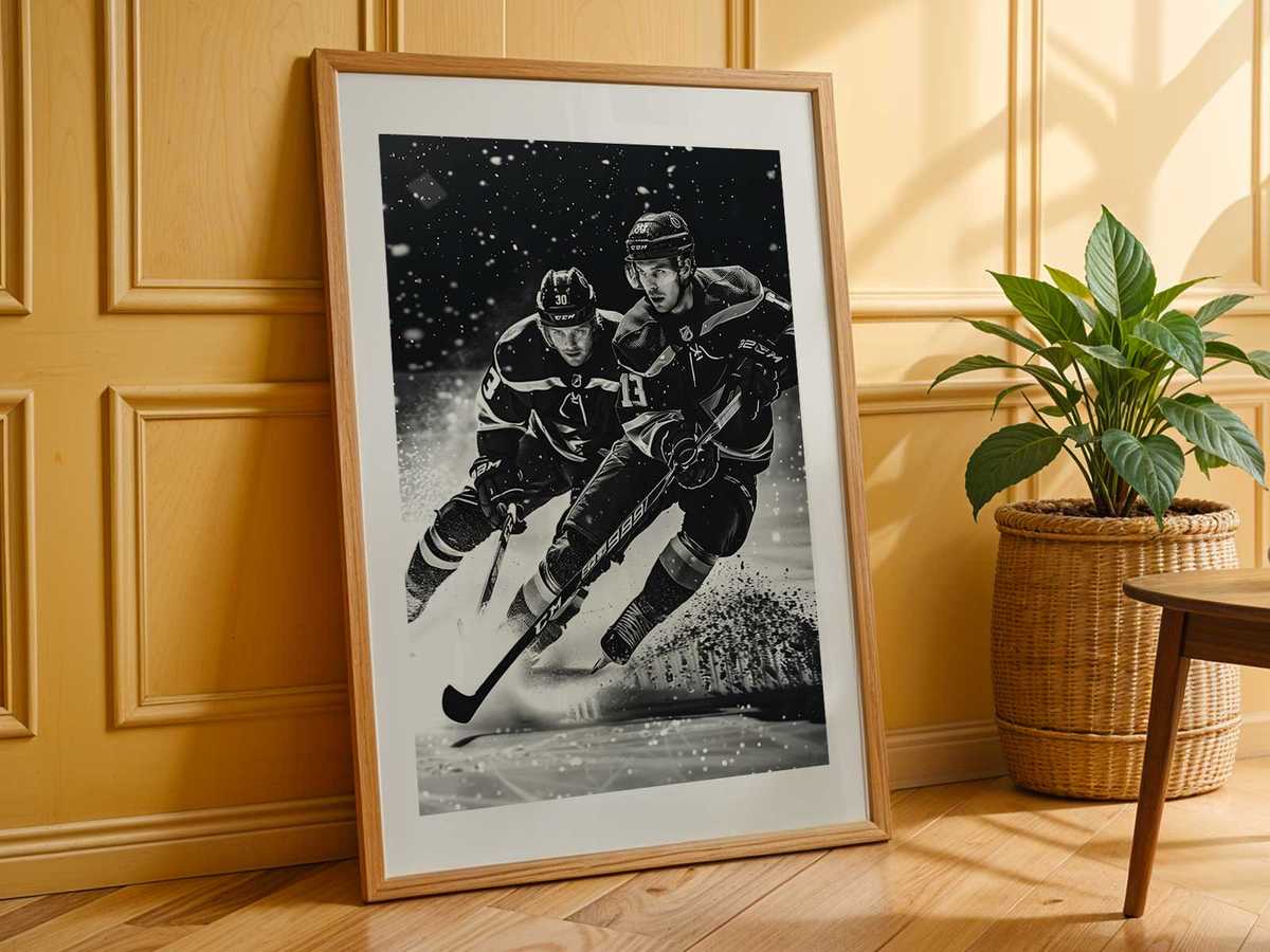
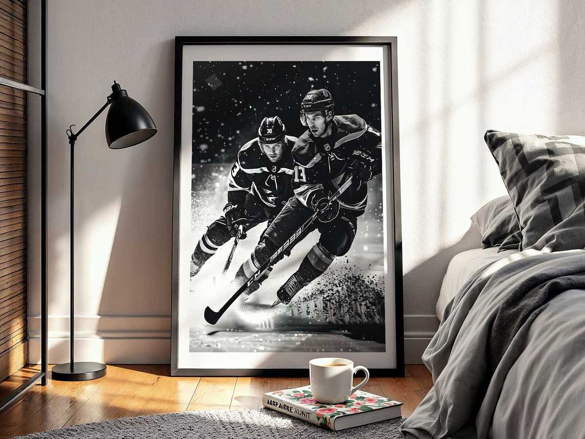
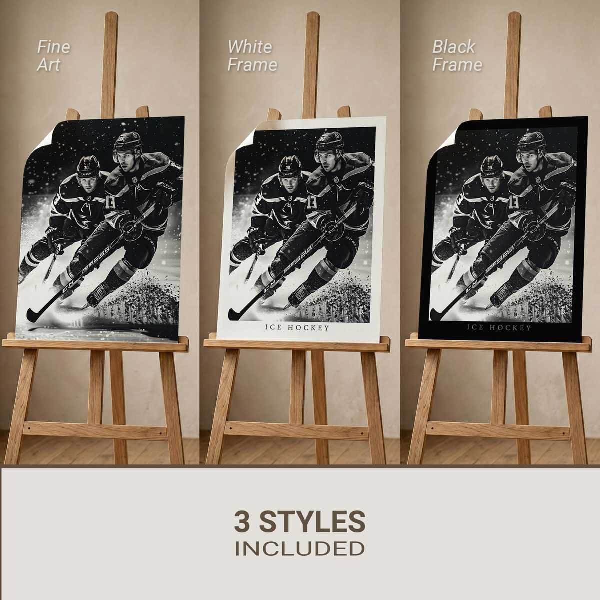
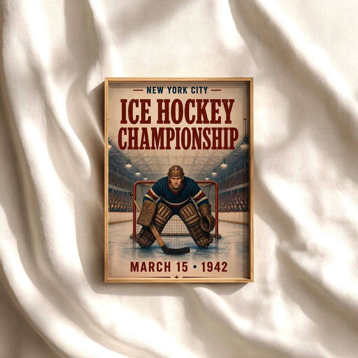
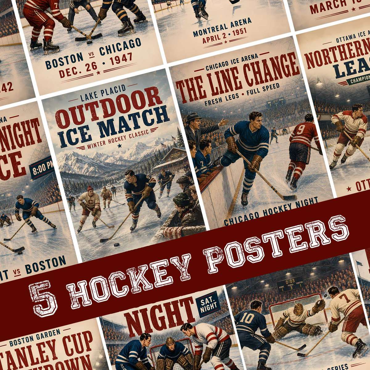
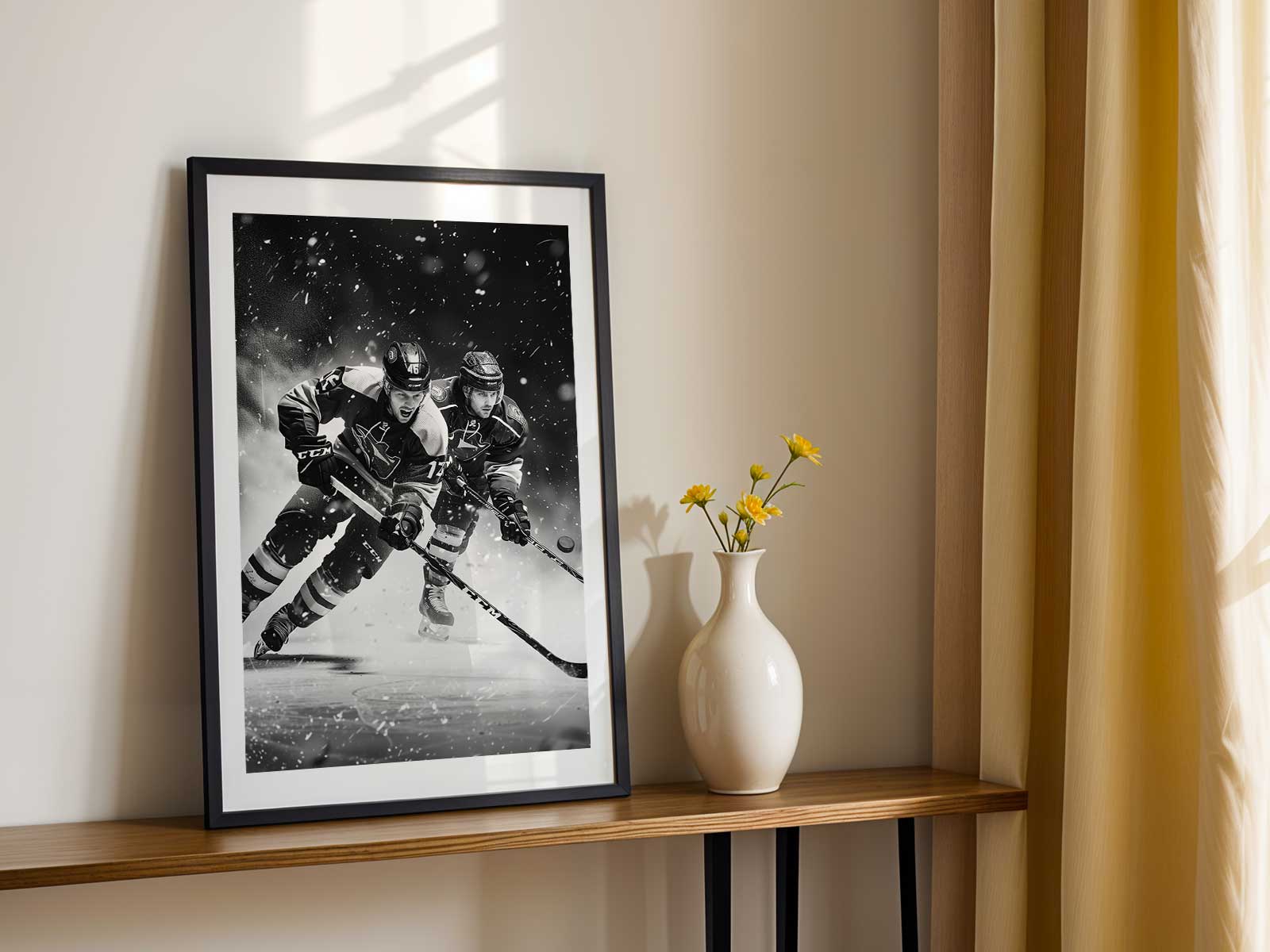
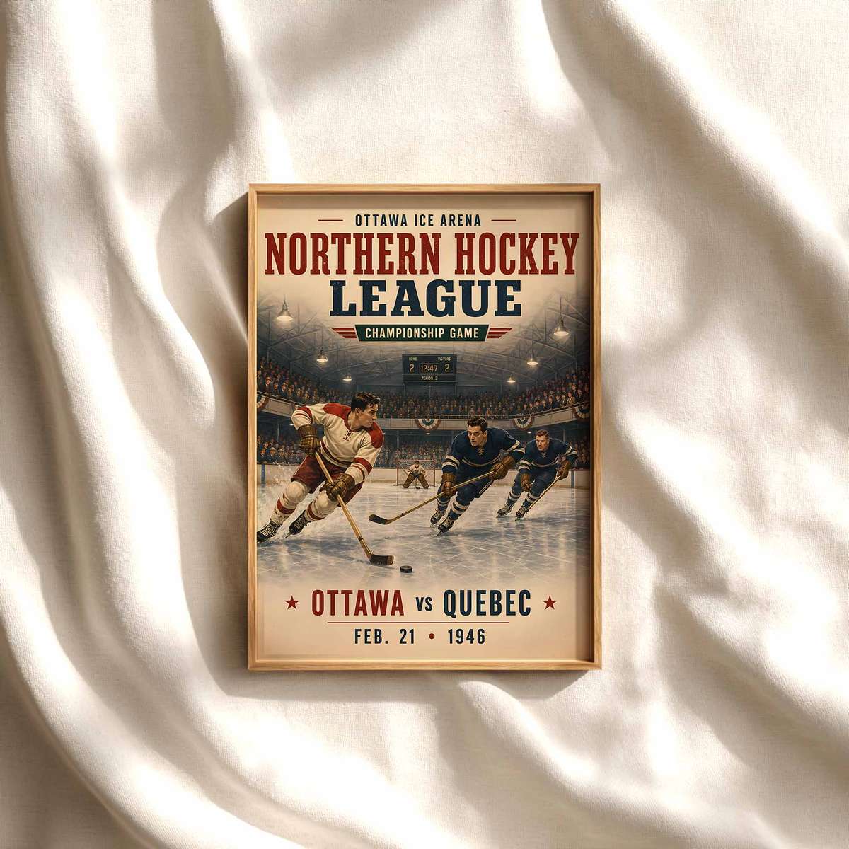
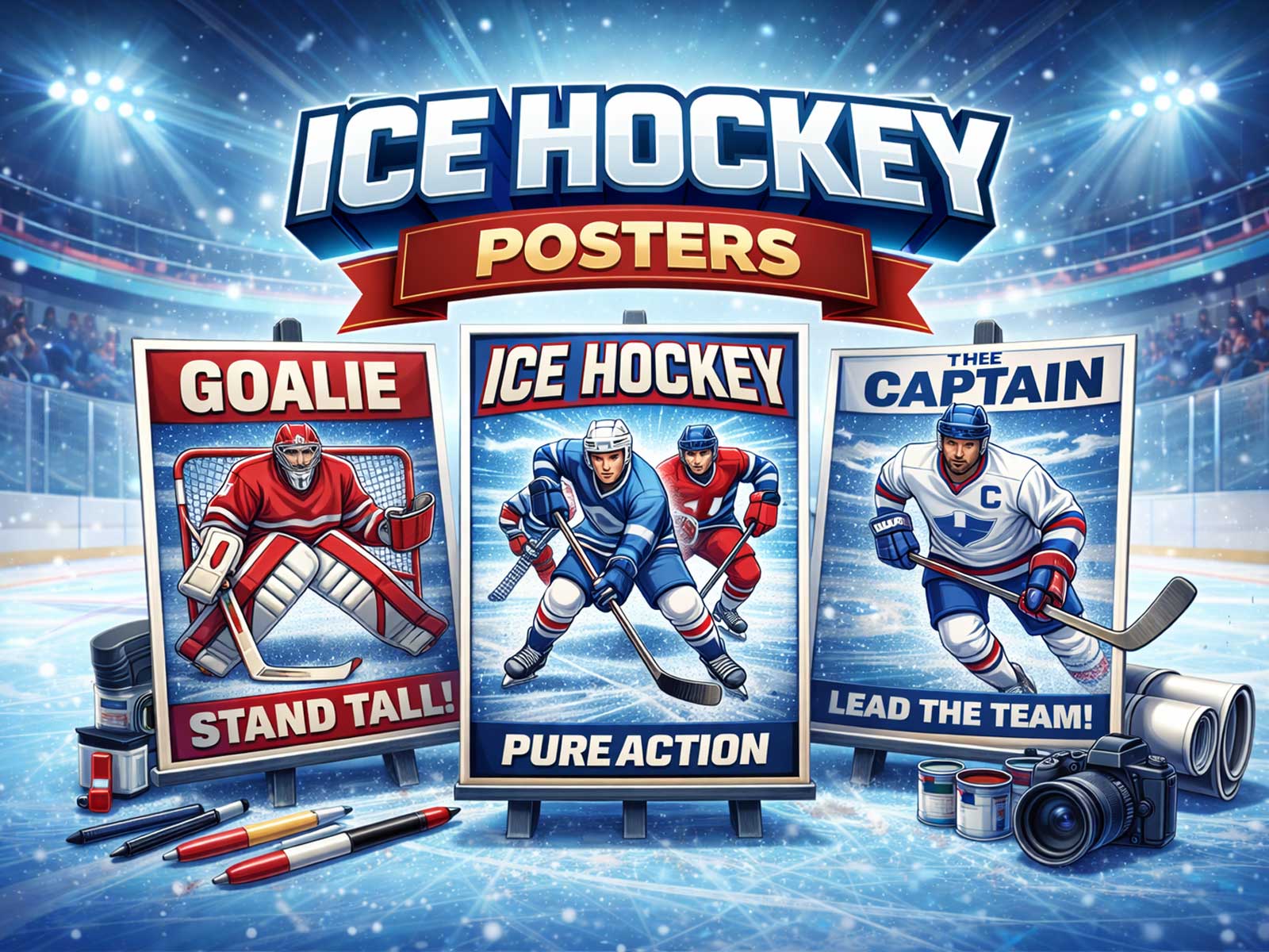
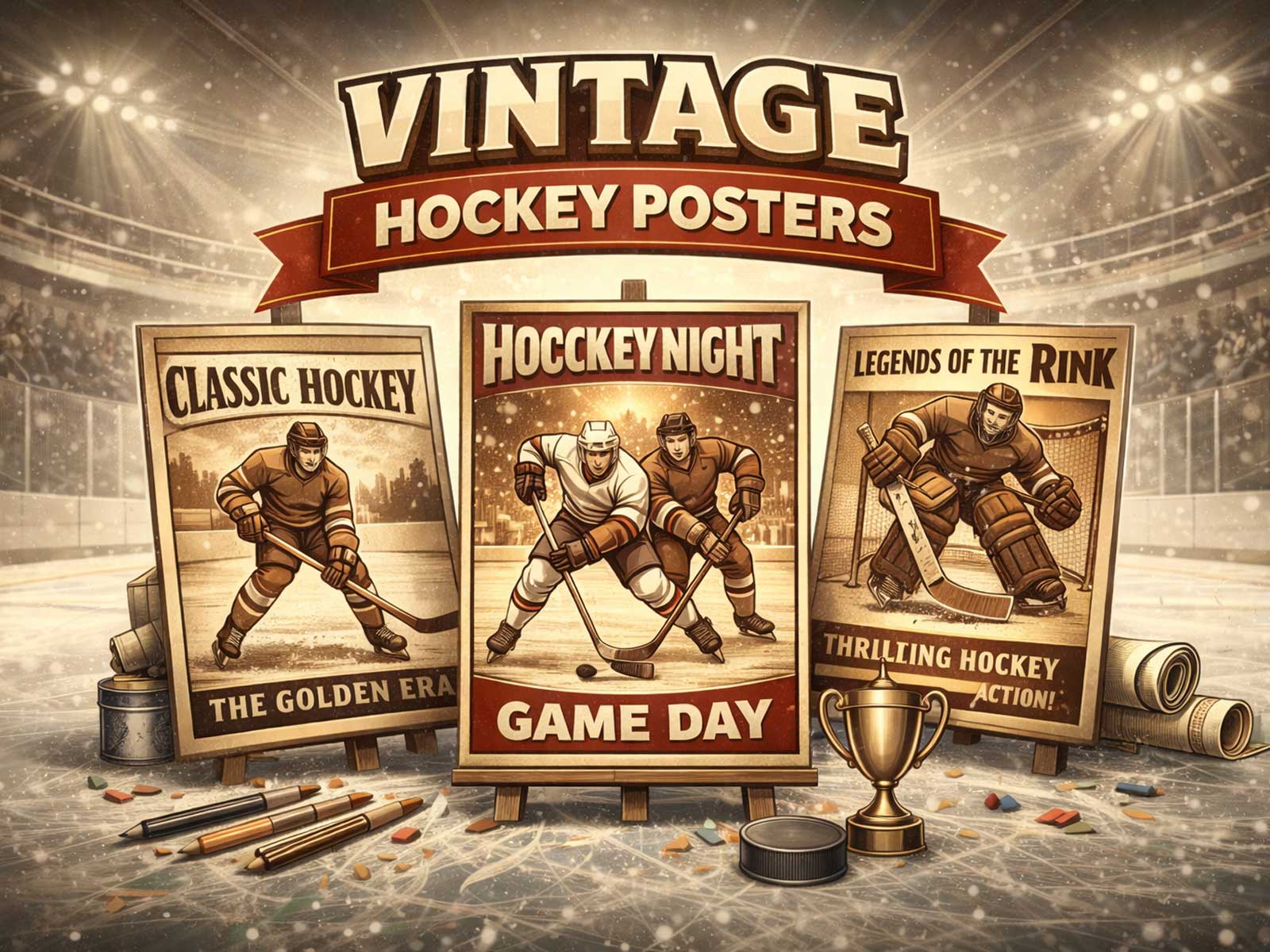
Hockey translates to wall art with surprising ease because its visual vocabulary is built for the frame. The rink itself functions like a backlit stage — a smooth, reflective plane that amplifies color, throws sharp highlights around silhouettes, and makes motion legible even in a single frozen instant. Against that bright, cool field a stick, a blade of skate spray, or the arc of a passing jersey becomes a clear, readable gesture that works at room scale and from a distance.
The most compelling hockey posters lean on three simple elements: luminous ice, body tension, and the pictorial clarity of sporting conflict. Ice behaves as an elegant negative space; it absorbs stadium light and returns it as texture — fine scratches, spray, and frost that read like painterly grain. Those textures give the eye something to rest on while players’ aggressive postures supply kinetic lines: a flexed stick, the bend of knees, shoulders turned into a check. These physical notes translate immediately into visual rhythm and energy on a wall.
[IMAGE_INSERT_ARTICLE_01]
Color and contrast are a designer’s secret. Team colors and crests simplify into bold blocks that pop against washed-into-white ice or the deep shadow under boards. Retro jerseys flatten nicely into graphic fields of color that feel collectible and nostalgic; modern kits, with cleaner type and sharper logos, read as contemporary statement pieces. Either mood works for decor: retro prints bring warmth and memory to a study, while modern compositions give a game room or office an arena-like, energetic edge.
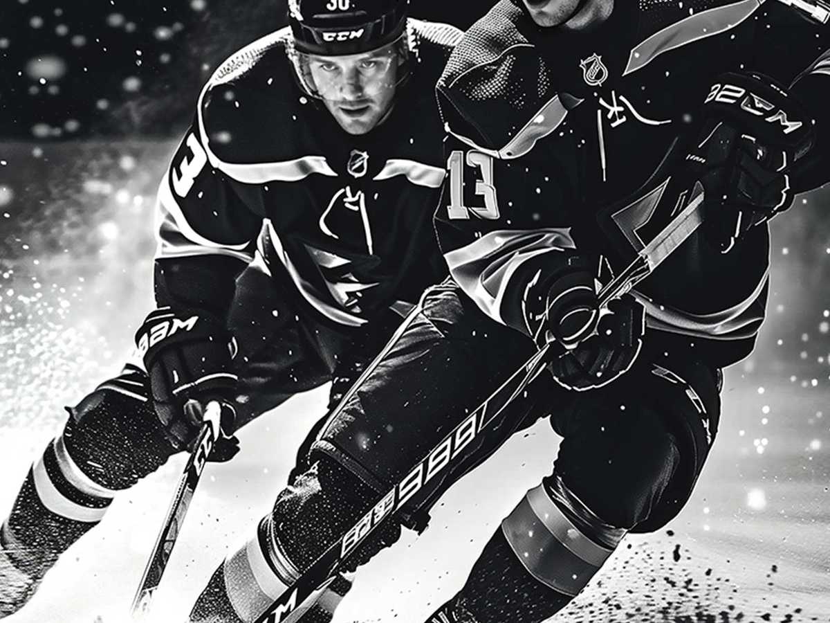
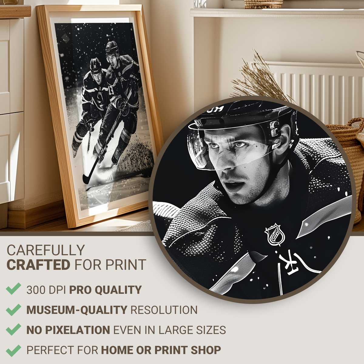
Close-reading rewards the viewer: the serrated spray of a stopped skate, the translucent heat of breath under arena lights, the halo where a helmet meets the spotlight. But the image also retains readability across a room because hockey’s visual grammar is economical — a few strong shapes and directional cues tell the whole story. That economy makes hockey stick wall art particularly suitable for hallways and living rooms where the piece must convey feeling at a glance and reveal detail up close.
Compositionally, the stick is an essential prop. It acts as both tool and pictorial line, slicing diagonally through frames to suggest speed or anchoring a low-contrast scene with a dark silhouette. A poster that emphasizes the blade — frozen in a skate-cut spray or tipped towards the net — gives a clear point of tension, inviting viewers to complete the action in their heads. When combined with tight cropping or shallow depth, the result is a cinematic, almost tactile image that feels alive on the wall.
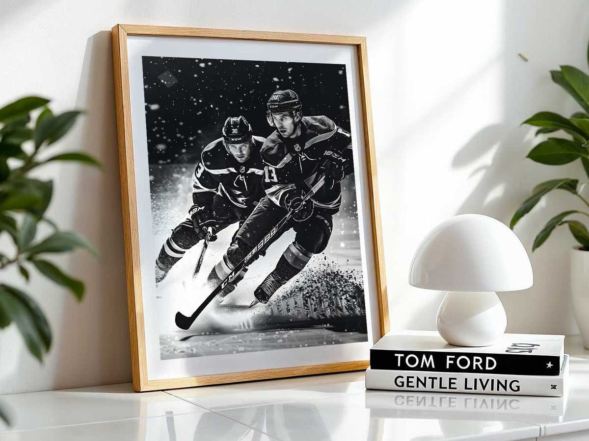
Beyond motion and texture, hockey art carries identity. Crests, helmet decals, and colorways signal allegiance without overwhelming a room’s palette when used with restraint. A single framed print can be the visual axis of a fan cave or the subtle statement in a minimalist office: it reads as both fan symbol and design object, depending on scale and finish. Matte paper, muted tones, or weathered printing push toward archival nostalgia; high-gloss or large-format prints amplify arena light and immediacy.
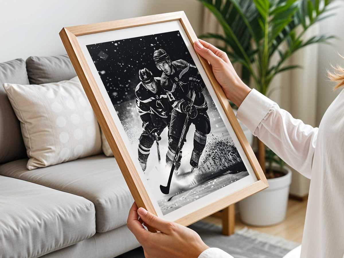
Finally, living with hockey imagery affects atmosphere. A piece that foregrounds tension — an impending check, a goaltender’s butterfly, a stick frozen mid-slapshot — creates a kinetic mood that energizes a space. A quieter, detail-driven print — ice texture, an old rink scoreboard, or a close of gloves on wood — cultivates nostalgic calm. Both approaches reward repeat viewing: from across the room the composition reads as confident and iconic; up close the small gestures — the scuff, the thread of a lace, the way light hits a visor — keep the eye returning.
Choosing hockey stick wall art is ultimately about the type of room energy you want. Look for images that exploit ice as light, celebrate the line of the stick, and preserve the readable clash of bodies and colors. Those elements ensure the poster functions visually in the home while carrying the sport’s raw, immediate drama into everyday rooms.