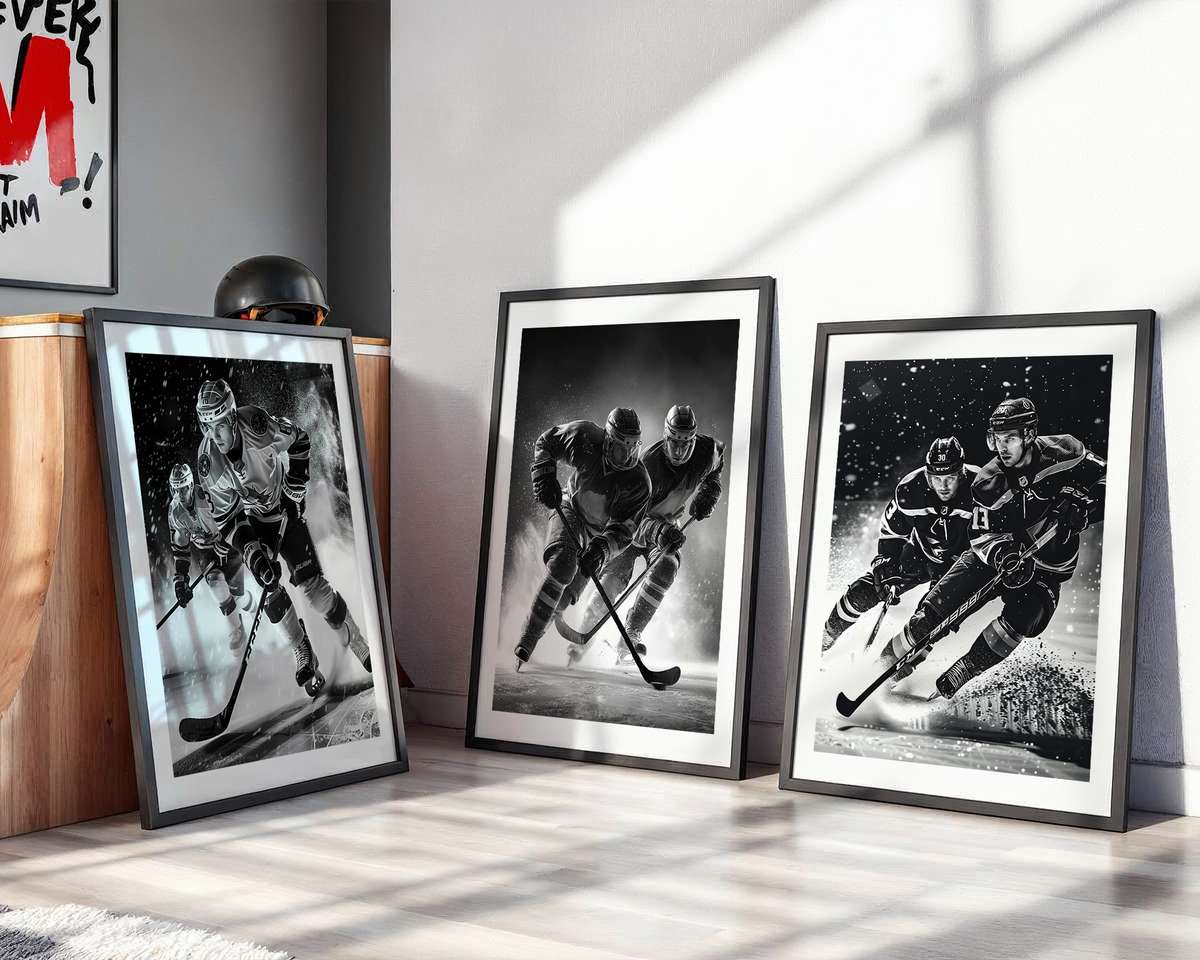
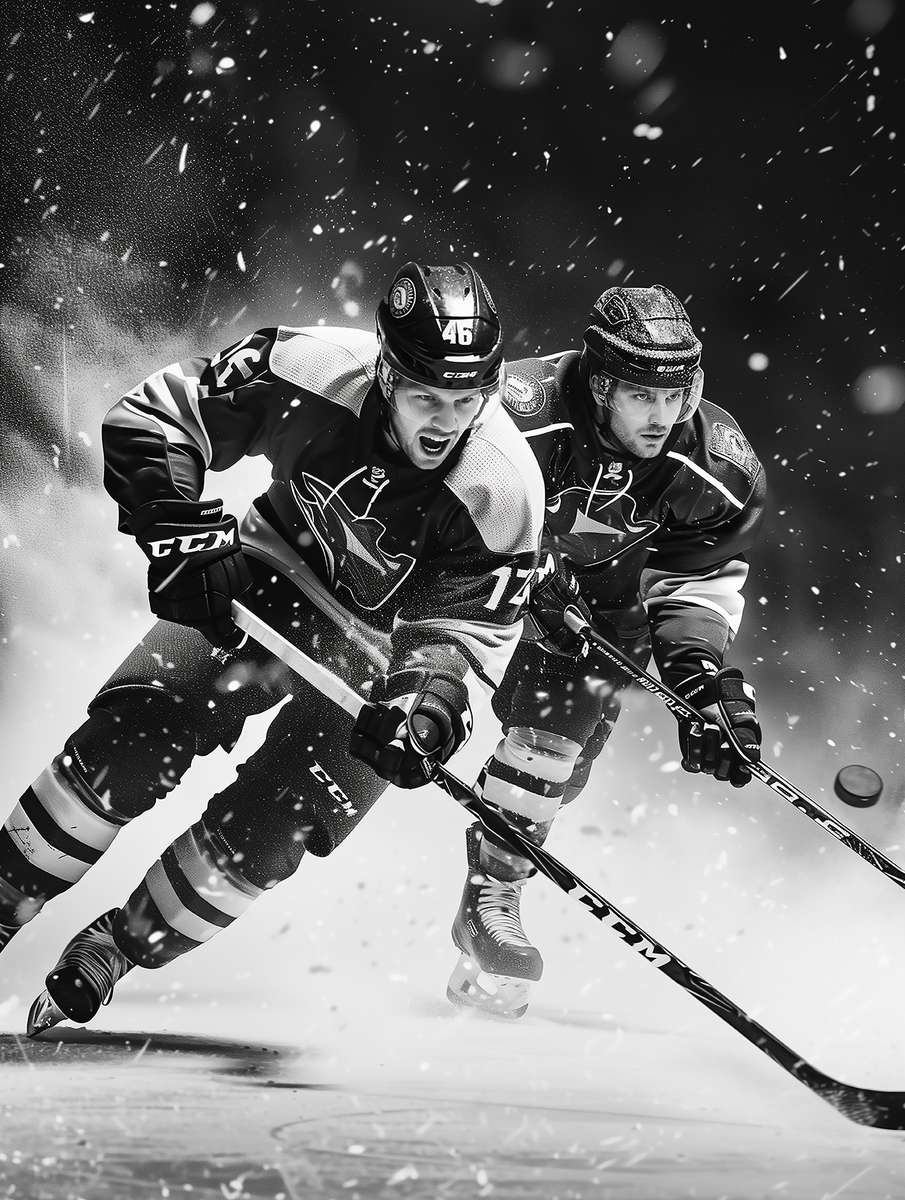
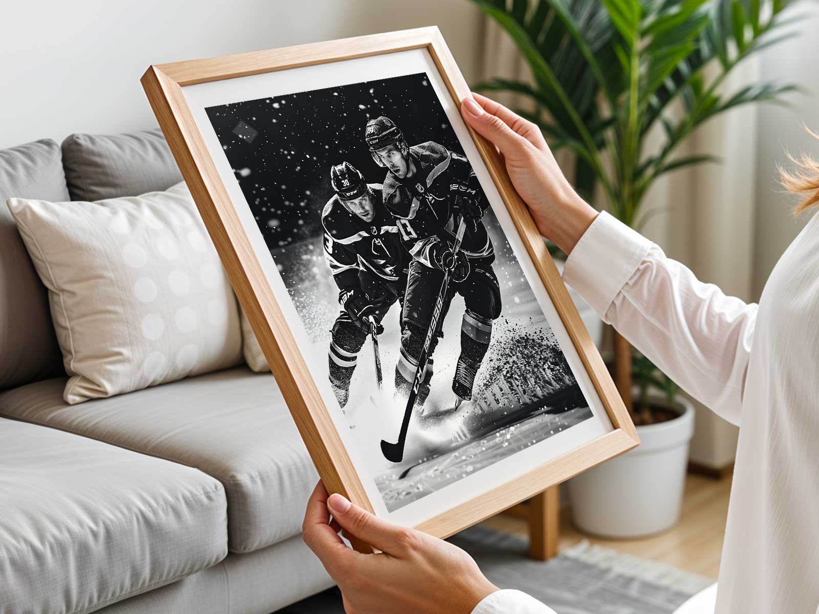
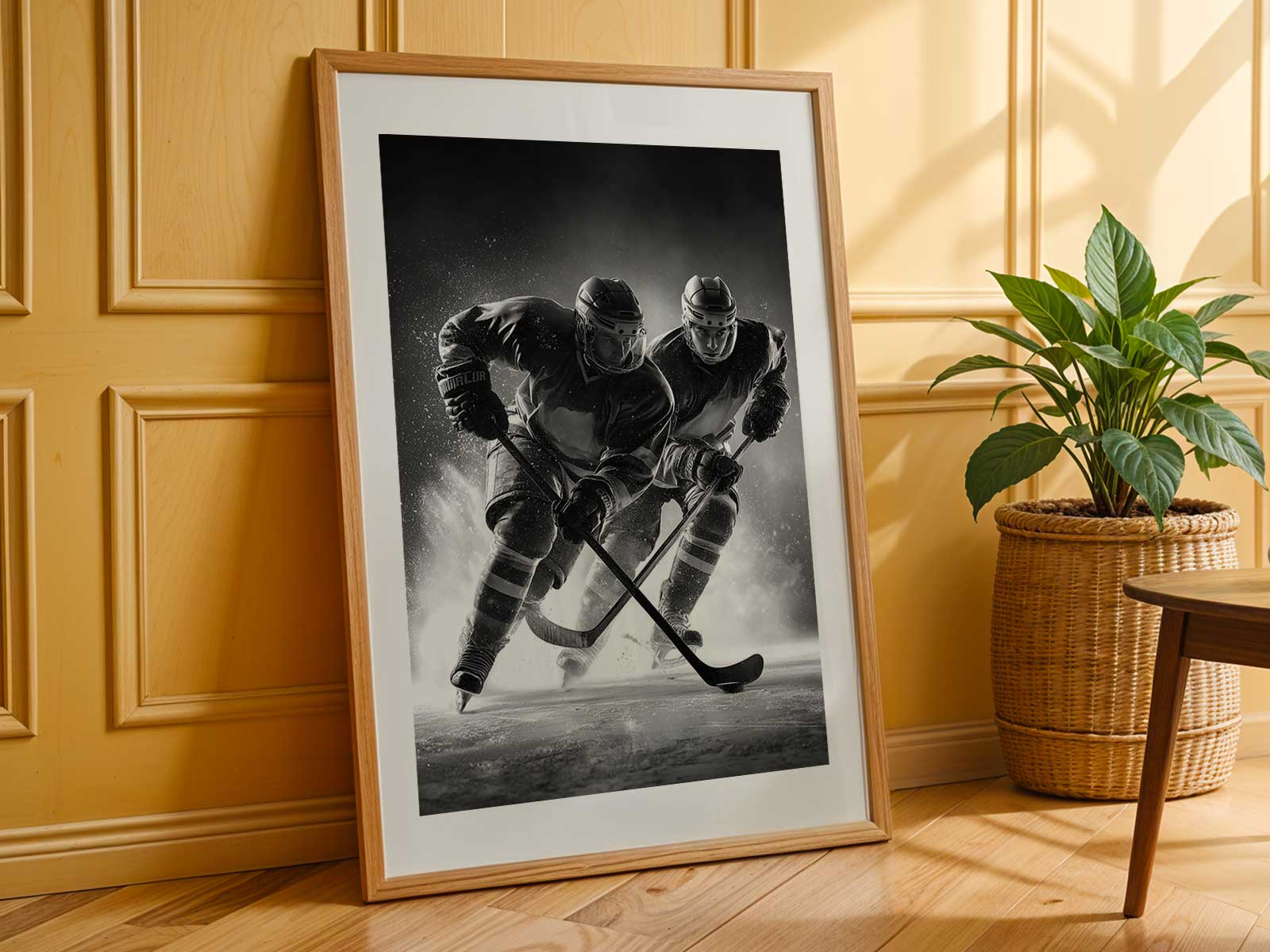
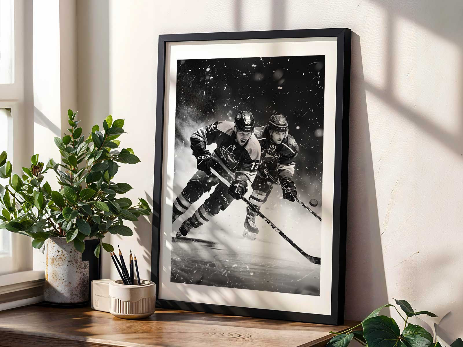
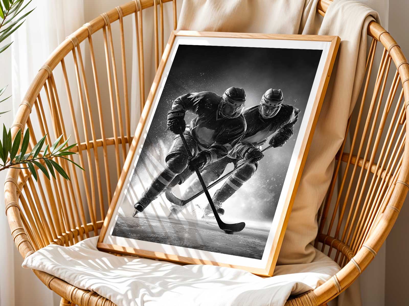
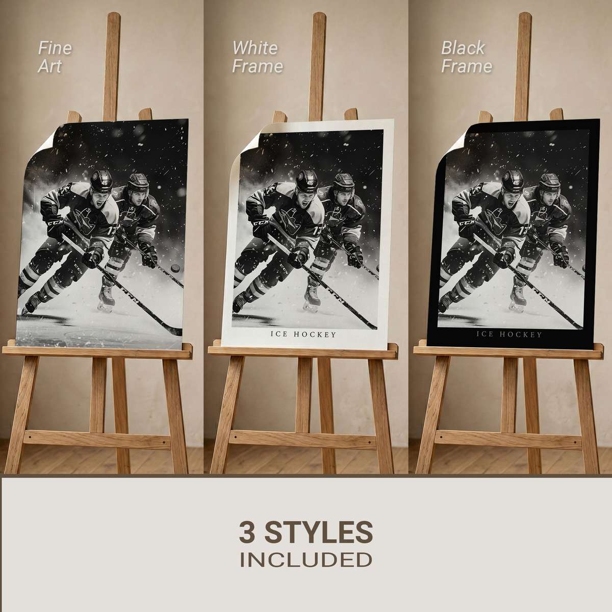
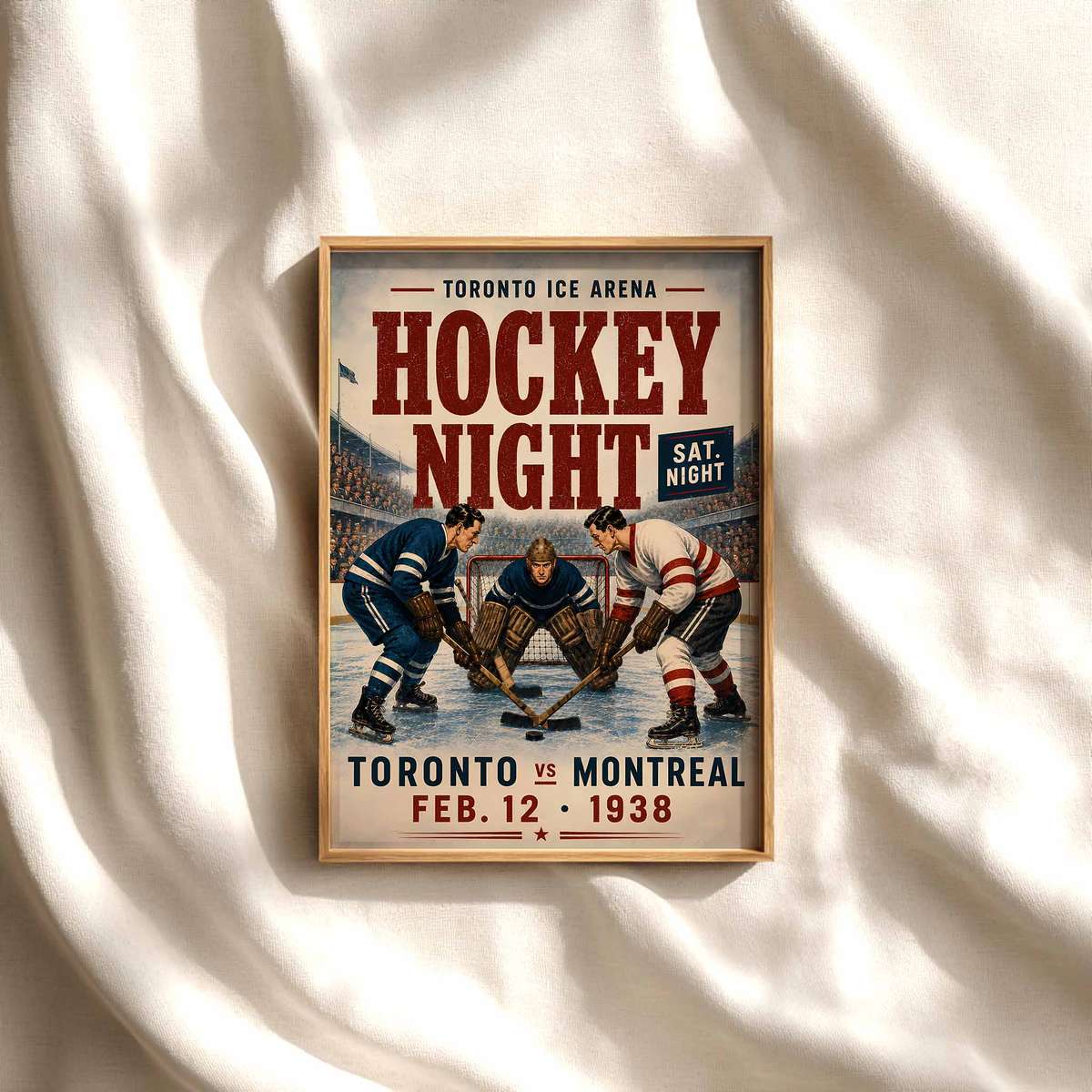
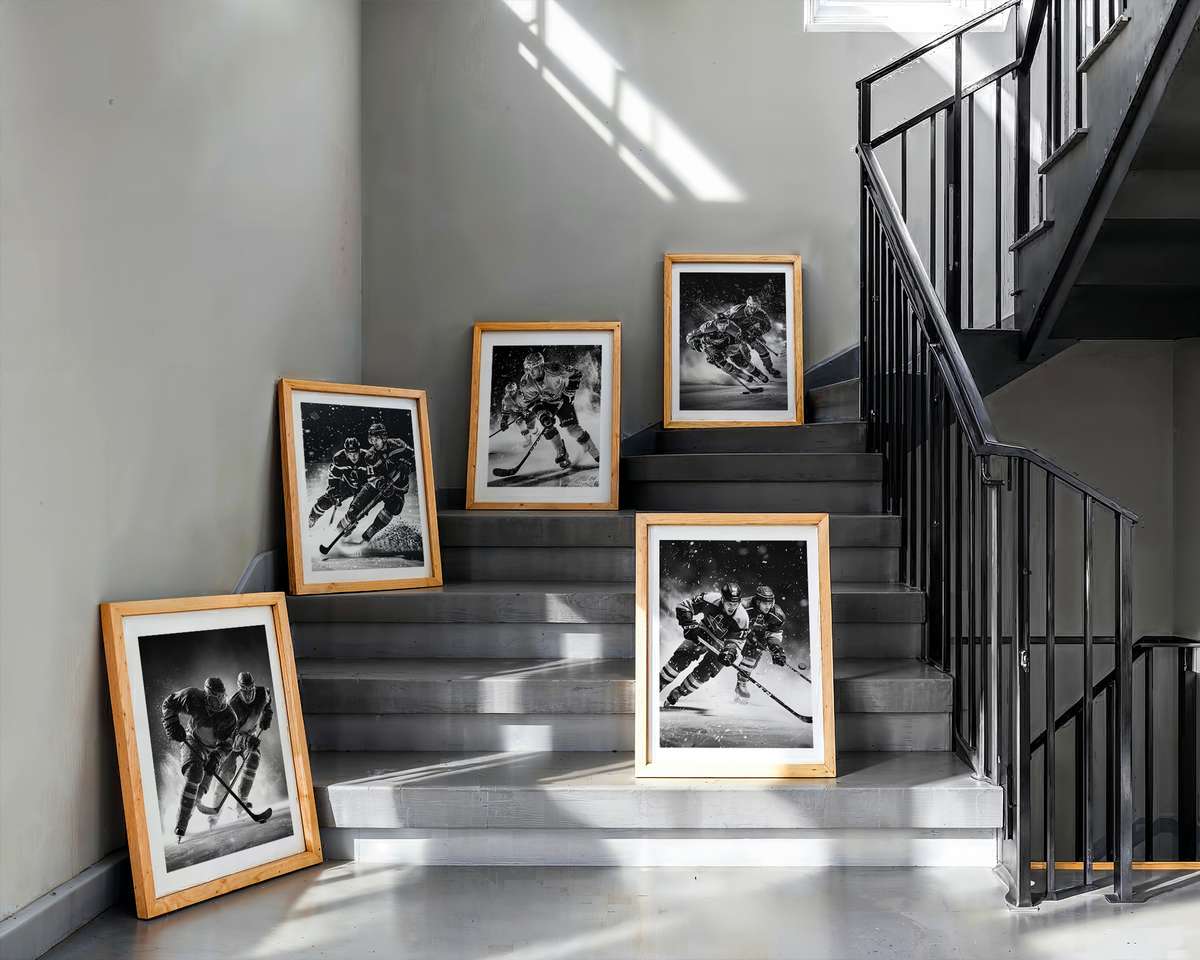
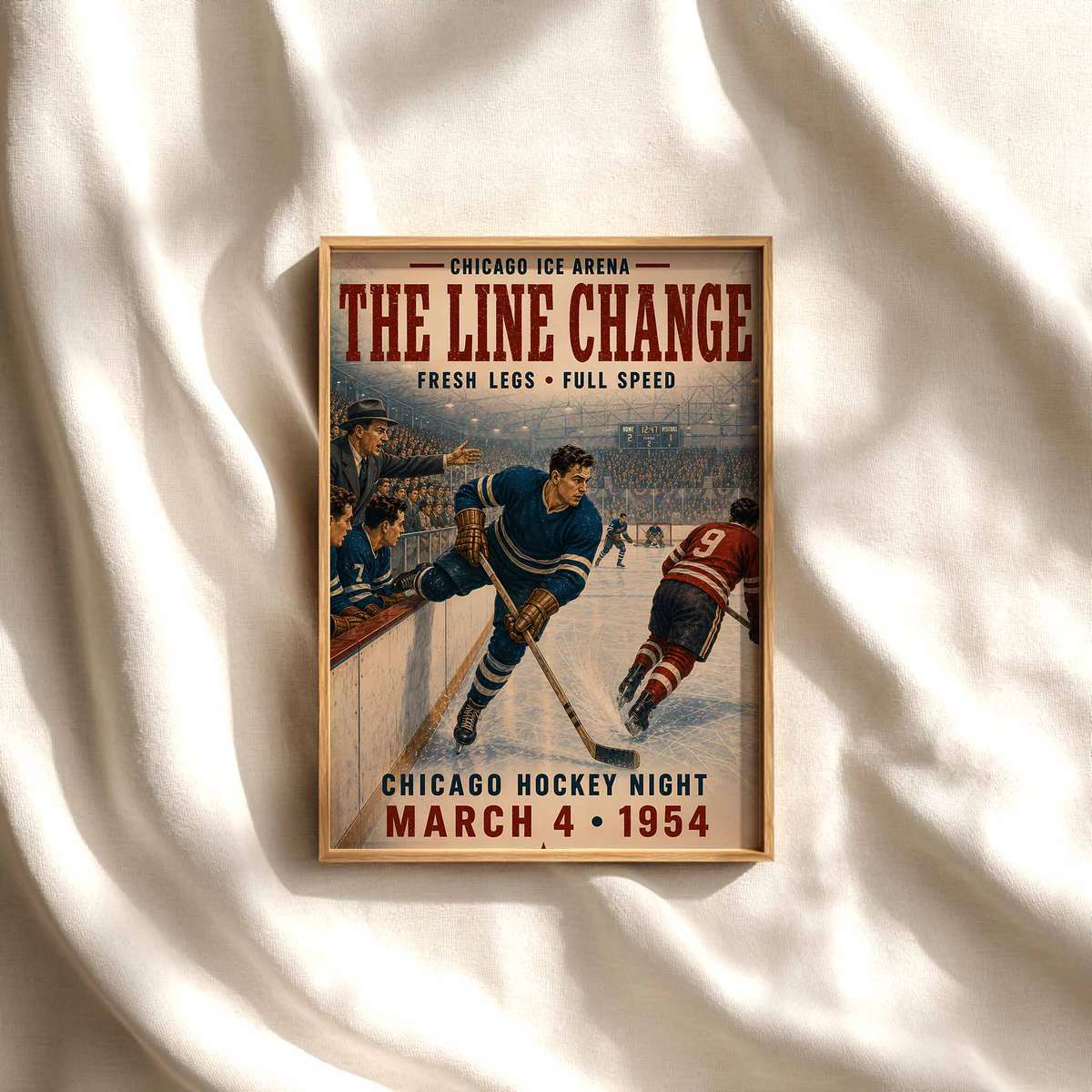
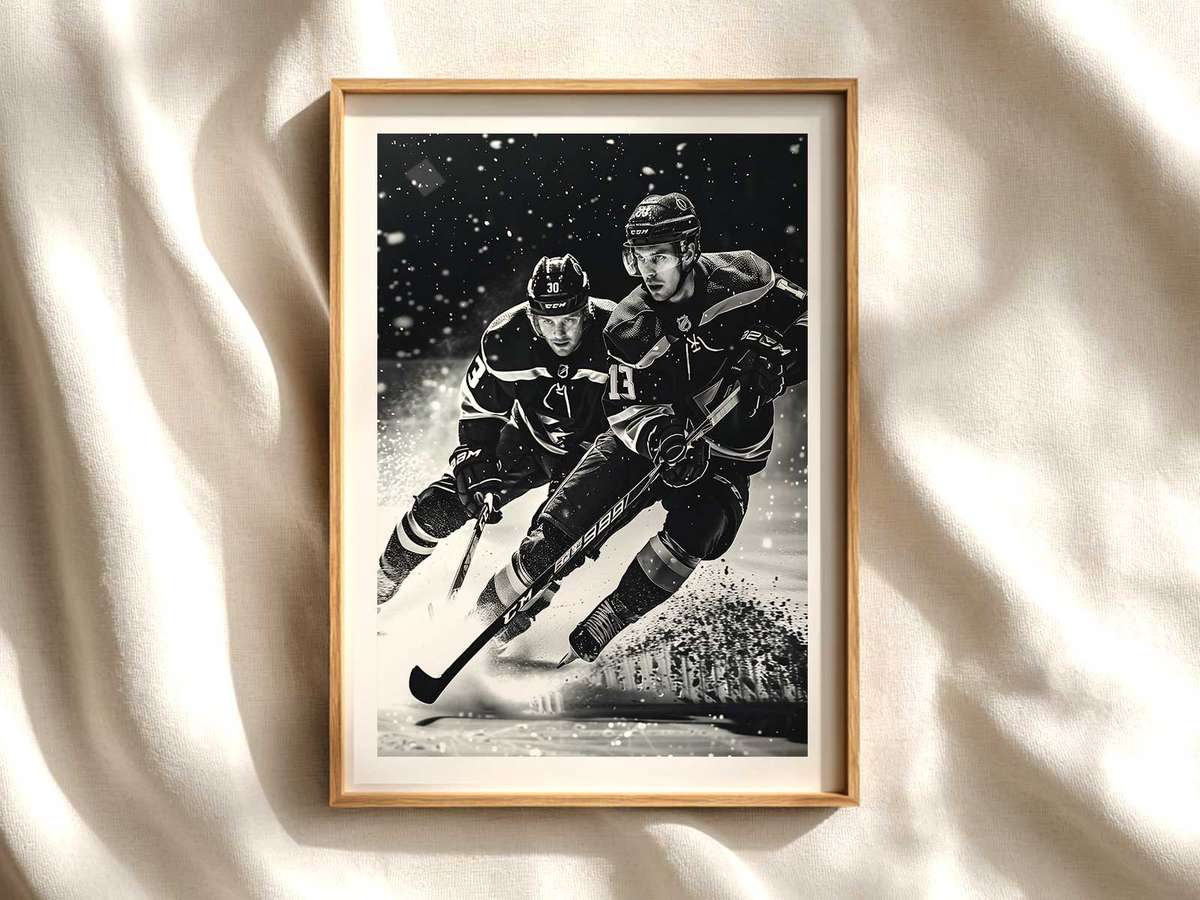
A single puck—black, compact, and scarred from play—can read like an entire game when treated as the visual anchor of a poster. The puck’s low, dense silhouette is an unusual focal point: unlike oversized player portraits or arena panoramas, it condenses motion, impact and memory into a compact emblem. On a wall, that compactness becomes strength. The puck’s shape reads instantly from across a room while its surface details reward a closer look, creating a layered viewing experience that works equally well above a desk or as part of a collector gallery.
Visually, the puck does what the rink itself promises: it suggests speed and collision without needing to show every player. Ice spray frozen mid-arc, a blade track that cuts through reflected light, or a single stick shadow crossing the puck all amplify the sense of motion. Because the object is small and symbolic, designers often place it against bold negative space—frosted whites, deep arena blacks, or a wash of a team colour—so the eye is drawn to contrast and texture. That tension between small object and big atmosphere is what makes puck-centric posters quietly dramatic.
Colour and identity play a decisive role. A puck framed by a crisp stripe of team colour or a hint of a crest balances abstraction with recognition: even viewers who don’t follow the sport pick up on the palette as a badge of allegiance. When personalised details—player number, a date, or a short line of text—are embossed or printed on the puck or nearby, the image becomes both intimate and iconic. It reads as personal ownership rather than broad fandom, giving the wall a curated, archival mood that suits studies, hallways, or fan caves.
[IMAGE_INSERT_ARTICLE_01]
The material language of hockey—matte rubber puck, gloss of a helmet visor, satin tape on a stick—translates beautifully to print. Close-up shots emphasise surface rub, nicks and cast shadows, turning the puck into a tactile object you can almost feel. From a distance the composition is readable: a dark disk interrupts a field of ice or colour, creating a bold, graphic punctuation. Up close, the viewer discovers tiny evidence of contact: scuffs, frost, or a paint fleck. That dual readability is essential for wall art: it commands presence from across the room and rewards a slow, focused look.
The mood a puck-focused poster creates depends on lighting and finish. A poster rendered in cool, contrasty tones—strong blues, cold whites and deep greys—leans arena-like and kinetic, lending a modern, intense atmosphere to a game room or office. Warmer, desaturated treatments with grain and rounded type evoke a retro locker-room nostalgia, perfect for a den or a study with leather and wood. Either direction uses the puck’s compact symbolism to anchor the room’s emotional temperature.
Compositionally, the puck naturally aligns with the geometry of the rink. Placed near a leading line—a blade mark, goal crease, or horizon of boards—it becomes a focal counterpoint that organizes the whole image. That interplay makes the artwork feel intentional rather than decorative: the puck is the story’s protagonist, and everything else is choreography. For collectors, this clarity of subject makes it easy to mix puck portraits with player photos or vintage ticket art without visual clutter.
Finally, a personalised puck poster brings a private narrative into a public space. Whether the engraved date marks a memorable game or the number recalls a favourite player, personalisation transforms a simple object into a mnemonic device. It’s not just about showing team colours; it’s about owning a condensed memory of speed, impact and atmosphere. Hanging such a piece shapes the room’s identity—quietly confident, kinetic, and unmistakably hockey—while inviting viewers to step closer and remember the moment behind the image.
Author: