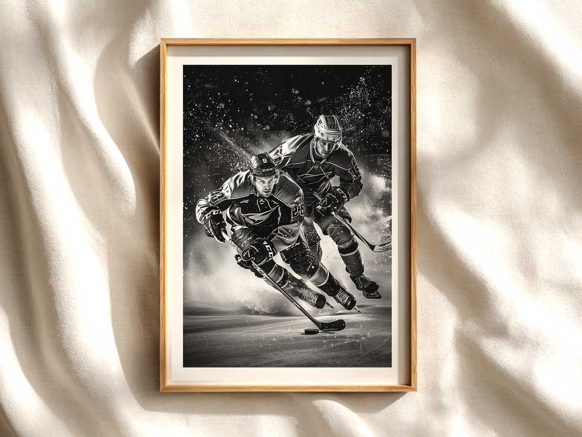
Hockey birthday party decorations often arrive loud, festive, and literal: pucks, confetti, cartoon sticks and instant-theme prints meant for a single evening. Reframing that same iconography for a permanent wall piece asks a different visual grammar. The trick is to keep the sport’s raw energy—the scar of a skate, the spray of ice, the cut of a jersey—and strip away anything solely event-driven so the image reads as art rather than a reminder of cake and balloons.
Begin by privileging the strongest signs of the game. A single, high-contrast silhouette of a stick and gloved hand, the diagonal arc of a shot frozen in mid-air, or a close crop of a helmet visor with reflected arena lights transforms novelty into narrative. These elements work because they suggest motion and intent without relying on textual party cues. The ice itself becomes a graphic field: rime, spray, and the cold sheen across a skate blade translate into textured surfaces that read beautifully at poster scale and hold up from across a room.
Color and contrast are the designer’s allies. Where party art tends to overuse primary brights, a wall piece benefits from disciplined palettes—one team color set against desaturated ice, a retro cream with muted red for a nostalgic mood, or stark black and white for modern minimalism. Jerseys and crests can be present as bold blocks of color or hinted at through cropped pennants and emblematic stripes; that restrained inclusion signals identity to a fan while keeping the composition elegant for non-sport spaces like studies and offices.
[IMAGE_INSERT_ARTICLE_01]
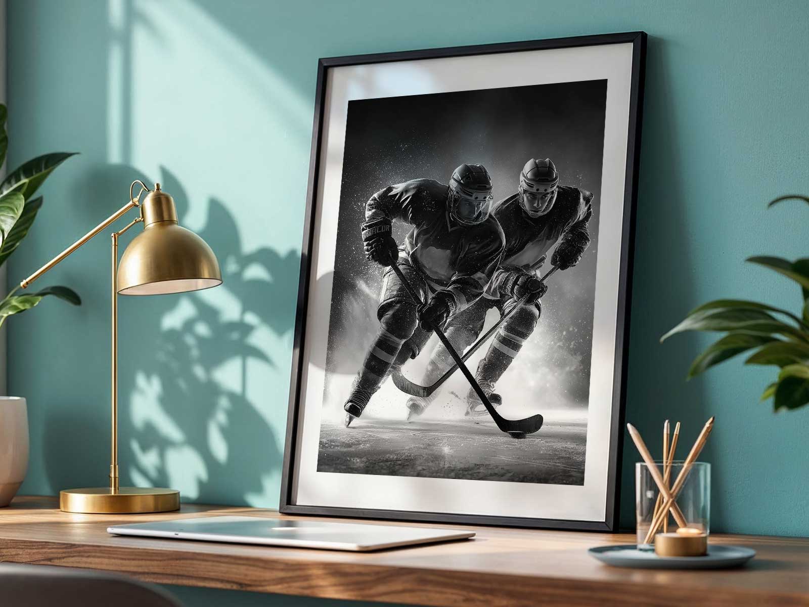
Compositionally, hockey is built for dynamic framing. The rink’s geometry supplies strong diagonals: boards, face-off circles, and goal frames give a poster structure, while player motion adds kinetic tension. A well-composed print will let a skate edge slice into the foreground, ice spray blossom into negative space, and a stick’s silhouette point through the frame—these lead the eye and make the piece readable from a distance yet richly detailed up close. Close crops reward attention with glove texture, scuff marks, and condensation on plexiglass; wider views recall arena atmosphere and communal memory.
The choice between retro and modern treatments determines mood. Retro treatments—muted tones, film grain, and deliberate weathering—evoke memory, suit collector walls and nostalgic bedrooms, and pair well with wood furniture and vintage jerseys. Modern treatments—high-contrast lighting, saturated team accents, and clean negative space—create a kinetic, arena-like presence that energizes game rooms, offices, or contemporary living rooms. Both approaches use the same visual vocabulary; they differ in tempo and texture.
Finally, think about living with the piece. A successful hockey wall print should anchor a room’s atmosphere—kinetic without chaotic, intense without clutter. It should read instantly as sport and image: identifiable from the doorway and rewarding at arm’s length. Avoid pun-heavy captions or overt party dates; let the photograph or illustration carry meaning through body tension, helmet silhouette, and the almost audible crash of ice. When crafted this way, a motif born for birthday décor becomes a lasting artifact: a poster that speaks to fan identity, design sensibility, and the austere beauty of the game.
Author: