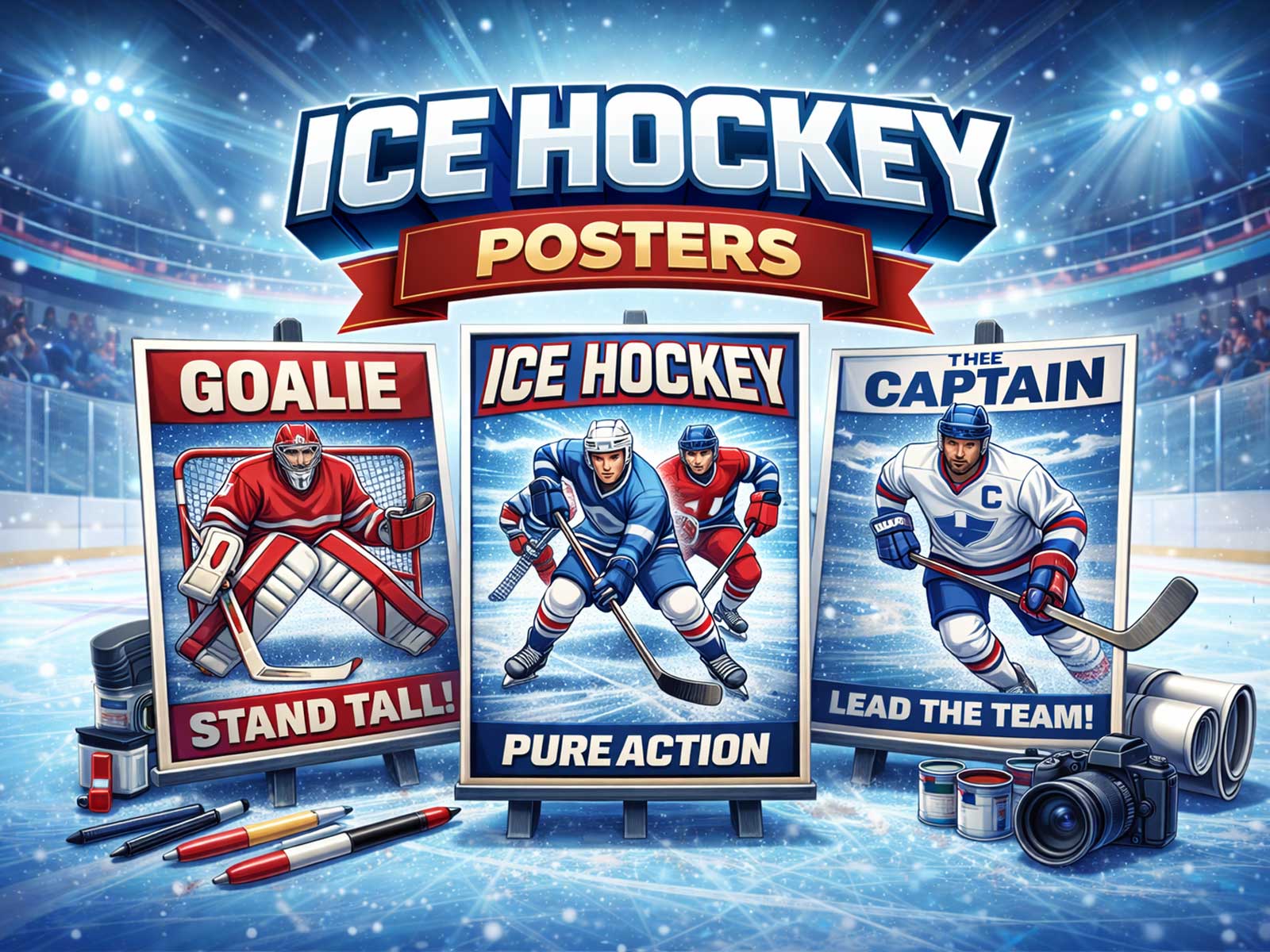
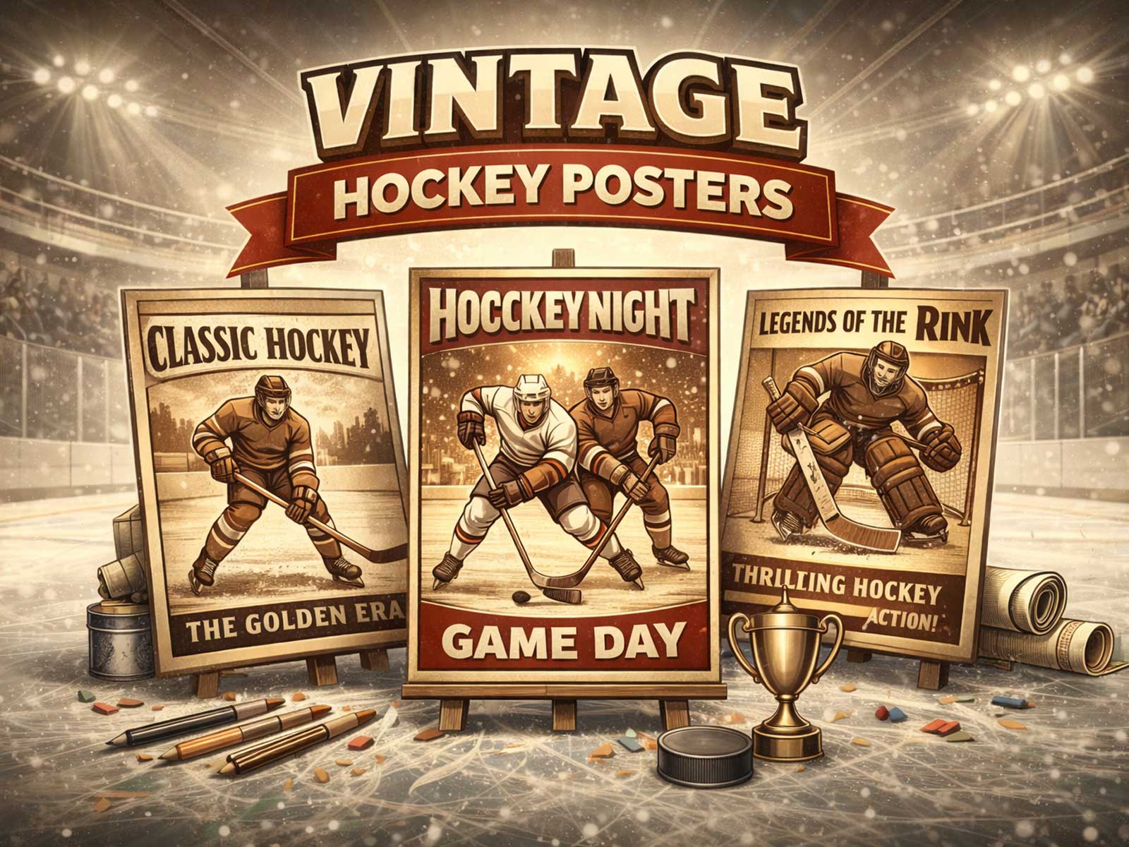
Hockey party decorations often start as bright, ephemeral signs: pennants, paper masks, confetti motifs and playful silhouettes meant to vanish with the last guest. Reframing that same visual language as wall art requires a different aim. Instead of celebrating a single event, a poster intended for room display needs a committed reading: to reveal motion, identity and atmosphere at first glance and reward the viewer with detail on closer inspection.
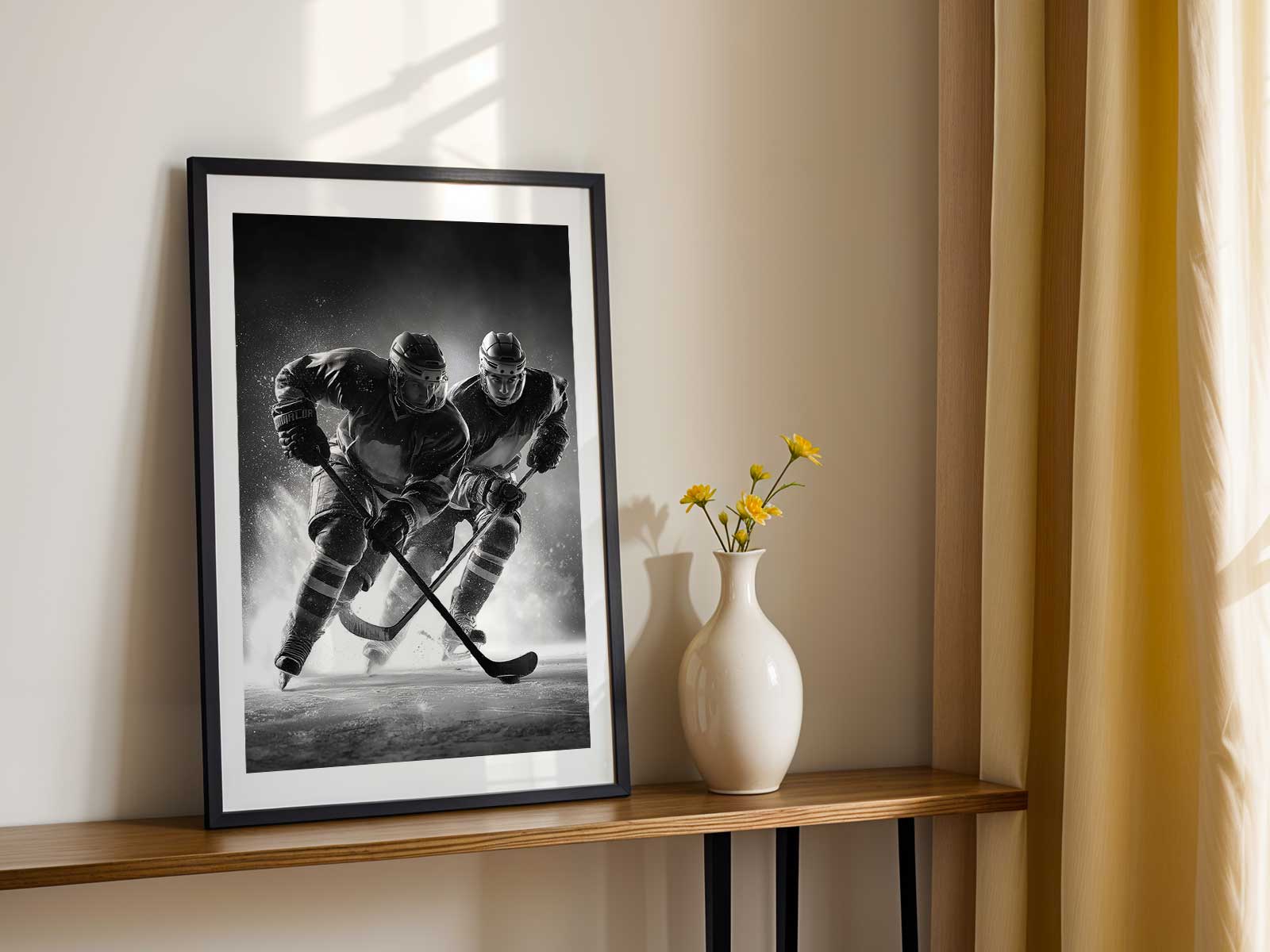
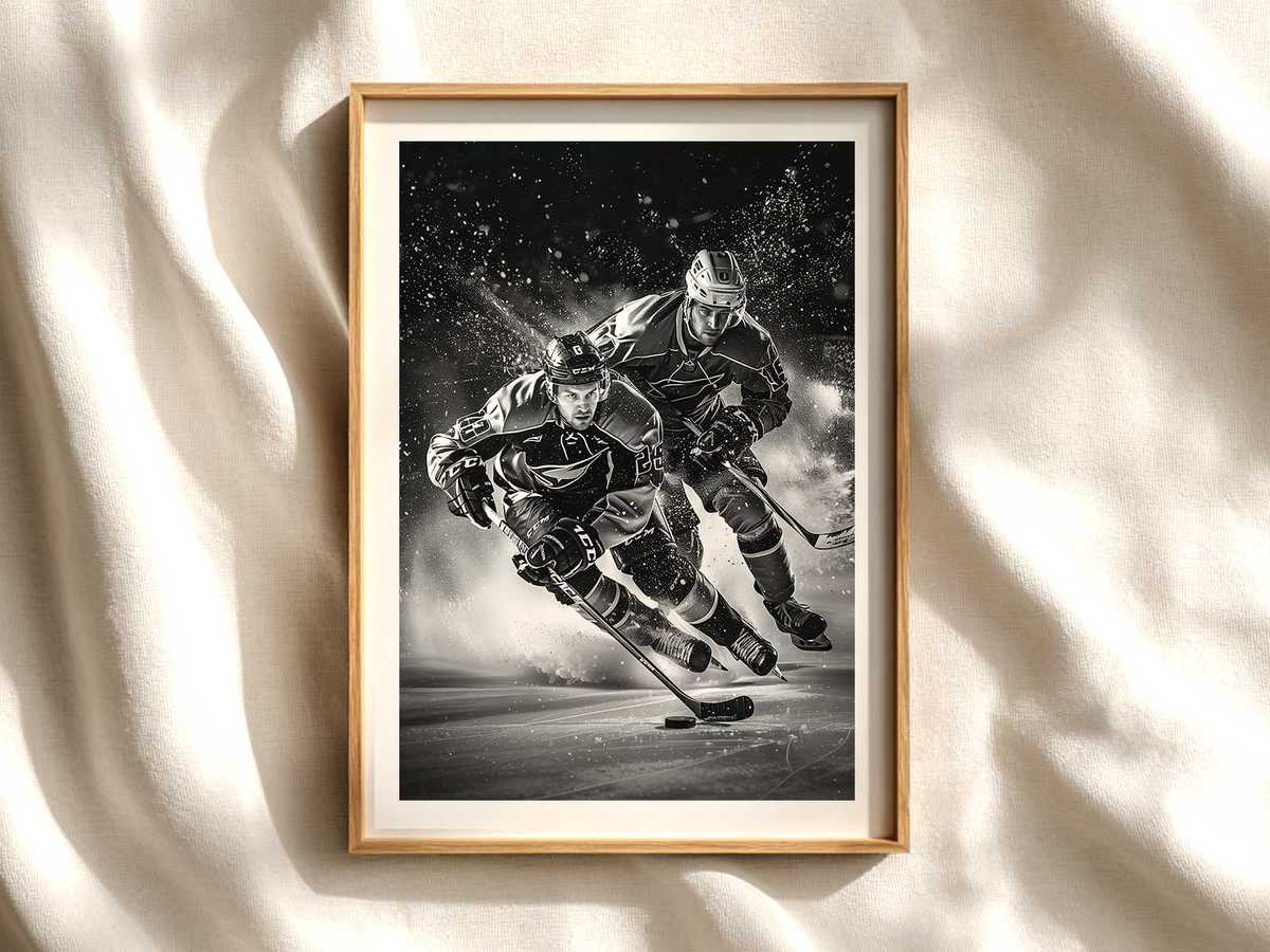
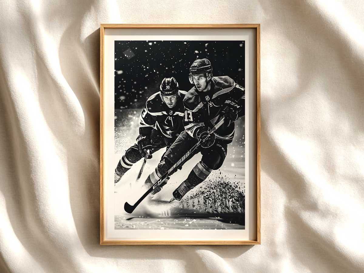
The strongest conversion from party icon to mural begins by privileging the game’s most legible signs — the blade slicing the ice, the spray of white crystals, the curve of a shoulder under a jersey, the negative space inside a helmet visor. These are not mere props; they are graphic anchors that translate well across distance. On a wall, a frozen instant of impact—skate digging in, puck on edge, torso twisted in a vital check—becomes a visual shorthand for speed and tension, communicating kinetic energy without the need for text or party clichés.
Color and contrast are the decorator’s allies. Party palettes that once relied on neon accents become more sophisticated when reduced to team-colour blocks and textured neutrals. A poster that uses a saturated stripe of team red or deep navy against bleached ice and shadowed boards reads clearly from across a living room while still offering subtle grain, stitching and logo detail at arm’s length. Jerseys and crests act as identity anchors; they give the eye a place to rest and invite collectors to place the piece among other memorabilia without overwhelming a space.
Rink geometry—boards, face-off circles, and the horizon-line of the arena—translates naturally into interior architecture. A composition that respects horizontal sightlines and leaves breathing space above a skate-spray arc will sit above a sofa or behind a desk without fighting furniture proportions. Conversely, vertical action shots emphasize height and movement, becoming a statement piece in narrow entryways or beside bookshelves. Lighting in the artwork matters as much as in the room: high-contrast arena light creates dramatic shadows and sheen on visors and helmets, giving a poster a gallery-like presence that still feels connected to the live-game experience.
[IMAGE_INSERT_ARTICLE_01]
Texture and finish decide how party-derived imagery ages as decor. Matte surfaces reduce glare and emphasize the frosted quality of ice, while a subtle gloss can enhance the shine of a stick or the wet look of a puck. Vintage-styled graphics, when used thoughtfully, evoke old-arena memory through desaturated inks and paper grain; modern treatments lean into minimalism with bold silhouettes and negative space. Both approaches work, but the successful piece always chooses a mood and commits to it—nostalgic warmth or crisp contemporary energy—so it integrates with room lighting and furnishings.
Finally, consider how the image reads at multiple scales. A wall poster should deliver an immediate emotional hit—speed, intensity, team pride—while rewarding closer inspection with small pleasures: the fray of a jockstrap, the mirrored reflection on a visor, the pattern left by a skate blade. When party iconography is pared down to these durable visual elements, hockey wall art stops being seasonal decor and becomes a lasting piece of visual culture that animates bedrooms, studies, fan caves and galleries alike.