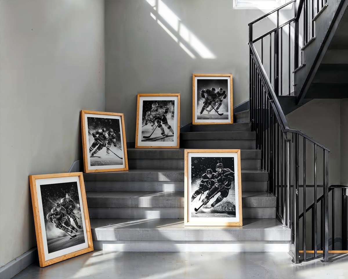
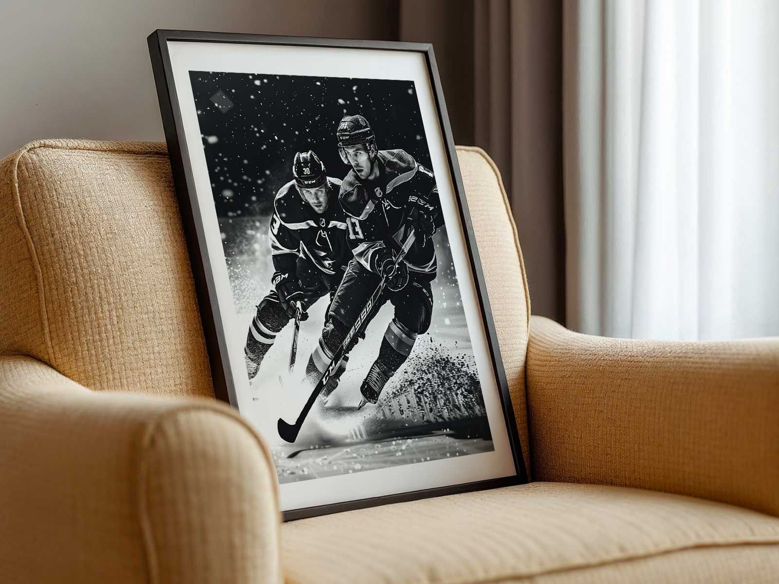
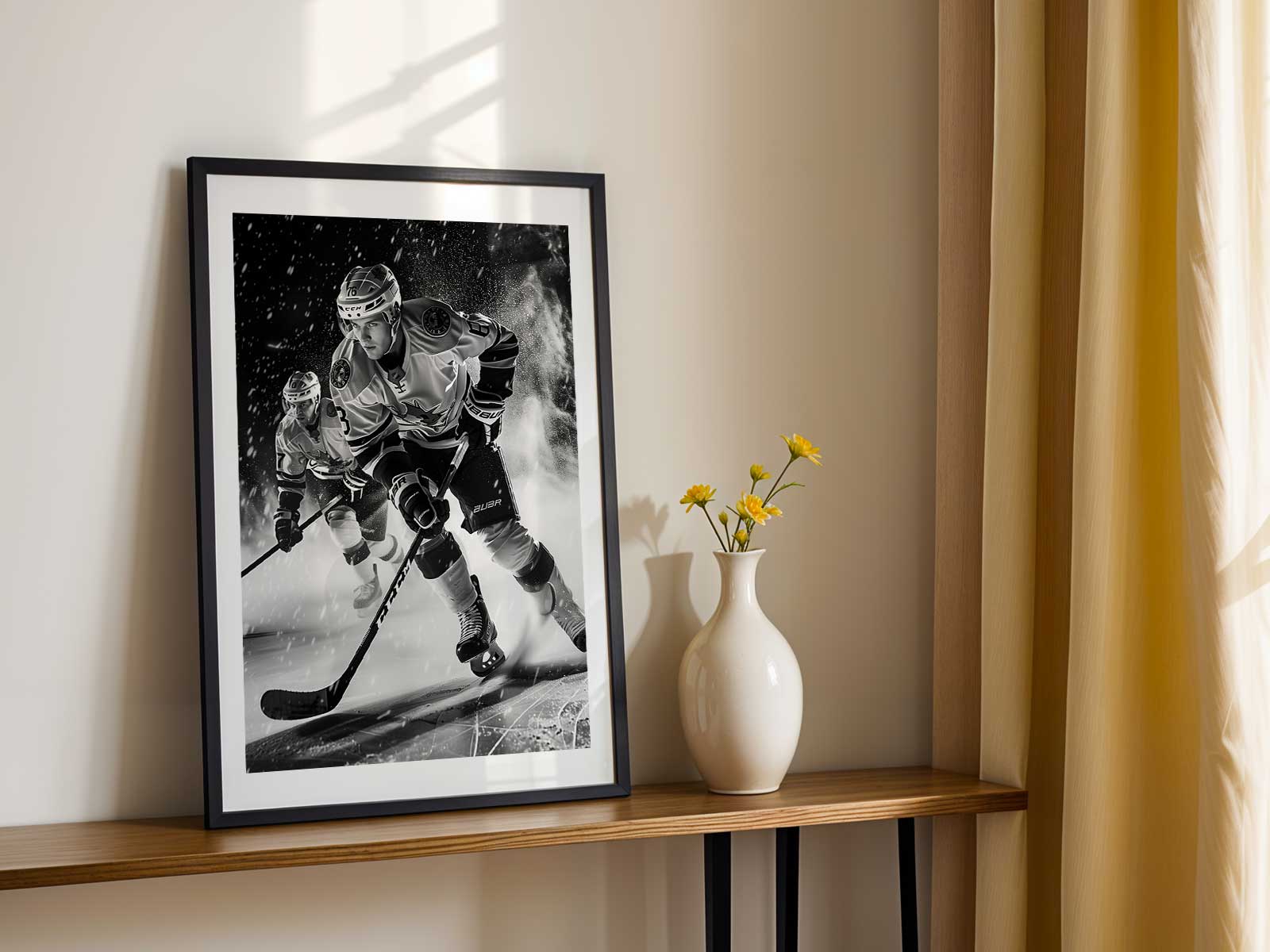
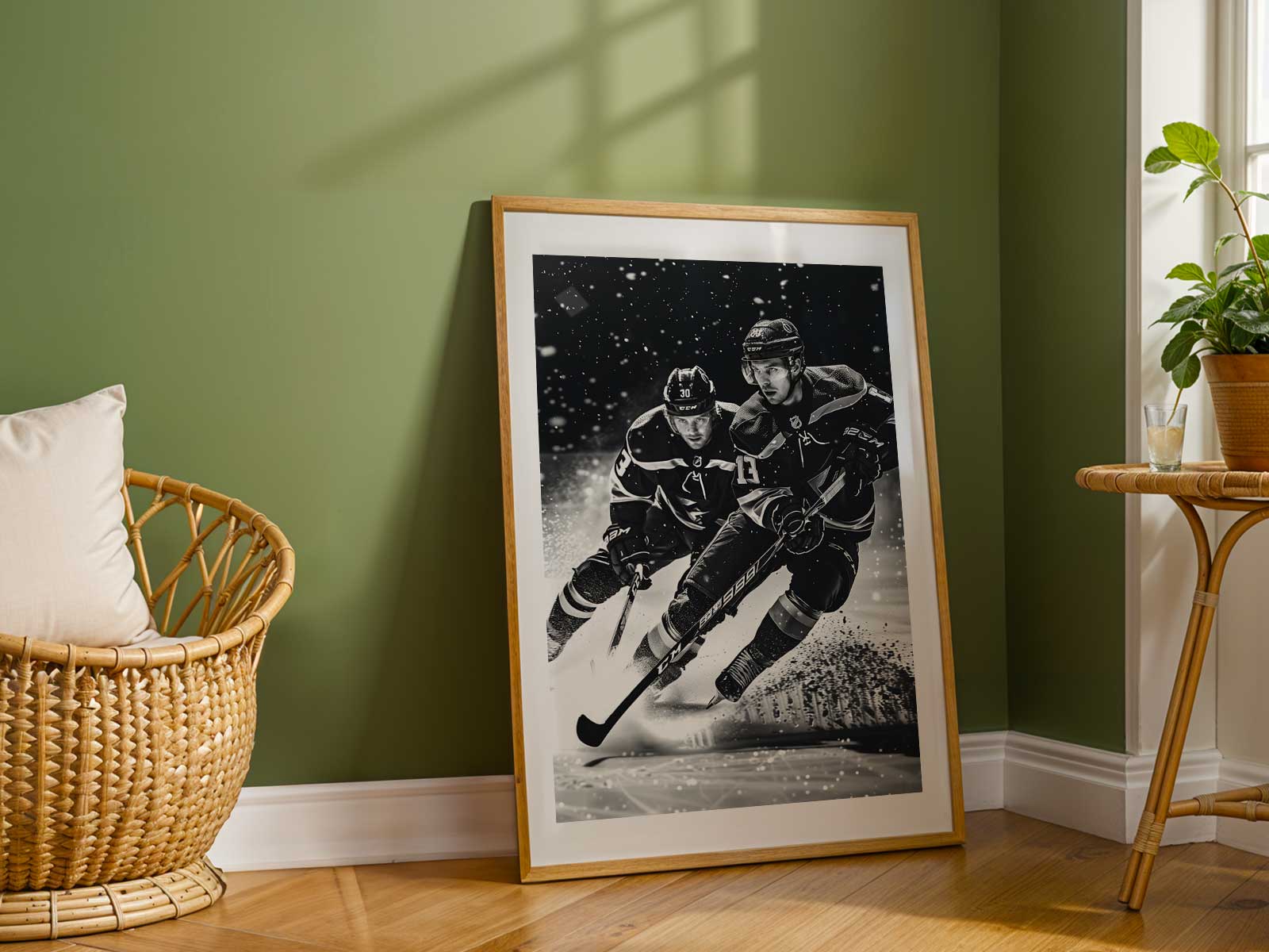
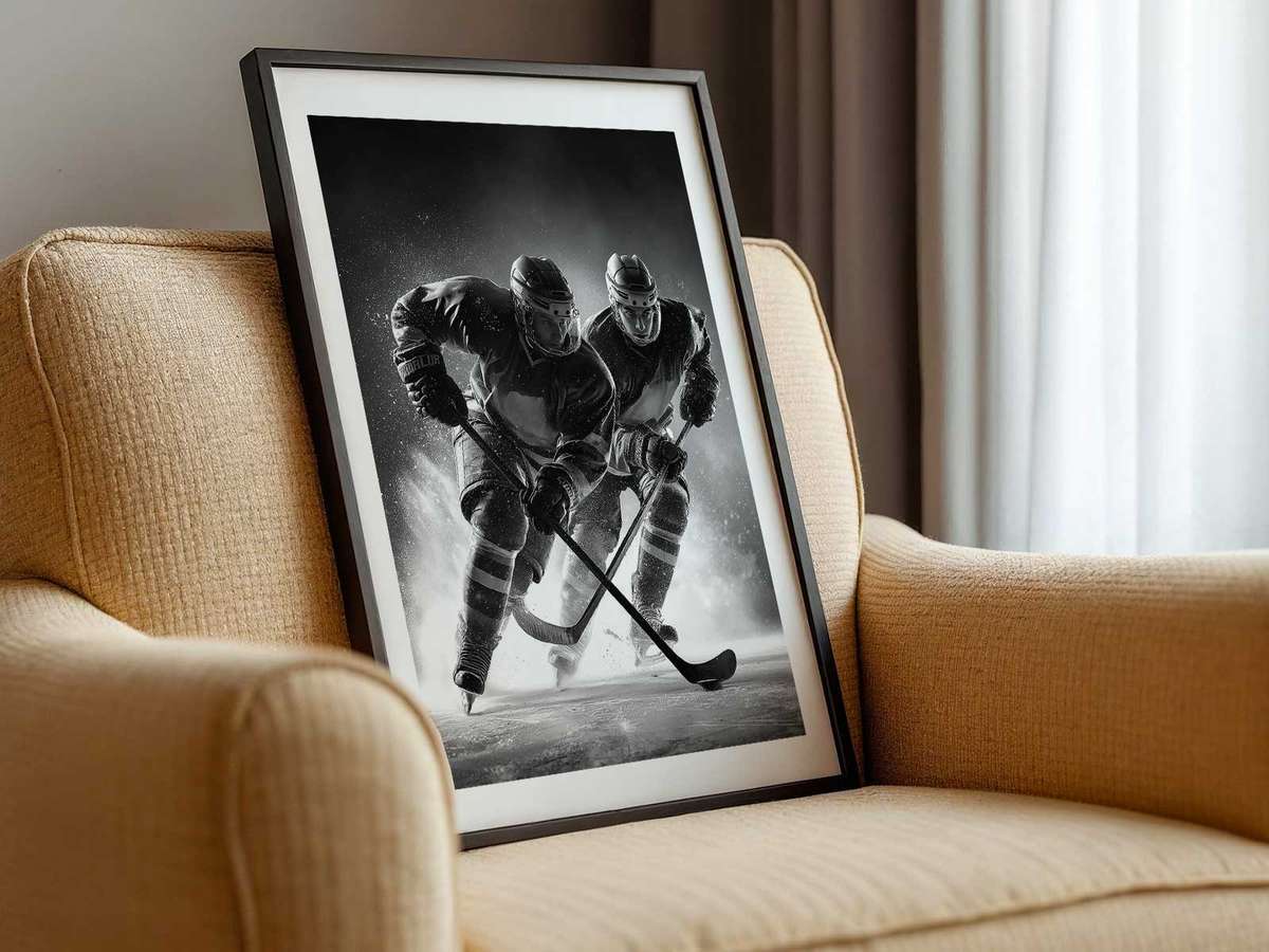
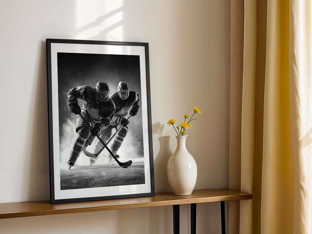
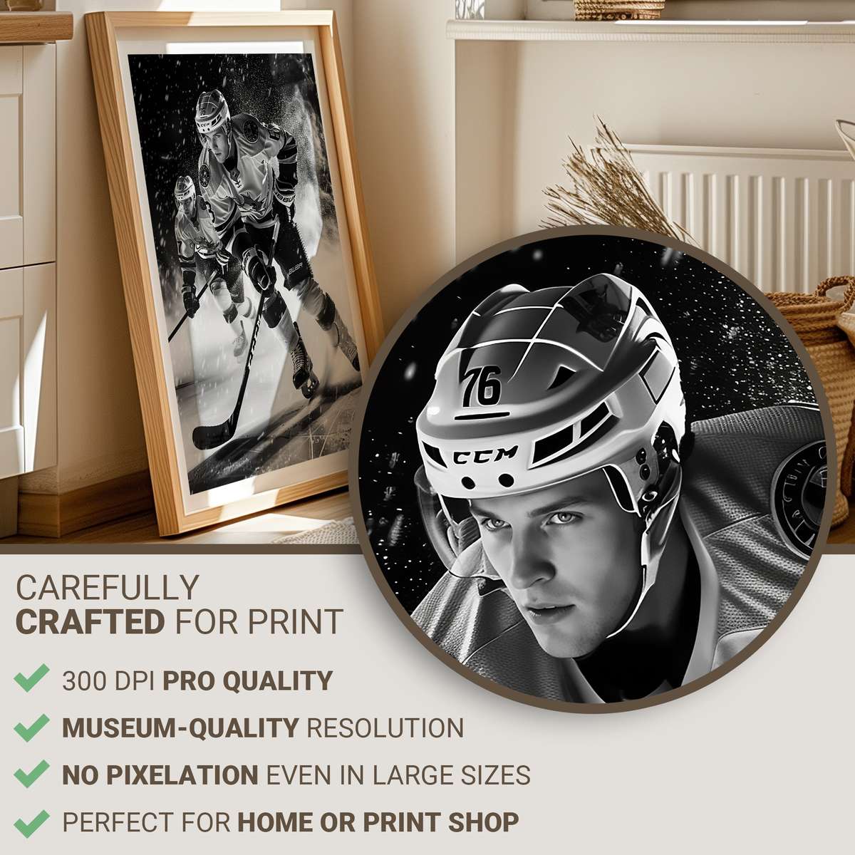
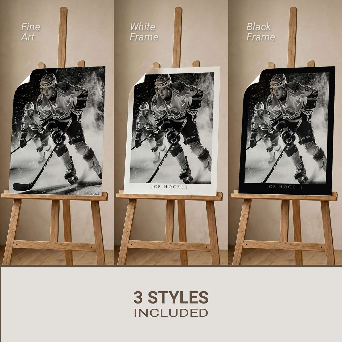
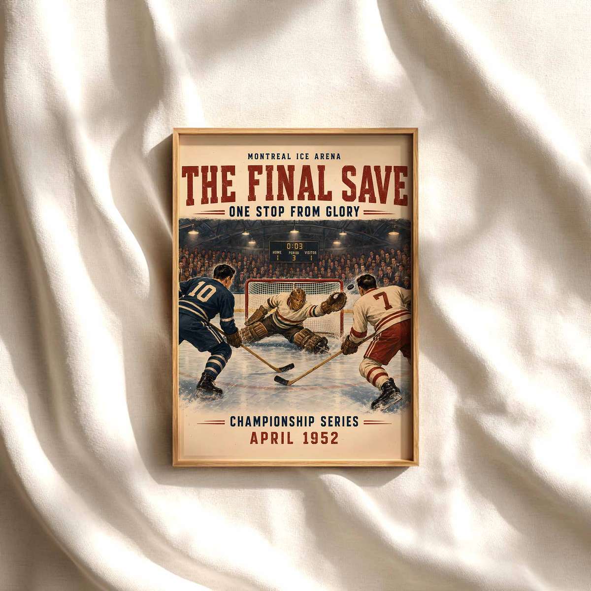
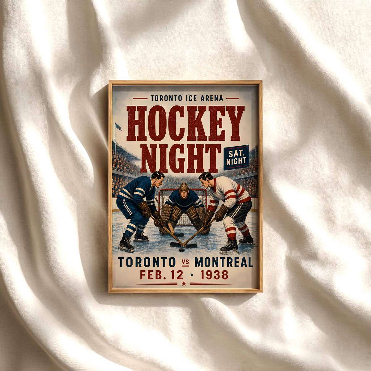
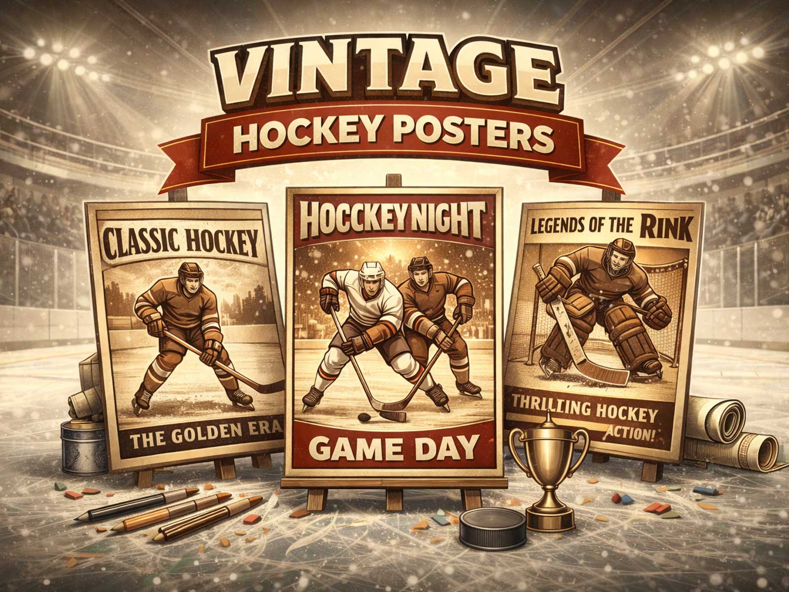
What makes a vintage hockey poster feel like more than a picture of the game? The answer lives in a handful of visual decisions that read like cultural shorthand: an archival-inspired palette that has lost its glare, a typography and layout that borrow from old print systems, the quiet geometry of a rink when crowds were part of memory rather than spectacle, and the subtle language of sweaters, crests and equipment that signal era without spelling it out. Read as a visual document rather than a mere illustration, a heritage-led hockey poster offers atmosphere, restraint and identity—qualities that make it as useful to an interior as it is to a collector.
At the heart of the poster’s authority is color. Instead of today’s saturated primaries, period-minded hockey art prefers a restrained, slightly sun-washed palette: tobacco browns, bottle greens, muted crimson, and rink-ice greys that suggest printed inks aged on paper. These tones do more than look old; they locate the viewer in a visual history of printed sports ephemera. When a red is tempered and a blue loses its electric edge, the image acquires a sense of time and tactility that modern gloss cannot replicate.
Equally decisive is typographic character. The best vintage-led posters use type like an editorial would—hand-set feeling headline blocks, condensed sans serifs that read like locker-room signage, and modest hierarchy that avoids modern bravado. Letterforms that hint at pre-digital typesetting or mid-century commercial printing anchor the poster’s voice; they tell the eye this object belongs to an older design logic where clarity and restraint mattered as much as energy.
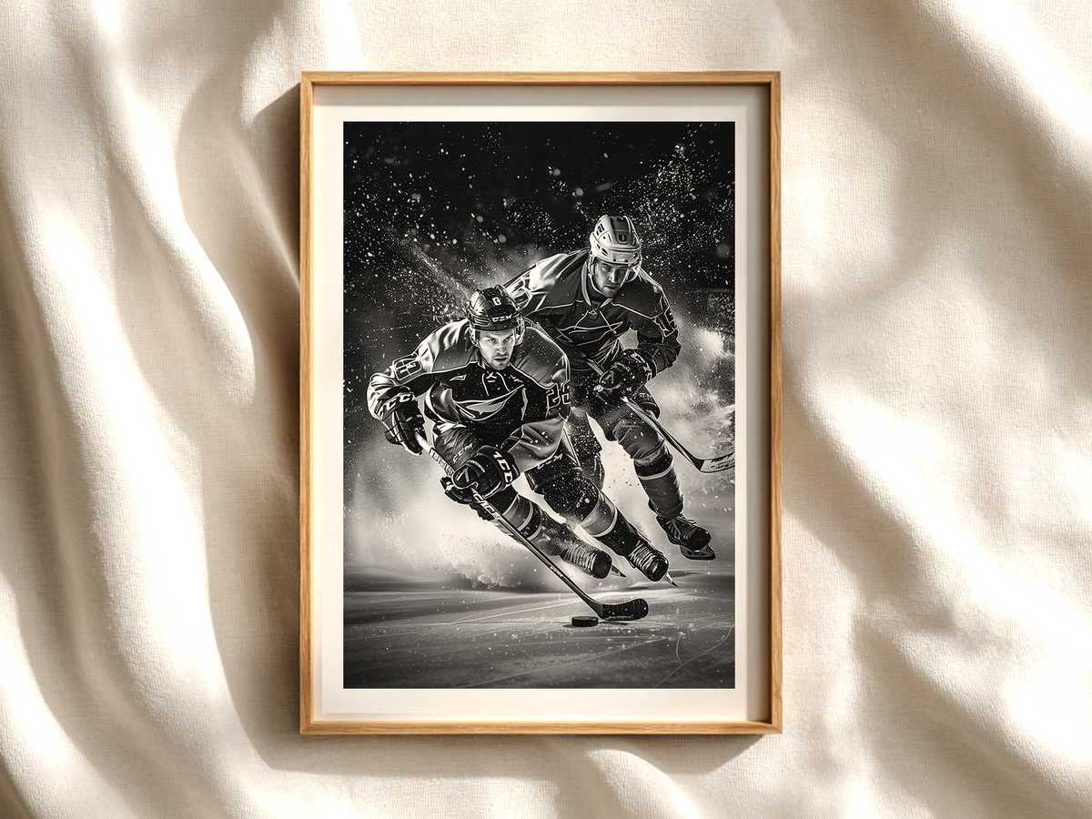
Composition and the suggestion of arena space do the emotional work. Rather than a wallpaper of crowd shots and flashy effects, heritage hockey imagery often returns to simple, architectural cues: the sweep of boards, the cold sheen of the ice, the open negative space of neutral zones. That quieter rink atmosphere—colder, narrower, and more intimate than contemporary spectacle—evokes the memory of real games lived up close. It’s not nostalgia for nostalgia’s sake but a visual promise: this piece remembers the game’s tactile environment.
[IMAGE_INSERT_ARTICLE_01]
Small costume and equipment details provide conviction without literalism. The silhouette of a classic sweater, the blocky shape of an older crest, the proportion of a wooden stick or bulkier glove read as signs rather than labels. These elements suggest continuity with team traditions and era-specific style while keeping the poster within the realm of visual interpretation rather than documentary claim. That restraint is what separates a heritage-led image from a generic retro gimmick—specific cues used sparingly, not a parade of clichés.
Texture and paper impression matter. A printed-paper character—subtle grain, simulated press marks or the suggestion of deckled edges—gives the piece a tactile dimension. Even when the work is a contemporary reproduction, these touches imply an object that has lived: passed between hands, hung in a hallway, collected over time. The collector appeal arises not from contrived rarity but from the visual discipline that makes the poster feel like an heirloom object in a modern interior.
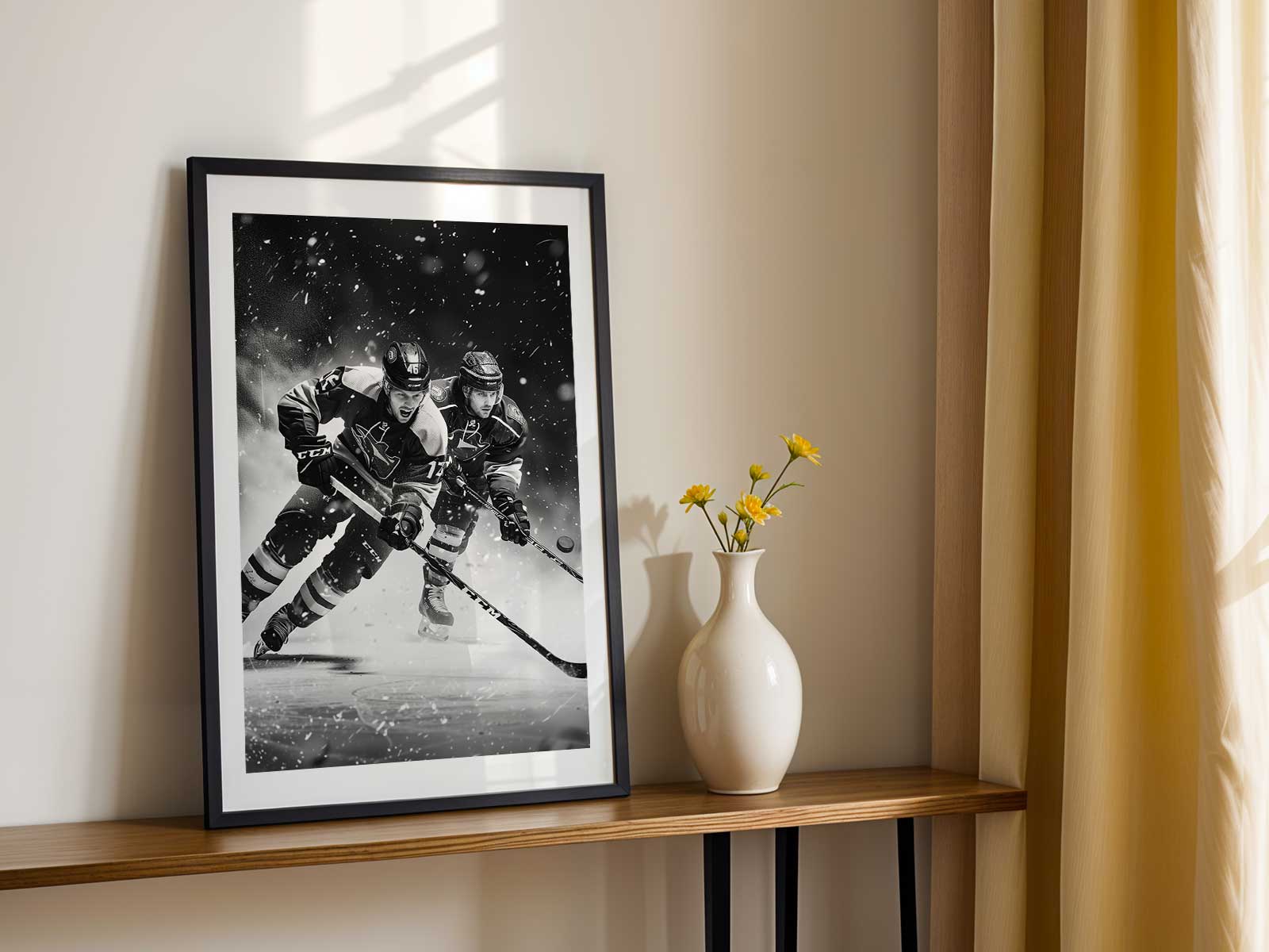
In a room, this kind of poster changes mood through tone rather than volume. Hung above a desk, it lends focus and a calm civic pride; in a den or game room it signals long-term attachment rather than temporary fandom; on a collector wall it plays a quiet counterpoint to more saturated pieces. Because the imagery is restrained, it integrates easily with mid-century furniture, a leather chair, or a layered gallery wall—helping a space feel lived-in, purposeful, and rooted in a cultural history of the sport.
Ultimately, the lasting appeal of a vintage hockey poster is not that it is old, but that it speaks with visual discipline: period-minded palette, archival typography, arena atmosphere, and thoughtful costume cues. These elements together create an object that carries emotional weight without shouting, one that signals identity and memory through tone and composition. For anyone building a fan room, study, or collector display, choosing a heritage-led poster is a way to add depth and provenance-like feeling to a space without relying on obvious branding or trend-driven effects.