Hockey birthday decorations begin life as festive shorthand: pucks, jerseys, cartoon sticks and cheerful crests arranged to celebrate a moment. The same visual vocabulary, when stripped of its party ribbons and reframed for the wall, becomes a powerful piece of decor. The trick is not to strip away the fun but to privilege the strongest signs of the game — motion, impact, light on ice, and emblematic silhouette — so a graphic conceived for a single night reads credibly as a long-term piece of art.
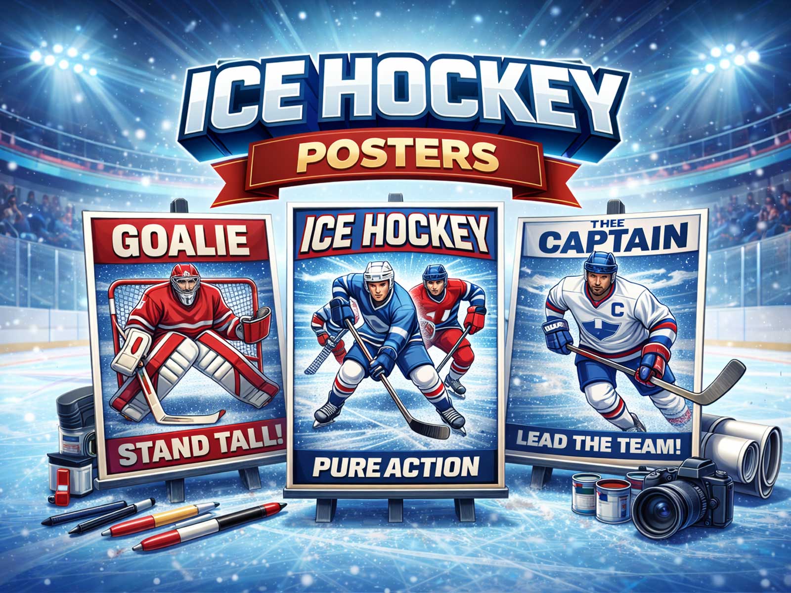
What makes hockey so naturally suited to wall art is its elemental geometry and high-contrast imagery. A rink is a widescreen stage: hard lines of blue and red, the bright sweep of arena lights, and the flat, reflective surface of ice that throws back colour and texture. Reduce a birthday banner to those essentials — the spray of a turn, a player’s shoulder and stick in silhouette, the grain of frozen ice — and you have an image that reads instantly from across a room and rewards inspection up close.
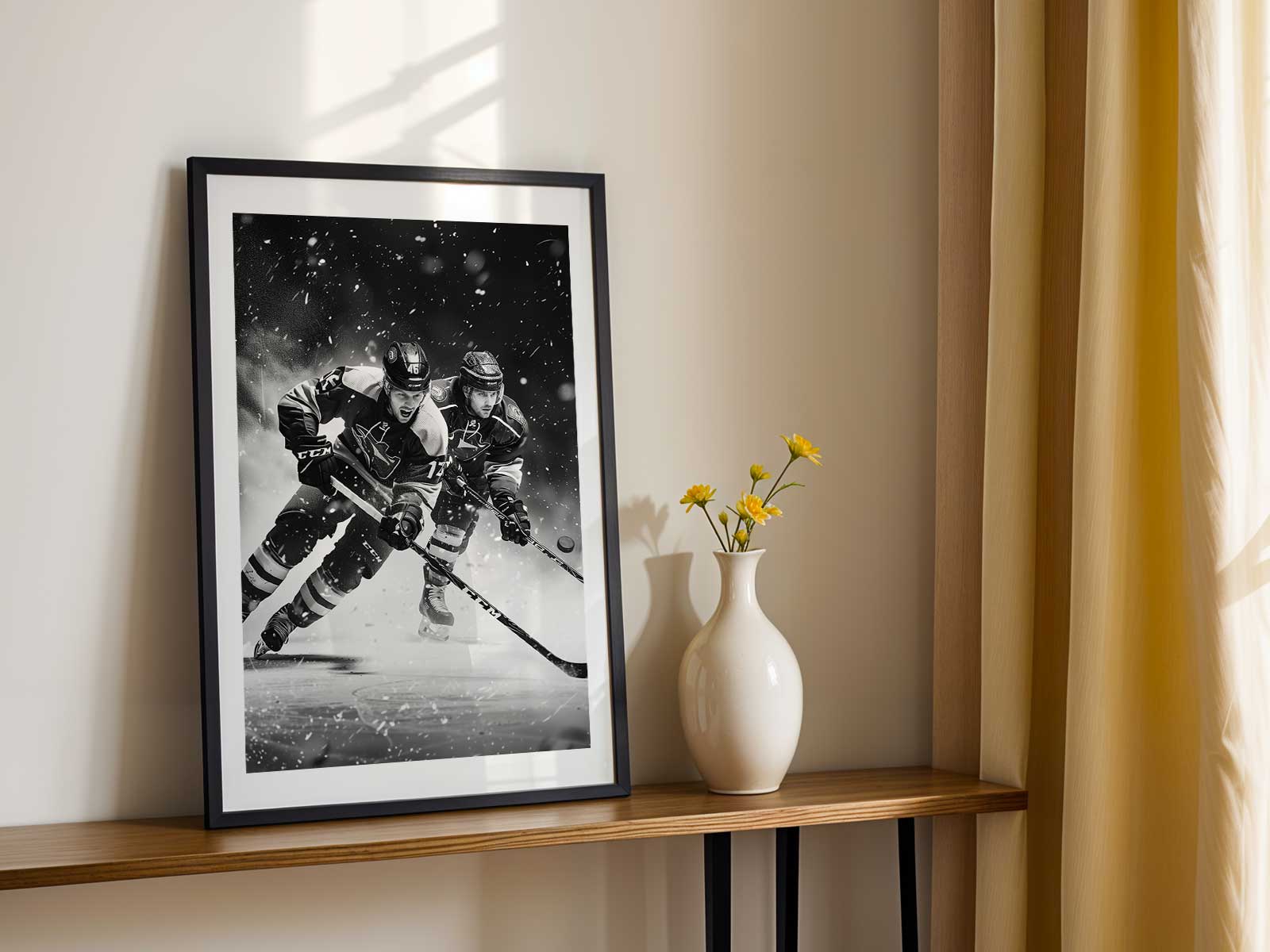
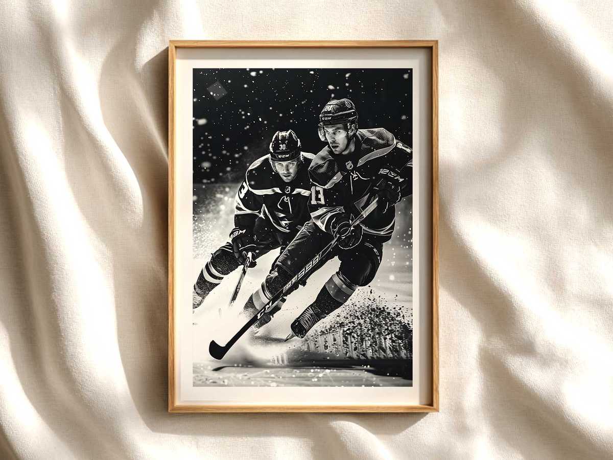
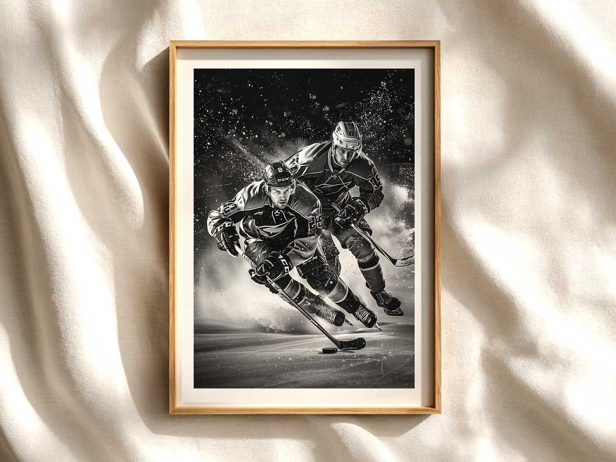
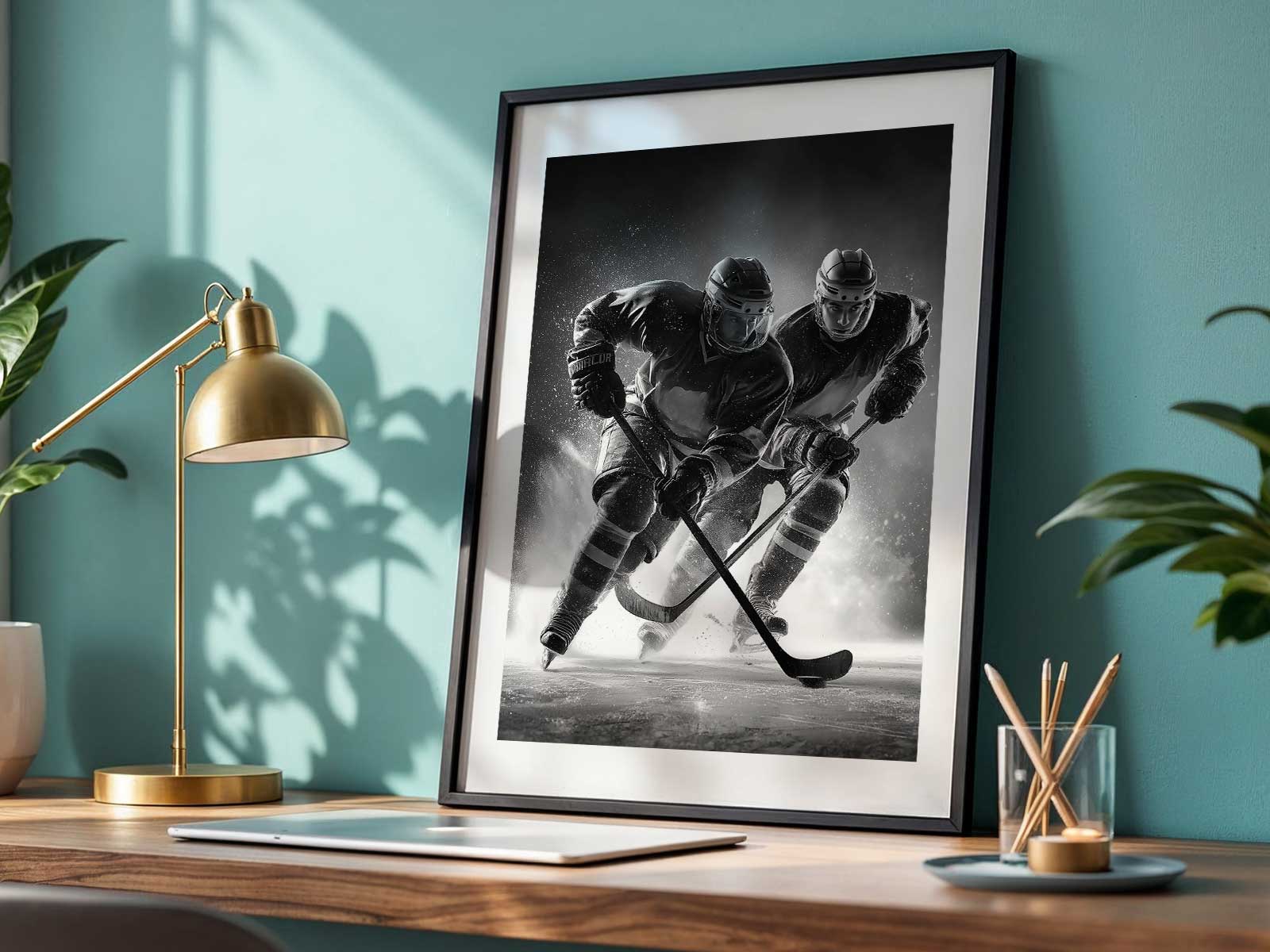
Motion is the first language of hockey wall art. Instead of a static athlete posed for a party photo, choose a frozen instant where bodies tell the story: a blade carving, an arc of ice spray captured mid-flight, a puck blurred into velocity. That kinetic fragment gives the poster a narrative without needing teams, dates, or text. It transforms playful iconography into something cinematic and alive, the kind of piece that brings a study or game room into motion even when the lights are low.
Colour and contrast are the visual anchors. Birthday graphics often overload with decorative elements; pared down, the same palette can be architectural. A strong jersey block against neutral ice, a crest reduced to a bold shape, or a helmet and stick rendered as black silhouette against arena light all translate into readable shapes on a wall. Those shapes maintain identity — team-pennant energy or retro charm — without demanding literal team allegiance, making the artwork flexible for different room moods.
[IMAGE_INSERT_ARTICLE_01]
Texture matters: ice is not just white. It is a field of tiny scratches, spray, and reflected light. Good wall art amplifies that tactile quality so the surface feels atmospheric at a distance and richly detailed up close. That contrast between the broad graphic forms (jersey, stick, rink lines) and the delicate ice texture is what keeps a poster interesting for years, turning a seasonal motif into something archival and collectible.
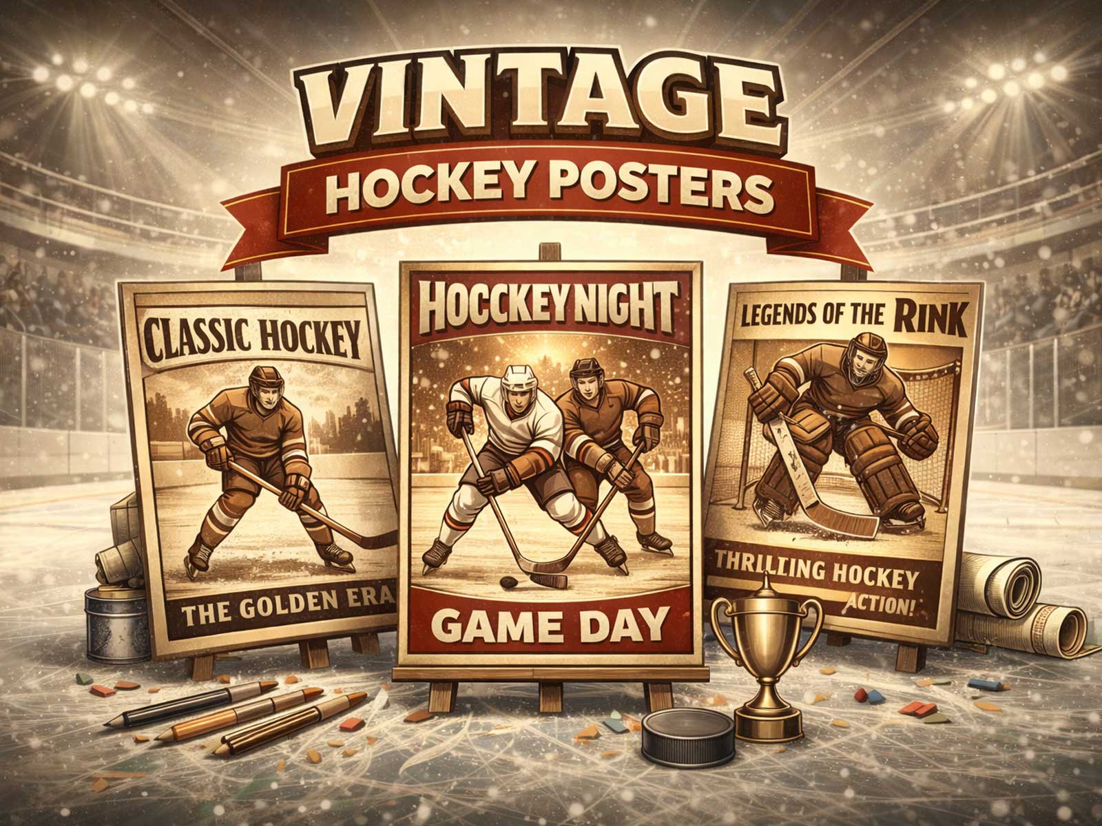
Consider the era the artwork evokes. A retro-inspired poster retains party warmth — simple type, flat colours, vintage crests — but when reoriented for the wall it should lean into nostalgia through aged paper tones, softer contrast, and classic composition. A modern interpretation uses hard light, high contrast, and negative space to create an arena-like intensity. Both approaches can come from birthday-icon elements, but the choices you make about grain, contrast, and composition determine whether the piece reads as ephemeral or permanent.
Finally, think about room placement and atmosphere. A kinetic, high-contrast piece brings energy to a game room or office; a textured, softer retro print creates a contemplative vibe for a hallway or bedroom. Because hockey imagery naturally occupies a broad tonal range — from the clinical brightness of ice to deep shadowed jerseys — it integrates easily with varied interiors and lighting. A single poster can anchor a collector wall, sit above a desk as a focal point of motion, or hang over a couch to introduce arena scale without overwhelming the space.
When you rework hockey birthday decorations for true wall art, you’re asking not what the image says about a party, but what it says about the sport’s visual essence. Prioritise motion, silhouette, ice texture, and colour blocks; remove the ephemeral trappings; and you keep the celebratory spirit while gaining a piece that endures in any room as a deliberate, readable object of design.