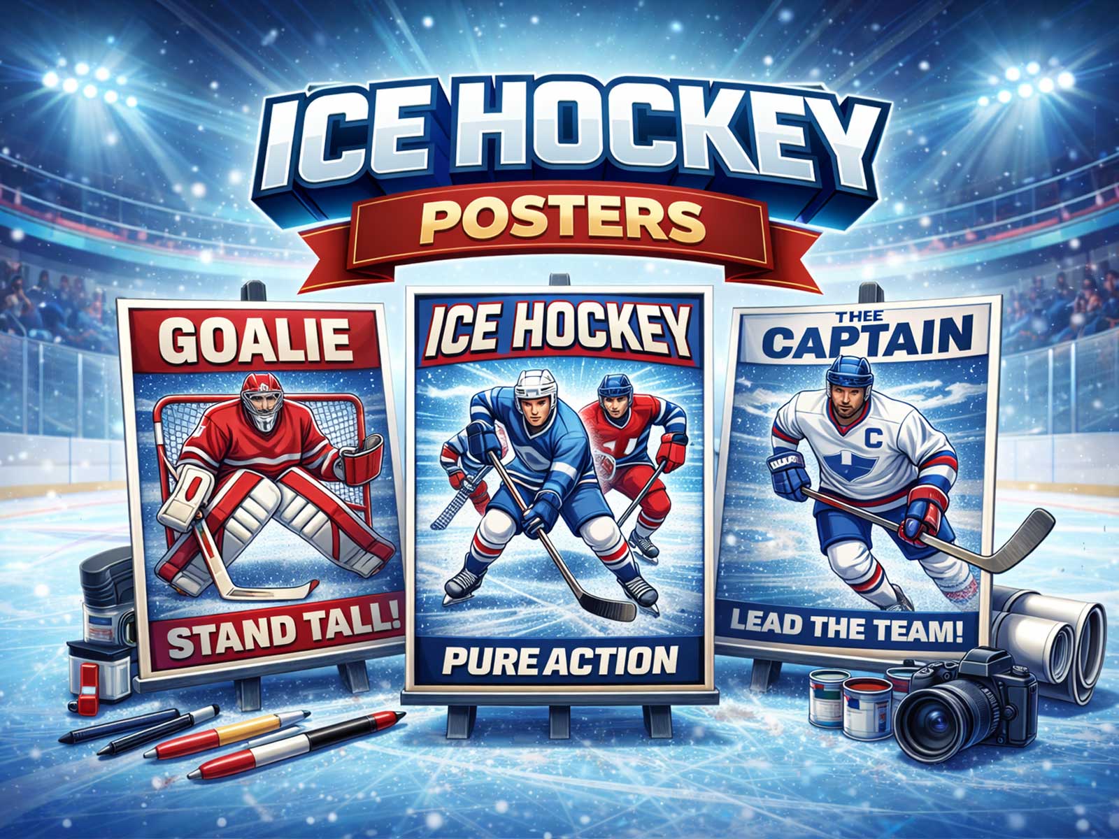
Hockey has a visual language that translates to striking wall art: the mirror-flat ice, sudden gestures frozen mid-stride, and a density of emotion that reads instantly from across a room. A great NHL poster captures an instant that is both graphic and cinematic — a bracing contrast of light and shadow on the rink, a burst of ice spray, the clean geometry of blue lines and boards, and the taut silhouette of a player at full extension. Those elements make hockey posters readable at a glance and endlessly rewarding up close.
The sport’s palette and textures are unusually poster-friendly. Team colors and crests offer bold blocks of hue that punctuate composition; jerseys become graphic shapes against the pale, reflective plane of the ice. Rink lighting creates high-contrast highlights and long, dramatic shadows that enhance depth without cluttering the image. Even the smallest details — the tip of a stick, the curve of a visor, a dropped glove — become compositional anchors that guide the eye from a distance into texture and motion.
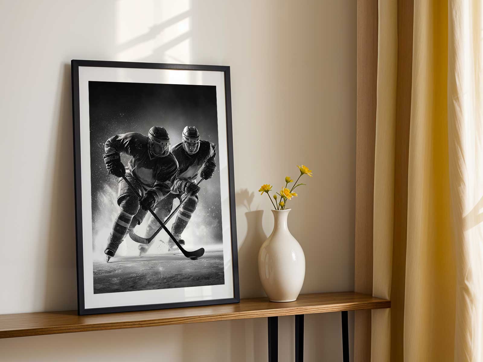
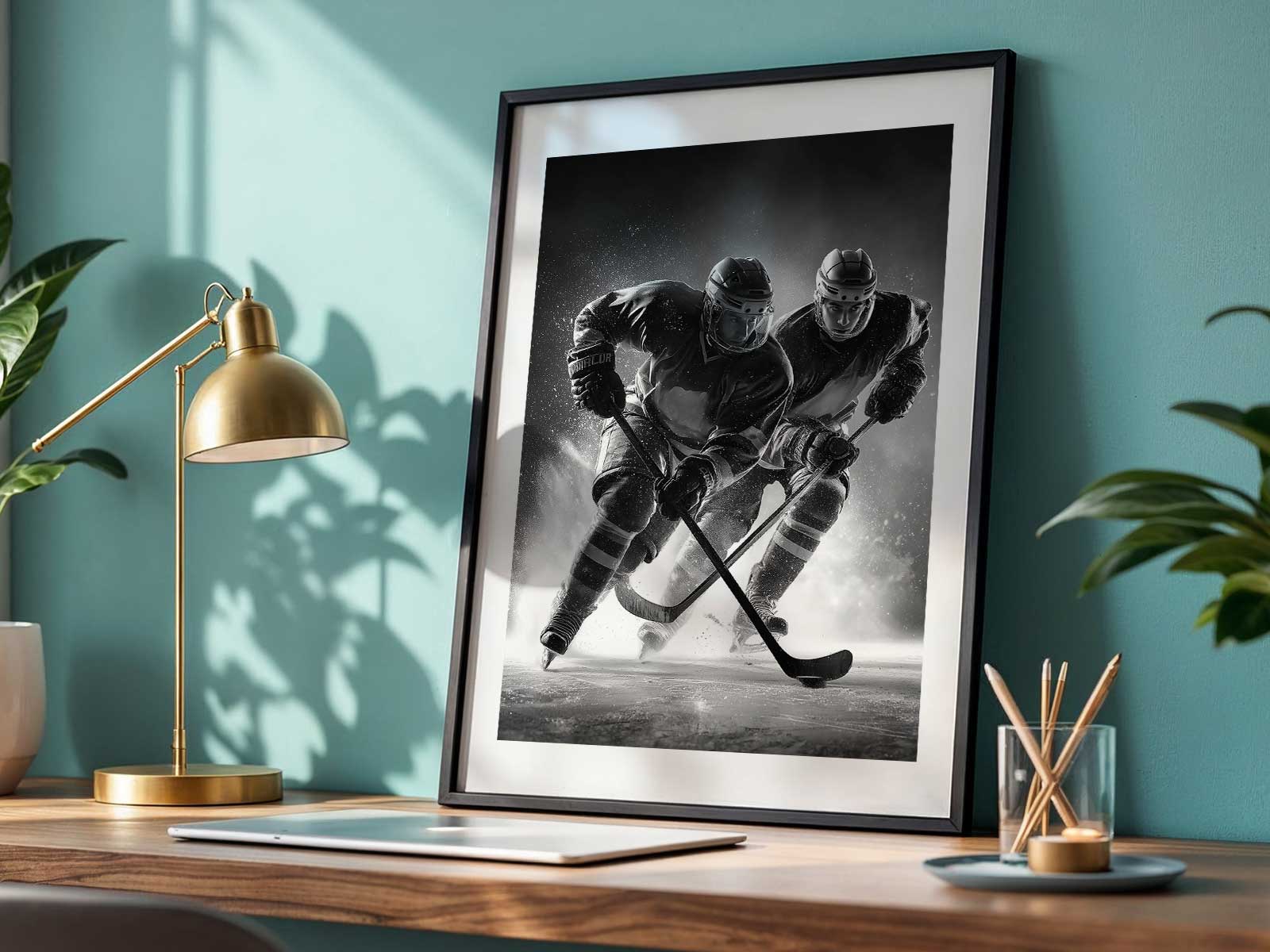
Motion in hockey is compressed and legible. Skates carve arcs, pucks flash like black punctuation, and sprays of ice act as natural graphic flourishes. When an artist or photographer freezes one of those micro-explosions, the result reads like a sculpture in two dimensions: body tension captured at the precise moment before impact, blades slicing light, jerseys billowing in a gesture of speed. That frozen violence has a clarity that makes the poster energetic but not chaotic — it carries drama while remaining visually ordered.
[IMAGE_INSERT_ARTICLE_01]
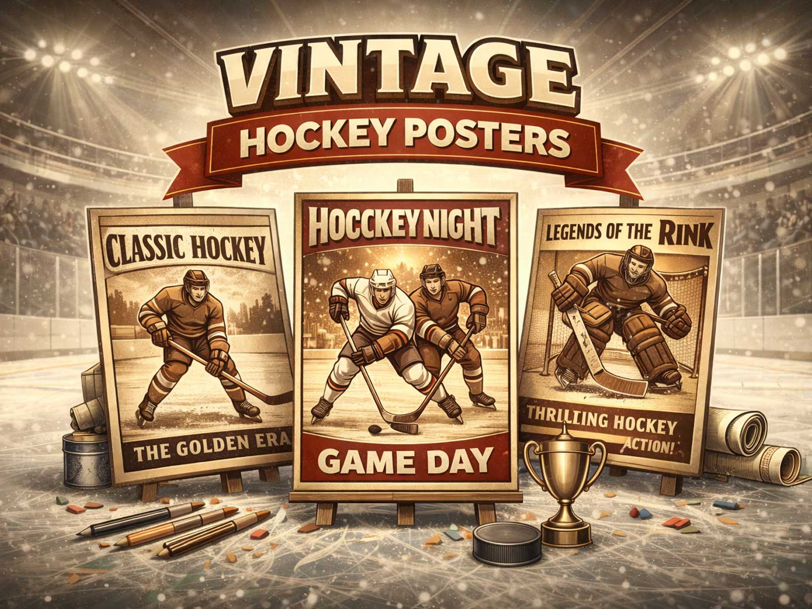
Hockey posters also straddle modern and vintage moods with ease. Minimal, contemporary prints rely on flat color, negative space, and crisp typography for a refined, design-forward statement. Conversely, retro-inspired posters lean into grain, warm tonality, and the patina of old arenas to evoke memory and nostalgia. Both approaches benefit from the sport’s inherent geometry: the rink’s lines, the circle of the faceoff dot, and the rectangular board frames provide compositional scaffolding that designers can exploit for both restraint and swagger.
Beyond pure form, hockey art resonates because it converts collective identity into a single image. A crest or kit alone can trigger a fan’s memory of a specific season, a game-winning rush, or an arena smell. In interiors, that recognition is subtle but potent: a poster in a study can lend an atmosphere of focus and competitive energy; in a game room it amplifies the communal rush; in a bedroom it can feel quietly aspirational. The visual clarity of hockey imagery — strong silhouettes, readable color blocks, and decisive gestures — ensures the piece remains effective at different viewing distances and in varied lighting conditions.
Collectors and design-minded buyers appreciate how hockey posters reward layered viewing. From afar the composition reads as a bold emblem; up close the viewer discovers texture in ice spray, stitching on a jersey, or the reflective sheen of a helmet. This duality — immediate impact and intimate detail — is why the sport translates so well to wall art. The image brings movement into a static space, turns cold light into warmth through color and memory, and supplies an atmosphere that can be kinetic, nostalgic, or quietly authoritative depending on the treatment.
In short, hockey posters work because they combine elemental visual forces: motion, contrast, identity, and texture. Whether your room aims for modern restraint or retro warmth, a well-composed NHL poster establishes mood, arrests attention, and keeps rewarding the eye over time.