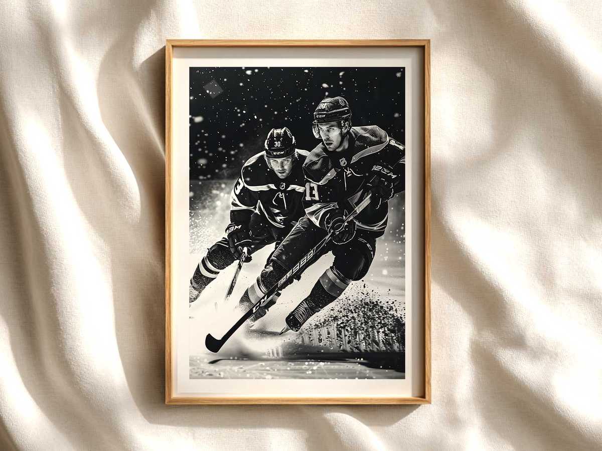
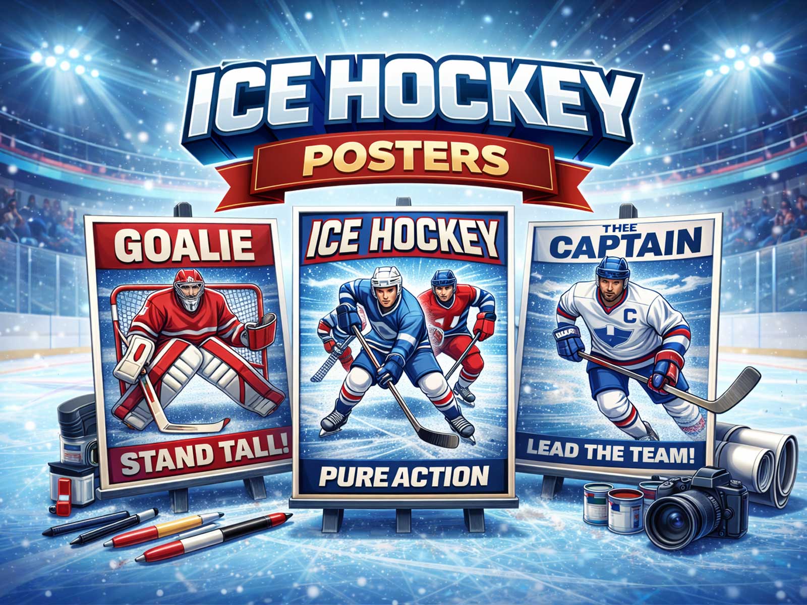
Hockey translates to wall art more naturally than most sports because its visual grammar is compact, high-contrast and immediately legible. A single poster can give a hockey themed bedroom a clean dose of kinetic energy without crowding the space: the rink’s reflective planes, the upright language of players and sticks, and a clear center of tension combine to read across a room at a glance while rewarding close inspection.
Begin with ice. Glazed surfaces and spray capture light in ways that make a two‑dimensional print feel like a slice of atmosphere. Thin, cool highlights across a poster mimic overhead arena lighting and create a luminous band that pulls the eye. This bright strip acts like a visual skylight in a bedroom: it lifts the composition and prevents the piece from visually weighing down a wall, even when team colours or dense action fill the frame. Ice reflections also introduce texture without clutter—subtle grain, streaks, and scattered light that look purposeful from a distance and tactile up close.
Verticality is the second secret. Hockey’s human forms—players upright on skates, sticks pointing, goal frames rising—read as strong, simple shapes. That vertical silhouette language complements bedroom elements such as bookcases, curtains, or floor lamps rather than competing with them. A poster that emphasizes long lines—extended stride, the arc of a stick, a goalie’s stance—creates a sense of elevation and motion that lengthens the room visually. This is why many successful designs avoid frenetic clutter and instead isolate a few tall figures against negative space: the result is an energetic focal point that keeps the rest of the decor calm.
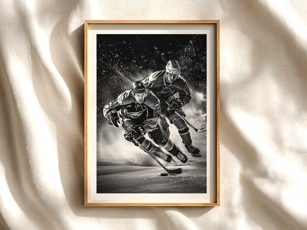
Visual tension is the third element that makes hockey art so effective in living spaces. Tension in a poster can be immediate and easy to read: a puck about to be shot, a player converging on a defender, the compressed coil before a save. Because hockey is played in split seconds, these instants feel dramatic but compact; they communicate action without needing a busy, multi-subject layout. A well-composed poster uses directional lines—the blade of a stick, the gaze of a player, streaks on the ice—to lead the viewer’s eye and create a stored energy that seems to vibrate against the wall.
[IMAGE_INSERT_ARTICLE_01]
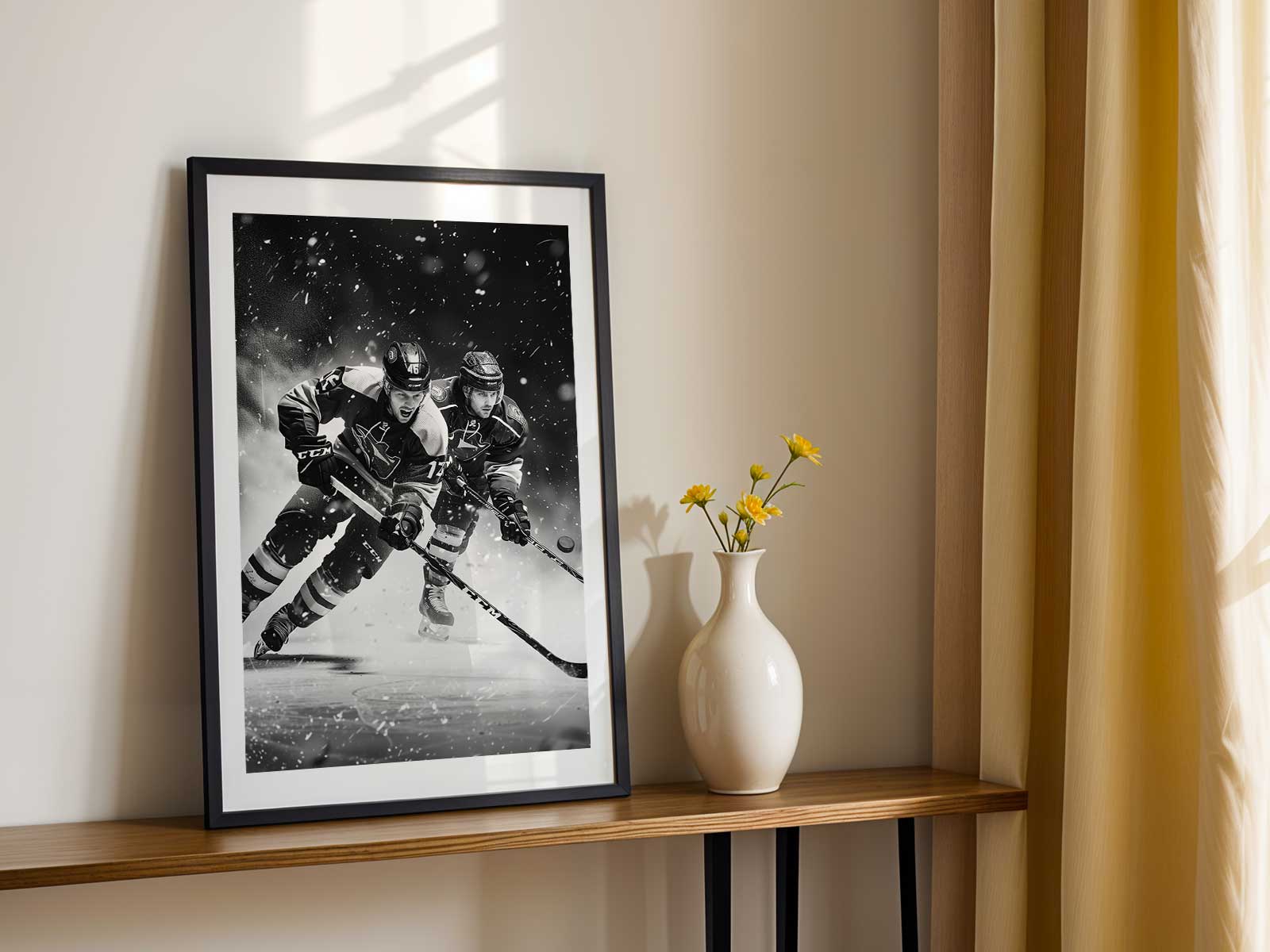
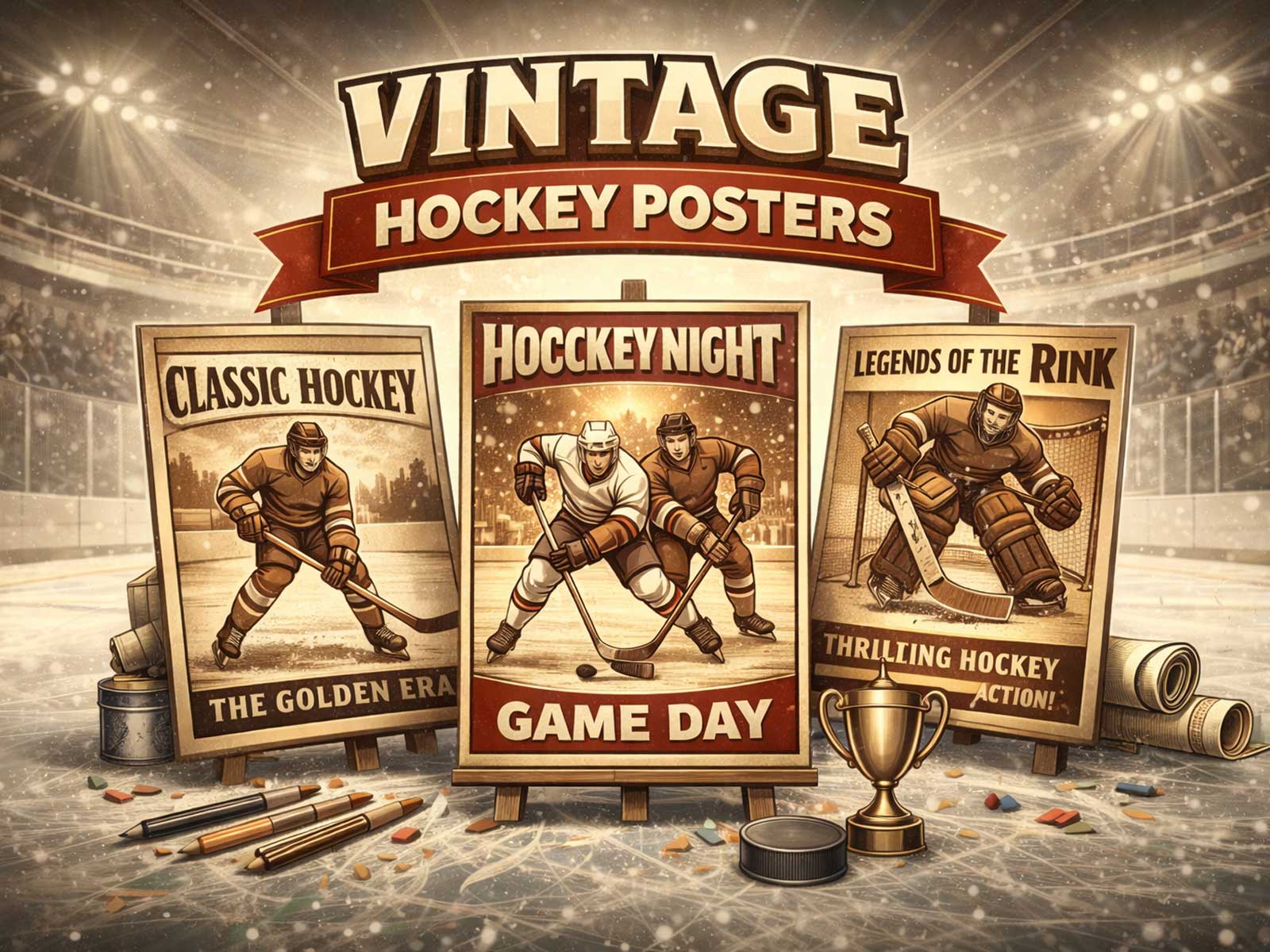
Colour and contrast determine how the piece behaves in a bedroom. Strong team hues or a bold crest provide identity and fan connection, but balanced with cool neutrals—icy blues, slate greys, and soft whites—those colours become accents rather than overwhelming statements. Retro and modern moods both work: a muted, grainy print evokes old-arena memory and a contemplative, nostalgic atmosphere; a high-contrast, cinematic photograph emphasizes speed and immediacy for a more contemporary, adrenaline-rich feel. Either approach can read as tasteful decor when the image keeps a clear focal point and an uncluttered background.
From a distance, readable shapes and contrast ensure the poster functions as a room anchor: the vertical silhouettes and light on ice are identifiable even across a room. Up close, the viewer is rewarded by details—ice spray frozen midair, the texture of a jersey, the subtle shine along a helmet—that invite longer looking. That layering of immediate readability and close-up richness is why hockey art suits bedrooms, studies, and game rooms: it supplies both mood and story without demanding constant attention.
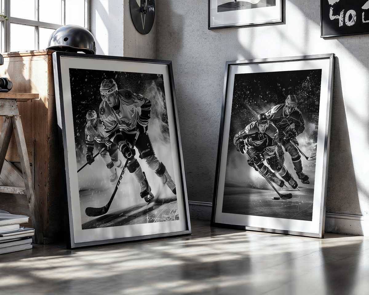
Finally, consider placement. Hung above a bed or desk, the poster’s vertical cues can visually raise the ceiling; placed over a console or between shelving, it creates a crisp central gesture that organizes surrounding elements. Choose scale with restraint: a single large print reads like a deliberate statement, while a series of narrower vertical pieces can echo the sport’s upright language and create a rhythmic gallery wall.
In short, a hockey poster works because its visual mechanics—reflective ice, vertical silhouettes, and clear tension—deliver energy that is precise rather than noisy. It brings arena light and movement into a bedroom while preserving calm and legibility, turning sport into a design asset that both fans and style-minded homeowners can live with comfortably.