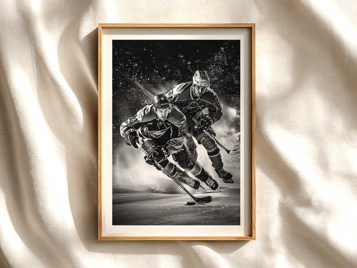
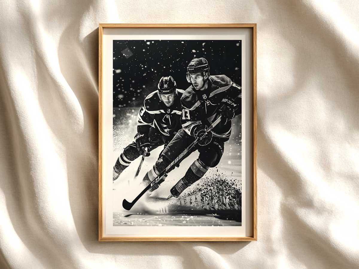
Hockey works as wall art because the game speaks in pure visual verbs: speed, impact, contrast. A single poster can translate a full arena moment into a room’s atmosphere — the lean of a skater in stride, the jagged spray of shaved ice, the hard edge of a stick silhouette — and make a plain wall read as kinetic and purposeful. When you think of hockey room accessories, consider how an image does the heavy lifting of mood-setting by using motion lines, high-contrast jerseys, and rink geometry to anchor the entire space.
The visual language of hockey is built around extremes. Bright team colours block against the neutral glow of ice; helmet and visor reflections fragment overhead lighting; and the white plane of the rink becomes both stage and graphic element. This contrast ensures the artwork reads at distance — crucial for a hallway or above a sofa — while inviting closer inspection: the salt-and-pepper flecks of ice spray, the scuff marks on a glove, the taut rotation of a torso bracing for contact. These tactile details make a poster feel lived-in and authentic rather than decorative only.
Composition matters. A well-composed hockey image uses the rink’s strong horizontal lines and the triangle of player clusters to create a directional flow across the wall. Diagonal body angles and stick shafts point the eye, so the print becomes part of a room’s circulation, guiding sightlines rather than competing with furniture. In small spaces, a vertical portrait of a charging skater amplifies height; in open-plan rooms, panoramic action scenes can echo the sweep of a couch or media console.
[IMAGE_INSERT_ARTICLE_01]
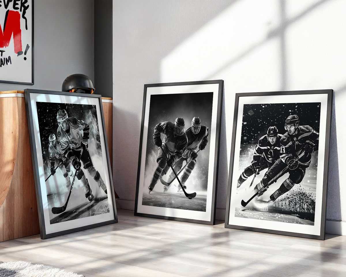
Texture and light are key accessories in themselves. The subtle mirror of ice — glossy where lights hit, opaque where the surface is scored — gives posters a dynamic mid-tone that plays beautifully against wood, concrete, or painted walls. Warm wood furniture next to a cold-ice image creates a pleasing tension; pair a retro-styled hockey print with vintage frames and matte paper for a nostalgic study mood, or choose high-gloss, high-saturation prints for a modern game-room energy. The same subject shifts from archival to contemporary depending on finish and framing.
Identity is another reason hockey imagery works so well in decor. Jerseys and crests are immediate shorthand for community and loyalty, but a successful piece balances recognisable marks with composition so it reads as design as well as fandom. Minimalist treatments — a cropped close-up of a crest, the head-and-shoulders silhouette of a goalie — make bold, wearable statements in offices or shared living areas where subtlety matters. More cinematic, full-ice scenes bring arena drama to dedicated fan caves and game rooms.
Finally, consider emotional temperature. Hockey posters can cool a room into arena calm or heat it into kinetic excitement. A low-angle capture of a collision freezes gravitational force and gives a study or office a sharp, focused edge. A widescreen sprint across neutral ice infuses a bedroom or stairwell with forward momentum. Either way, the image creates an immediate, readable mood that complements lighting choices and existing decor without overwhelming them.
In short, a hockey image is more than memorabilia: it is a compositional accessory that shapes space through motion, contrast, and material texture. Whether aiming for nostalgic archive, modern minimalism, or raw arena energy, the right poster turns a wall into a statement of speed and identity while remaining a quietly elegant part of the room’s visual grammar.