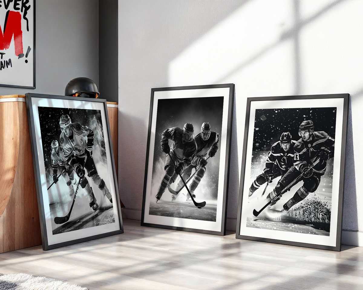
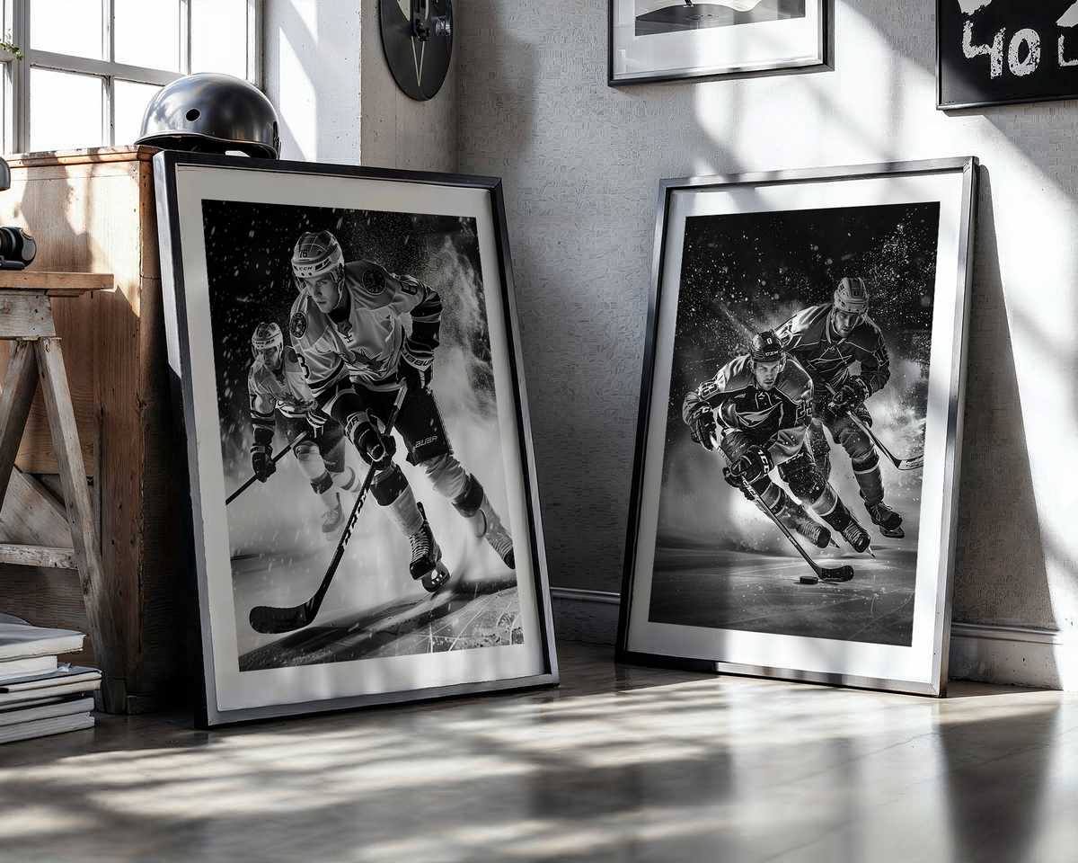
Hockey on a wall reads immediately: it’s an economy of motion, a freeze-frame of impact that turns a static surface into a pulse. A single poster can supply rhythm to a bedroom, study, fan cave or hallway because the sport’s visual vocabulary—sharp diagonals of skate blades, sprays of ice, compressed bodies, and bold jersey color—maps naturally onto interior composition. The cool, reflective plane of the rink becomes a backdrop that amplifies contrast; arena lights translate into highlights on helmets and sticks, and a collision or dive becomes a graphic motif that organizes the room’s energy.
The most compelling hockey images work at two distances. From across the room they read as strong shapes: a diagonal stick cutting the frame, a high-contrast silhouette against a pale ice field, a block of team color anchoring a wall. Up close they reward the viewer with texture—the granular spray of shaved ice, the scuff marks on a glove, the stitching on a vintage jersey—details that make the poster feel like an artifact rather than mere decoration. This dual readability is why hockey posters fit so well above a desk or over a sofa: they make a bold statement at first glance and invite a slow, attentive look.
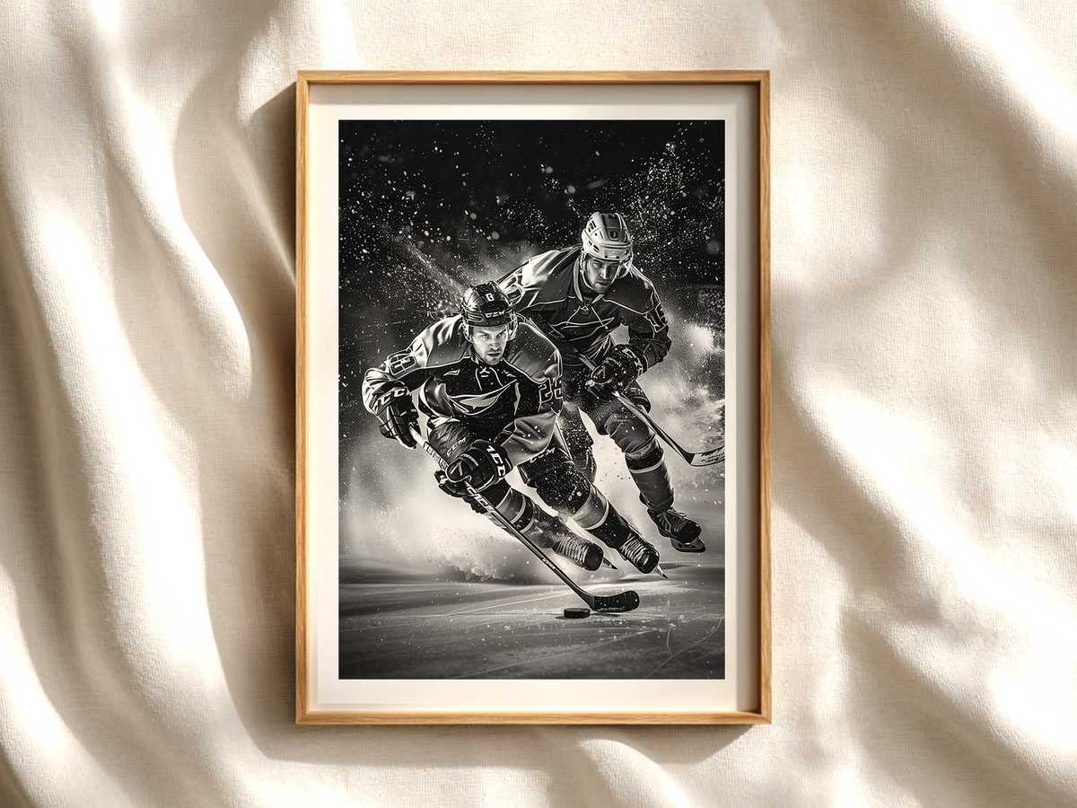
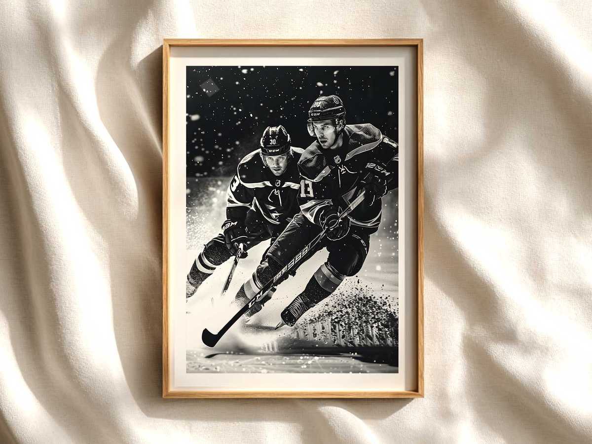
Cold light is a central motif. Rink illumination is typically bright and slightly bluish; when translated into print it lends a luminous, almost architectural clarity to the scene. That coolness plays beautifully against warm interior finishes—wood, leather, or brass—creating a deliberate tension that enlivens an otherwise neutral palette. Designers and owners can use a hockey poster as a color anchor: a pop of deep navy, scarlet, or forest green from a jersey can be echoed in cushions or a rug to create cohesion without fuss.
The tension of bodies in motion is the emotional engine. Hockey is about compressed energy—hips low, shoulders engaged, blades biting ice—and those human angles make for dynamic compositions. A well-composed image captures the moment of maximum intent: a forward leaning into a shot, a goalie sprawling, a defender braced for contact. Those gestures convey determination and focus, giving the room an active mood rather than passive nostalgia. Depending on the picture’s mood, the atmosphere can tilt kinetic, intense, or quietly archival.
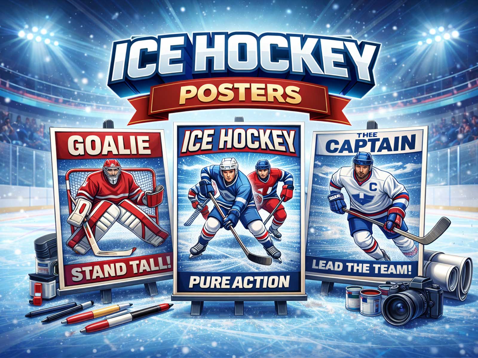
[IMAGE_INSERT_ARTICLE_01]
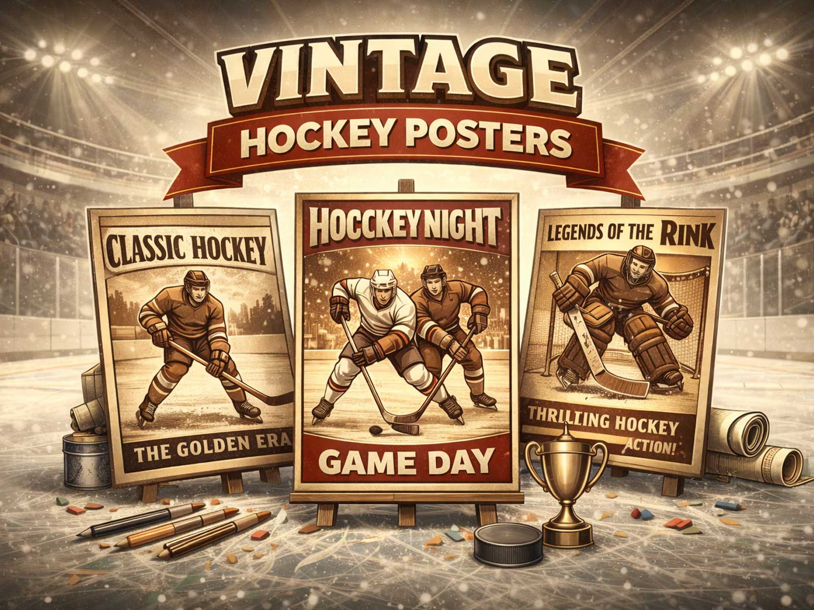
Visual identity matters. Crests, numbers, helmet silhouettes and stick profiles are instantly legible icons that carry meaning even without identifying a specific team. Retro treatments emphasize grain, muted palettes and the warmth of old arenas; modern treatments favor high contrast, tight crops and hard light. Choosing between them is a matter of interior intent: retro pieces soften and suggest memory, while contemporary prints push forward motion and immediacy.
Finally, think about placement and scale. A large-format image over a couch or media console creates an arena-like focal point, while a smaller, framed piece beside a bookshelf reads like a collectible—something you encounter while moving through the room. Because hockey imagery often contains strong diagonals and predictable vantage points, it plays well in narrow hallways or above stair landings where the eye follows implied motion. The result: a room that feels considered, energized and connected to sport culture without shouting for attention.
Author: