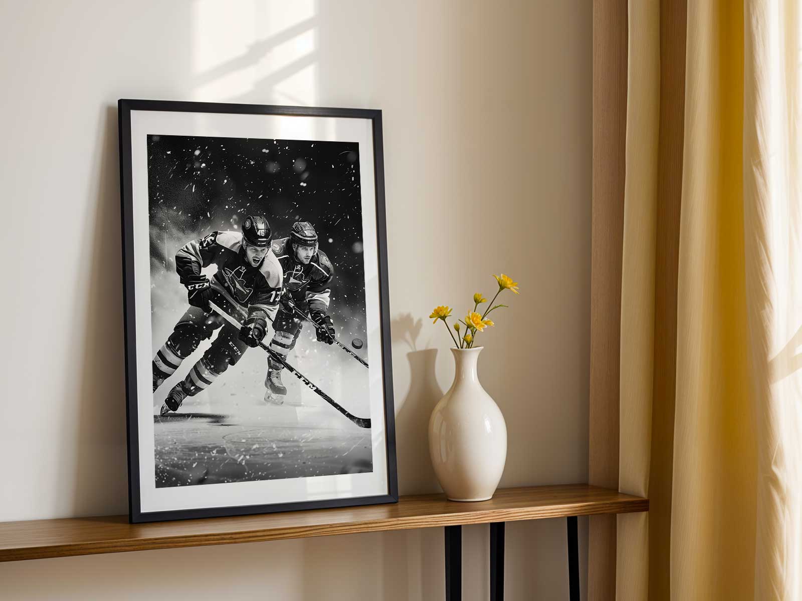
Hockey images work like a visual metronome: they set tempo in a room through contrast, motion and a crisp, chilly light that the eye feels as much as it sees. A single poster can read as both a snapshot of impact and a compositional device that organizes surrounding décor. The bright, clinical glare of rink lighting, the grain of shaved ice caught mid-spray, and the diagonal sweep of a stick or skate blade combine to create a rhythm that draws the viewer in and then keeps the eye moving across the wall.
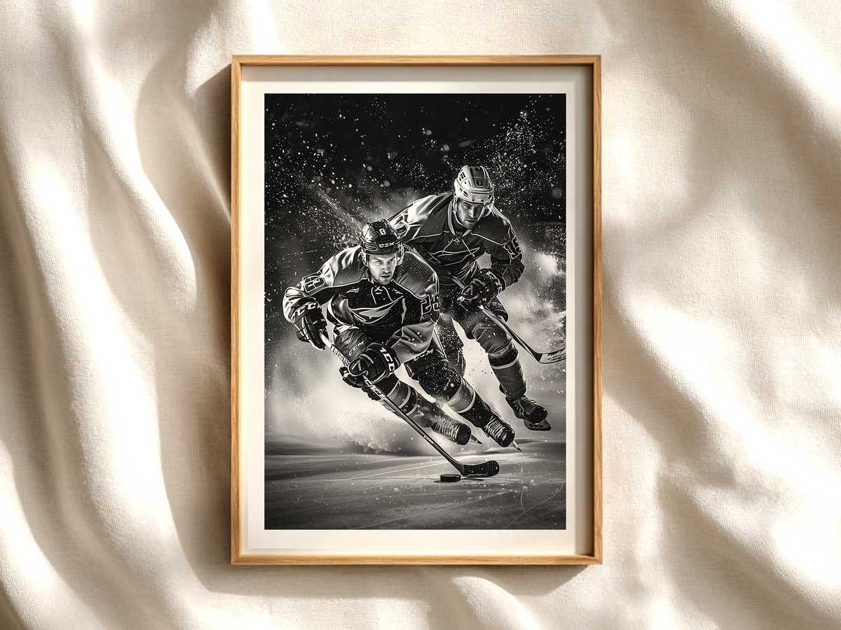
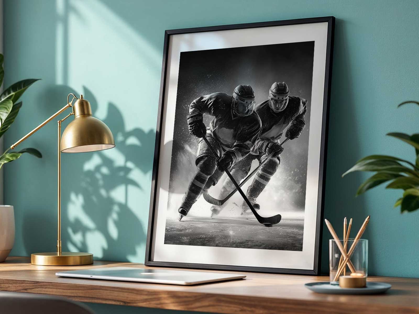
At the heart of that rhythm is body tension. Hockey players are sculpted into action poses—knees compressed, shoulders wound, sticks bent—so a framed image rarely feels passive. Those taut bodies introduce a sculptural energy that contrasts beautifully with domestic softness: a wool throw, a reading chair, the matte of a wooden desk. In a study or office the result is kinetic focus; in a living room or game den it becomes intentional drama. From a distance the strong silhouette of helmet and stick anchors the composition; up close, details like the spray of ice or the creased fabric of a jersey reward inspection.
The palette of hockey imagery is another reason it succeeds as wall art. Arena light flattens air temperature into color—cold blues, steely grays, and pin-sharp whites—while jerseys and crests provide concentrated hits of saturated color that act like visual punctuation. Those color blocks read clearly at a glance, making the artwork legible across a room, yet they also hold layers: textures of mesh, gloss of the visor, and the matte scuff of a puck all become tactile cues that invite longer looks. Whether the image leans modern—high contrast, minimal background—or retro—with grain, warm film tones, and patina from an old scoreboard—the essential interplay of cool ambience and bright team color places hockey art between documentary and design.
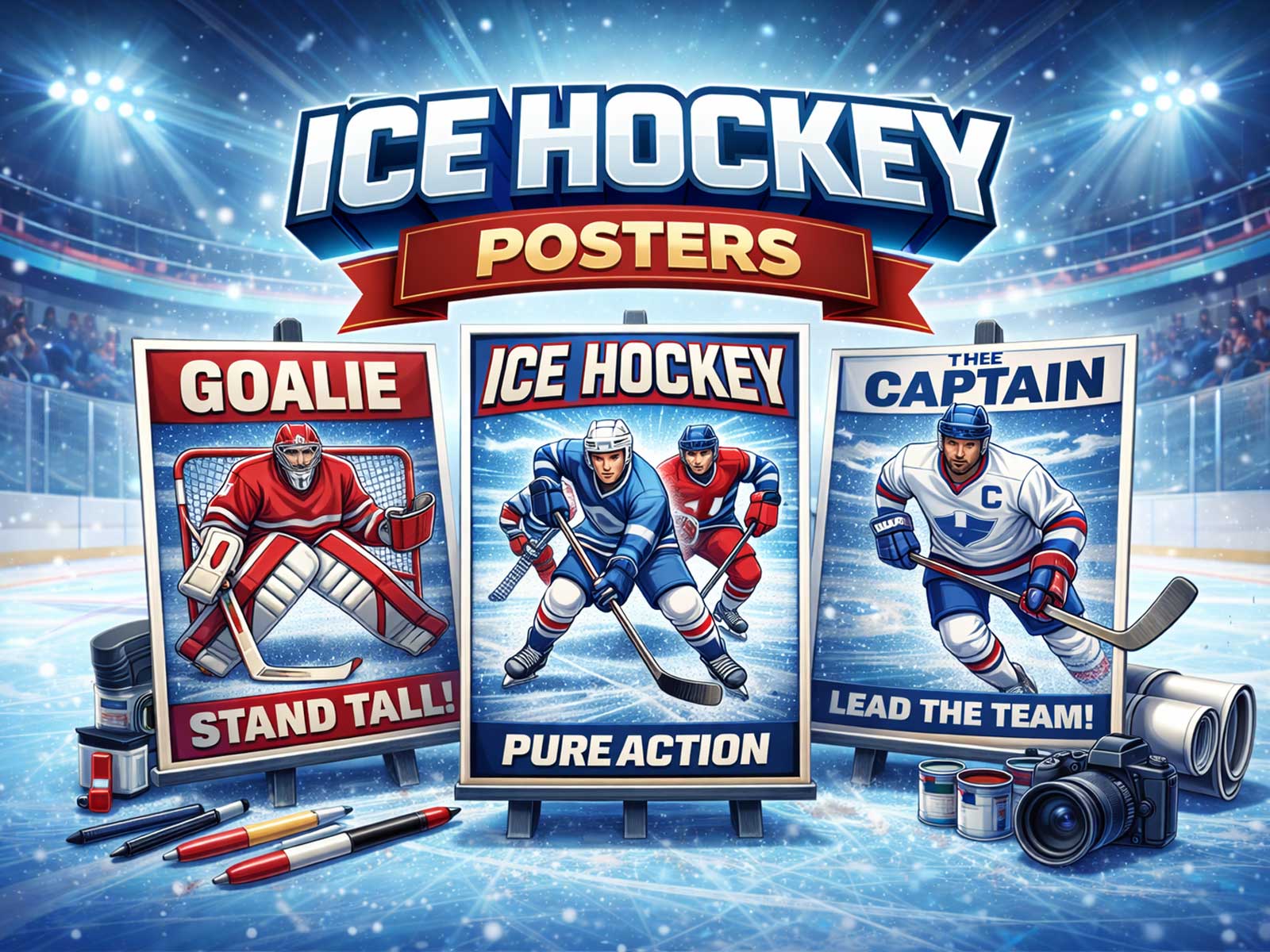
[IMAGE_INSERT_ARTICLE_01]
Rink geometry contributes to compositional clarity. The boards' horizontal lines, the face-off circles, the angle of the blue lines and the predictable horizon of the dasher create a framework that designers love: clear axes for alignment, negative space for breathing room, and directional lines that lead the eye to a focal point. That makes hockey posters perform well near furniture where alignment matters—above a sofa, behind a bed, or over a console—because the image’s internal structure resonates with the room’s own lines.
There is also a cultural shorthand at play. Jerseys, crests and helmet silhouettes immediately signal affiliation or memory. Even for those who are not obsessive fans, these symbols carry narratives of competition, teamwork and ritual—qualities that translate into an interior as purposeful atmosphere rather than mere decoration. A poster with a strong crest or a vintage helmet becomes a conversational anchor, but it never overwhelms; its visual grammar—contrast, motion, texture—keeps it elegant and readable.
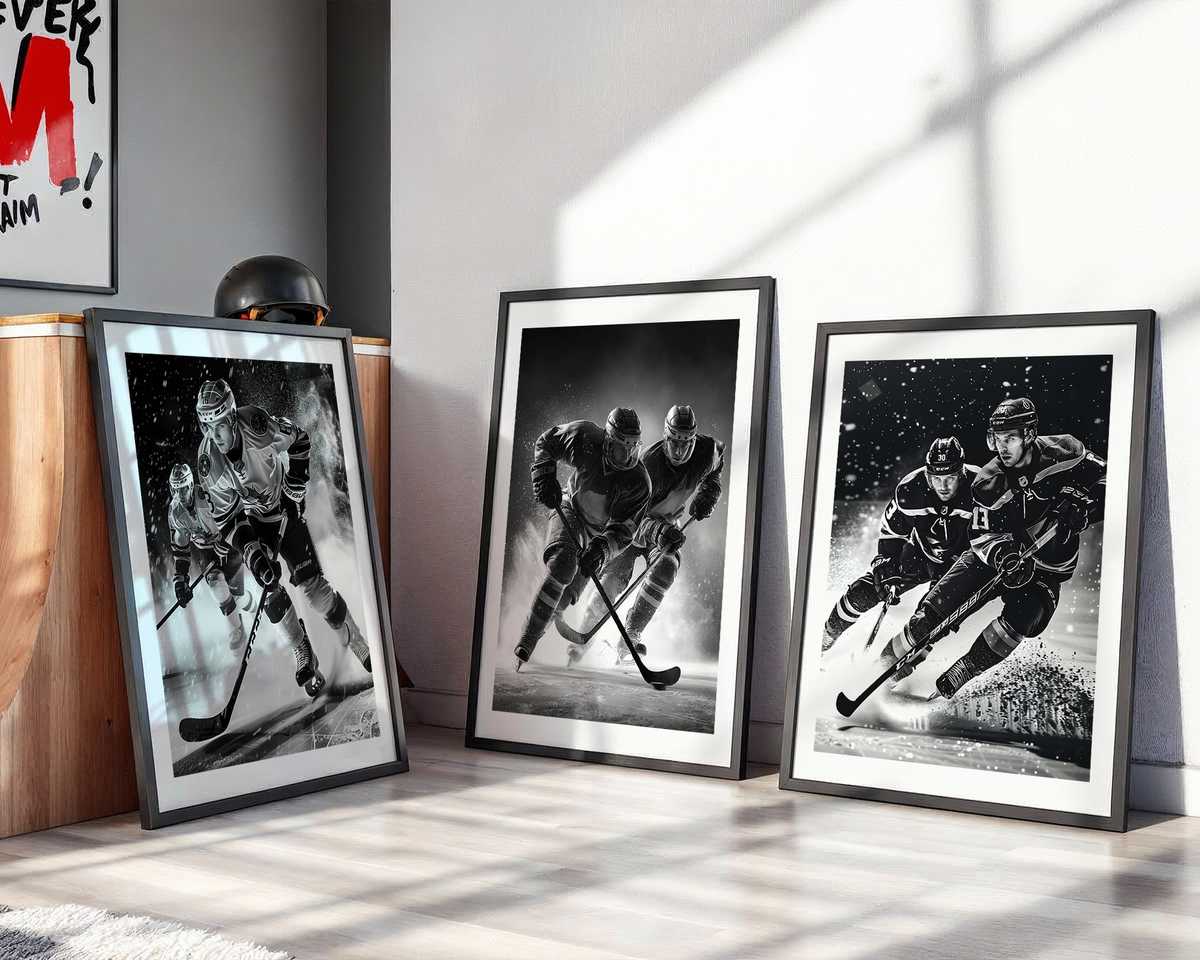
How the artwork changes a room depends on scale and finish. A large, matte print accentuates the arena’s hushed, cinematic quality and reads like a window into action, perfect for a study or a gallery wall. A smaller, glossy print emphasizes details—ice spray, puck marks, fabric grain—making it intimate and tactile for bedside or shelf displays. In both cases the frozen instant of engagement—the player leaning into a check, a goalie split mid-save, the puck under a blade—serves as a deliberate, framed moment that brings momentum to everyday life.
Ultimately, hockey decor succeeds because it balances opposites: cold light and warm identity, controlled geometry and explosive motion, readable color fields and textured detail. That balance makes the art versatile—capable of anchoring a modern office, lending nostalgia to a hallway, or charging a game room with arena-like tension—while remaining visually sophisticated. A well-composed hockey poster doesn’t just show a sport; it imposes a rhythm on the space, one that is at once perceptible and quietly commanding.