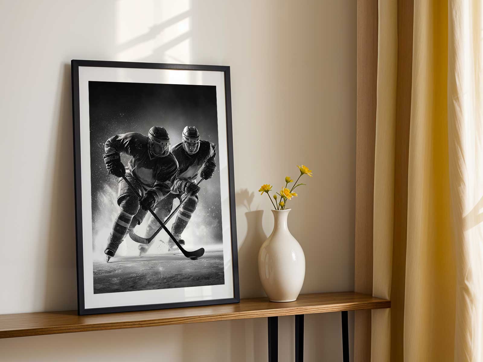
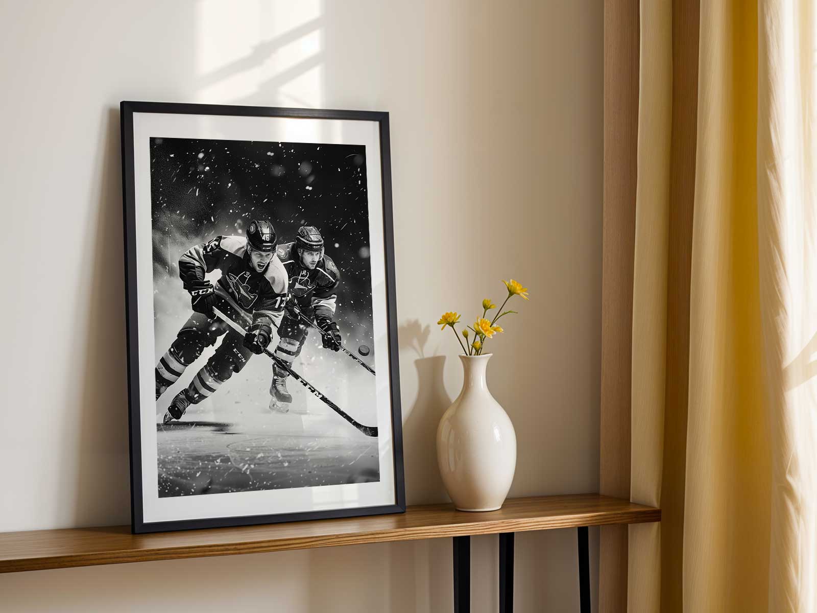
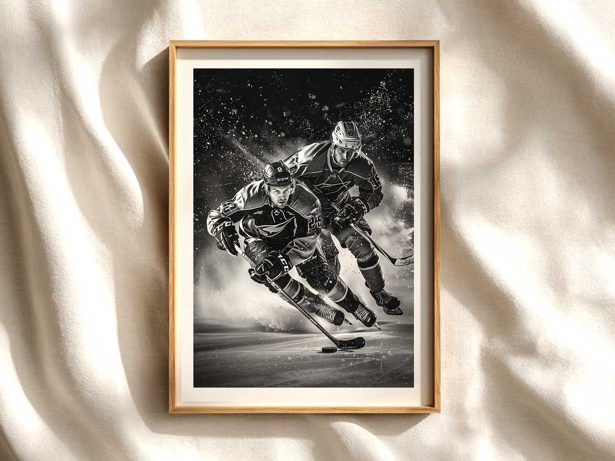
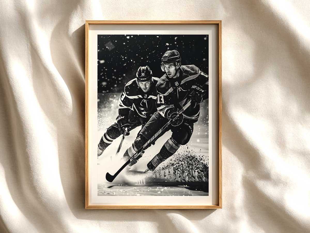
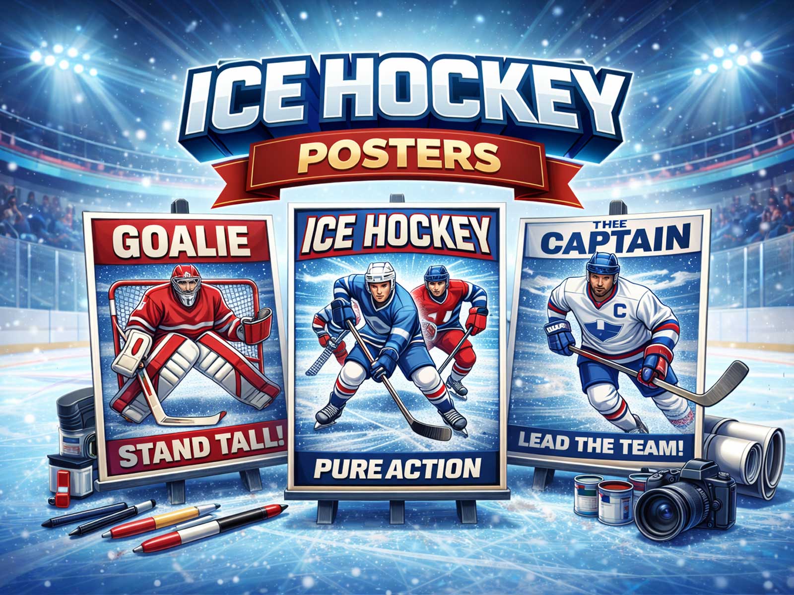
Hockey works for wall art because the game speaks in pure visual vocabulary: a burst of motion, shards of ice spray, the hard silhouette of a stick and helmet against stadium light. When a single image freezes that instant—the blade carving, a player braced in mid-collision, the puck sliding across glossy ice—it turns a flat wall into an energetic stage. That translation from live action to still composition is what makes hockey-themed room art so immediately compelling: the picture both describes movement and anchors a room’s atmosphere.
What you notice first in a successful hockey poster is contrast. Rink ice catches and reflects light in broad, cool planes; jerseys and crests cut through those planes with saturated color and graphic shapes. This is why hockey translates well at several viewing distances. From across a living room or game den the bold color blocks and heroic outlines read instantly. Up close the image rewards inspection: flecks of ice, thread detail on a jersey, a scuffed helmet tell a tactile story. The same piece can deliver arena-scale energy from afar and intimate texture at arm’s length.
The language of motion—body tension, bent knees, flexed sticks—is naturally cinematic. Even without faces or names, posture conveys intent: a forward drive, a defensive crouch, that suspended split-second before impact. Good hockey wall art emphasizes those lines of force, using composition to lead the eye along a stick shaft, into a spray of ice, and toward the implied goal. Rink geometry reinforces this effect; boards and glass provide horizontal anchors while overhead lights cast long, dramatic shadows that add depth and theatricality to a room.
[IMAGE_INSERT_ARTICLE_01]
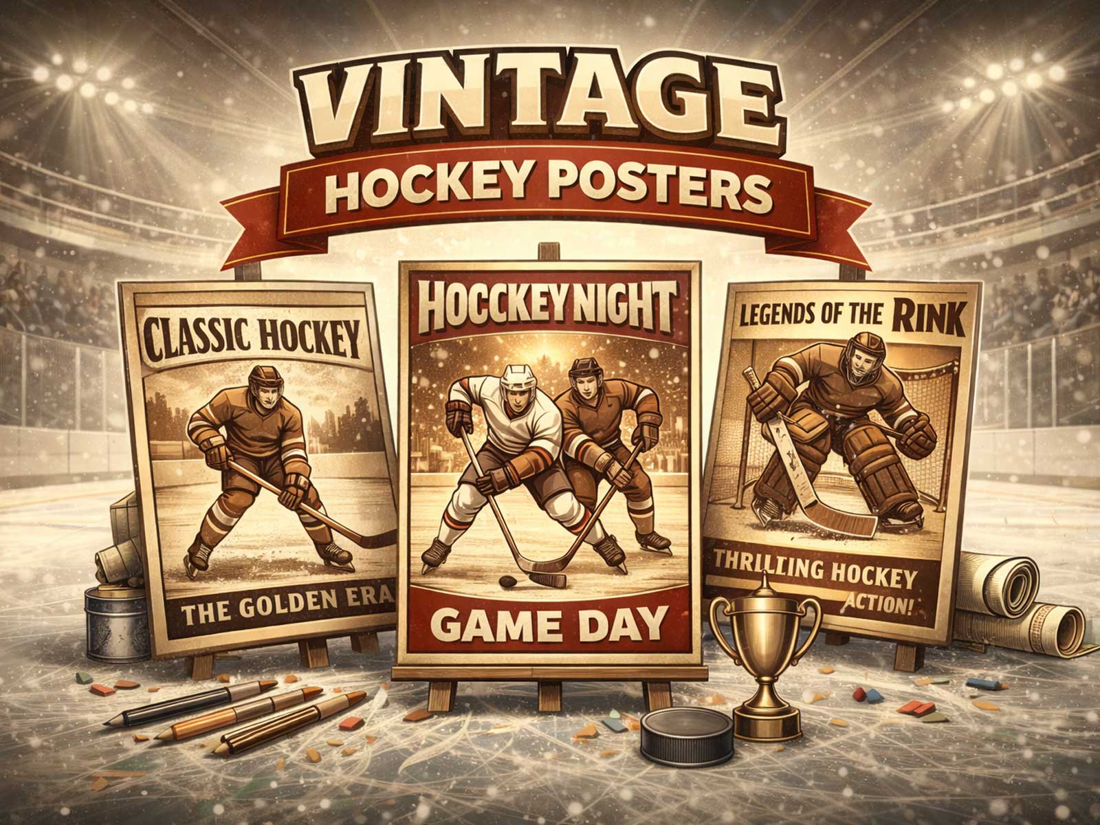
Texture and light are essential. Ice reflects not like water but like a luminous stage—soft halos around arena lights, crisp flaring off fresh skate grooves, and the gritty, matte smudge of puck marks. Artists and photographers use those elements to set mood: cold, clinical clarity for a modern study; warm, amber-lit grain for a retro, old-arena memory. The choice between modern gloss and vintage grain shifts the poster’s role in decor. A contemporary, high-contrast print feeds a minimalist office or media wall with kinetic focus; a desaturated, filmic image invites nostalgia in a hallway or collector’s alcove.
Team identity plays a visual role beyond logos. Jersey color blocking, crest shapes, and helmet silhouettes provide immediate recognition and a strong compositional palette. That’s why hockey images balance well with a range of interiors: a bright team palette enlivens neutral-toned rooms, while a restrained monochrome study complements darker, library-style spaces. The result is a piece that reads as both fan culture and considered design—recognizable to supporters, aesthetically coherent for anyone who values strong imagery.
Finally, consider the emotional atmosphere the image creates. A single frozen charge across the blue line can make a room feel kinetic and alert; a poised goalie silhouette introduces a meditative, defensive calm. Posters that foreground ice spray and impact create immediacy and tension—great for game rooms and entertainment areas—while quieter compositions that focus on light, arena architecture, or archival texture suit studies and bedrooms where mood and memory matter more than adrenaline.
Hockey wall art succeeds because the sport’s essentials—speed, contrast, texture, and identity—map naturally onto visual design principles. The best pieces do more than commemorate a team or moment: they convert the physics of the rink into a mood for the room, inviting both fans and design-minded viewers to live with an image that is at once cinematic, tactile, and unmistakably alive.